Quantcast
Channel: Viget Articles
Viewing all 939 articles
Browse latest View live

7 Tips for the Aspiring UX Designer

$
0
0

This time last year, I had never heard of UX. Coming from a family of doctors, the only job-related acronym I knew was MD. But this changed during my summer in Silicon Valley, where I worked as a media intern with a startup accelerator and venture capital firm. Over the course of just three weeks, four colleagues told me that I should look into UX. I really think you would like this. You’d be so good at it!

Thinking it was some sort of sign, I decided to give UX a try. It was love at first sight.

From that point on, I spent my free time immersed in UX books, articles, and blogs. I had never felt so passionate about a field before.  I used my Christmas break to take an online UX course. I filled my schedule with phone calls with every UXer in my LinkedIn network. I convinced a professor to give me the last seat in her graduate level usability design course.

And after months of hard work, this intense immersion paid off. In April, I landed my dream job: a UX internship with Viget.

I might have “won the prize,” so to speak, but I haven’t forgotten all of the the stress, long hours, and uncertainty it took to get here. At first, like many aspiring UXers, I was totally lost.  What even is UX? How do I learn the skills I need? What do I need to do to get a UX job?

From my experience, finding answers to the questions can feel impossible.

But it doesn’t have to be that way. Here are 7 tips I’ve come up with to help others interested in pursuing UX get the answers they need...without the stress.

1.  Immerse yourself in UX knowledge

UX is a hot field right now, so there are tons of resources out there to learn more. The challenge is finding the right ones. Here are some of the resources I found the most useful starting off:

Books:

  • Don’t Make Me Think (Steve Krug) – this is UX must-read #1. It walks you through the basics of every aspect of UX, without overwhelming you with hyper-technical terms.

  • The Design of Everyday Things (Don Norman)– although it’s centered around the design of physical objects, this book stresses the importance of understanding user needs.

  • The Elements of User Experience (Jesse James Garrett) – this book will help you see the big picture of UX. It breaks down the complexity of the field into clear explanations and diagrams.

Blogs:

  • 52 Weeks of UX– this is an easy and quick way to build your UX knowledge. Content is broken down into 52 weeks, each of which features 1-3 short UX insights.

  • UX Booth– this site is made for beginners and intermediate UXers. Start with this article for a UX crash course.

  • UX Magazine– this publication is like UX Booth, but with the addition of UX event calendars and job listings.

People:

  • Brad Frost (@brad_frost) – a developer, designer, speaker, and writer, Brad  tweets about a wide variety of awesome web design stuff.

  • Luke Wroblewski (@lukew) – currently a Product Director at Google, Luke is one of the most influential people in the UX field. (He coined the idea of “Mobile First.”)

  • Kim Goodwin (@kimgoodwin) – author of Designing for the Digital Age, Kim offers great tips on what it takes to be a successful UXer.

2. Take an online class

If you prefer structured learning but don’t have the time or money for a full-fledged UX program, online classes could be the move.  There is a plethora of options out there, but based on my research and personal experience, here are the three classes I  would recommend:

  • Hack Design– 50 easy-to-follow (and free!) design lessons delivered straight to your inbox over the course of 50 weeks

  • User Experience Design Fundamentals– a cheap, video-based course that teaches you basic UX principles in just 10 hours

  • General Assembly UX Design Circuit– if you have the time and money, this is a course worth investing in. You will learn key UX skills and put them to practice in a real project.

3. Find mentors

Although I learned a ton about UX from scouring the internet, reading books, and taking online classes, I have gleaned the most from conversations with people in the field.

If you live in a small city or somewhere non-techy, it may seem like you’re all alone in the big, scary world of UX. But chances are, you’re not.

Do some LinkedIn detective work.  Ask family and friends if they know anyone who does UX (if they look at you with blank stares, try “web design”).  Even if you only find one match, that one UXer can probably connect you to dozens more.

Once you’ve found these potential mentors, get their attention. Send emails and InMails, Tweet at them, reach out via their website. It may take months, but your perseverance will pay off.

When you land a conversation – whether by phone, in-person, or simply through email – make sure you show up prepared. Know what the person does and be ready to ask questions catered to that experience. I saw on your LinkedIn that you attended grad school for Human-Computer Interaction...do you think that’s the best path for becoming a UX Designer?  

Most people don’t want to simply tell you about their job – they want to tell you about the journey, the challenges and successes, and the learnings along the way. And they want to share those learnings with you.

Approach every networking opportunity as an opportunity to learn. Don’t waste your time figuring out how to make yourself sound as awesome as possible. Spend that time finding the best way to learn from each connection you make.

4. Attend local UX Meetups

Meetups are another great way to network with UXers in your area. They’re also an awesome opportunity to learn new design skills and discuss broader tech-related topics.

All you have to do is go to the Meetups app or website, search UX (try usability and interaction design if you reach a dead end), register for an event, and then show up.

5. Start a personal project

After you have some basic UX knowledge under your belt, you can take it to the next level by applying it to an actual project. If you can’t take a class or get an internship or apprenticeship with a company right away, don’t worry – you can do UX work anytime, anywhere.

There are several routes you can take:

  • Think of a website you hate. What makes you hate it? What could make it better? Now turn those ideas into designs – sketch out some ways you think the site could be improved.

  • Send an email to a company you like asking if you can do some informal research on their website. Does it match the needs of the target audience? Does it follow basic UX design standards? Make sure to clarify that your only intention is professional development.

  • Design your own app or website. You can use a  pre-existing product as a launching point or create something radically new.

No matter which route you choose, make sure you record every part of the project process so you can add it to your UX portfolio. Write about what you did, take photos of sketches and scribbles, and capture screenshots of sites that inspired your designs.  You’ll be able to compile case studies from these artifacts.

6. Analyze everyday experiences

An easy way to build your UX chops is to evaluate the experiences that everyday objects, products, and technologies create.  What could make them more intuitive or enjoyable to use? What prevents them from being this way?

For practice, think about how the principles of UX apply to these examples:

Can you think of other real-world applications of UX principles?

And most importantly...

7. Trust yourself

There are very few rights and wrongs when it comes to UX. There’s no right way to break into the field – no specific degree you have to get or class you have to take.  And there’s is no right way to design a website.

So if you’re worrying about not doing UX “the right way,” don’t.

As long as you’re absorbing all of the knowledge you can and then starting to apply that knowledge in your daily life, you’re already well on your way to becoming a UX Designer.

Have any tips you’d like to add to the list? Post in the comments below!


Crash Course: VR Design for N00bs

$
0
0

We have a tradition at Viget of experimenting with our own ideas, independent of client work. But, honestly, it’s been too long since we built something pointless. Today, we’re debuting our latest experiment in virtual reality—a WebVR adaptation of the classic circuit-board puzzle Lights Out. It’s a one-player game, with the objective of turning all the “lights” in the grid off.

Sure, the final product is neat, but how did we get there?

Jumping into the VR metaverse is overwhelming. I was disappointed to find there are tons of libraries for developers—but very few centralized resources for designers. As creatives, we pride ourselves on our ability to apply design thinking to everything. So, where are all the thought leaders in VR design? There’s little to no consensus around even the most basic design standards—like typography or accessibility.

Basically, VR design is a wild west free-for-all.

However, instead of seeing this as a deterrent, I see it as a call to action. The more we create, the faster we learn. This is an opportunity to define the future web. Here’s a crash course to get started:

1. Know the difference between VR and WebVR

What’s the difference between VR and WebVR? The accessibility of the technology. WebVR doesn’t require any additional (very expensive) equipment to get started. All you need is a laptop, some WebGL chops, and a viewer—like Google Cardboard ($15). We actually did all of our prototyping with a Cardboard and the View-Master Deluxe VR Viewer ($40). WebVR is ideal for applications with light content and short user durations.

Better yet, users don’t even need to visit the app store. With WebVR, you can engage with the experience directly from your smartphone or desktop. Since it lives on the web, not in a native application, all viewers need is a simple hyperlink.

2. Put yourself in a box

Defining constraints in the beginning is essential. Frame them as actionable goals. For Lights Out, we wanted this experiment to be short and sweet. We decided on 3 constraints: we would build this for WebVR, Google Cardboard was our target device, and the project would last 4 weeks.

Aside from all the reasons why WebVR is awesome above, working with simple viewers like Google Cardboard afforded us energy to focus familiarizing ourselves with the basics—like integrating Microcosm with WebGL.

3. Before you sketch, read

Specifically, read Mike Alger’s paper on Visual Design Methods for VR. It’s the most comprehensive resource for volumetric user interfaces. While this paper primarily explores interface design of a VR-based operating system, his theories around content zones (pp. 36-46) were especially insightful for our exploration. If academic papers aren’t your thing, you can also watch his condensed VR Interface Design manifesto.

Leap Motion, a VR product company in San Francisco, also has a fantastic compendium of articles on everything from establishing space and perspective to sound design. This particular article dives into their initial explorations in user interface design.

4. Set up proper art boards

Sometimes the simplest tasks in a new medium are the hardest. I had to Google this. The width of your entire canvas should be 3600 pixels wide by 1800 pixels tall—which cleverly translates to 360° by 180°. Remember that only a portion of this segment is viewable at any given time. The dimension of the UI view is roughly 1,200x600 px. Here's an example of the setup I used for my UI. I denote these spaces as such in my working files:

5. Retina displays are not your friend

As we moved into prototyping, one of the first things we noticed was aliasing. As a result, I had to go back in and amend my designs to account for the low-fidelity output. Details like the fine, crisp lines had to quadruple in width and spacing.

6. Design and export textures in powers of two

If your interface contains any kind of SVG pattern, you’ll need to export them with sides equivalent to the power of 2 for optimization purposes. This is more efficient to store in video memory and easier for WebGL to map within the final geometry. Each side should be: 1, 2, 4, 8, 16, 32, 64, 128, 256, 512, 1024, or 2048 pixels. Refer to the Mozilla Developer Network for more context on using textures in WebGL.

Finally, accept the fact that whatever you make—it will probably be bad.

Do you remember what websites looked like in 1999? Shudder. No one really knew what they were doing. But that’s how you learn, by trying (and failing). I’m sure we’ll all laugh about the first VR experiences 10 years from now. They’ll be kitschy and nostalgic, like arcade games. Embrace it.


Prayash, the creative developer in this collaboration, is currently working on a WebVR tutorial as a follow-up to this article. Excited? Me too. Tweet @_prayash and tell him you can't wait to see it.

In case you missed it at the top, try Lights Out and tell us what you think. And if you beat level 2 let me know—I still haven't figured it out yet.

Text-Snippets for Work and Play

$
0
0

This week I listened to a podcast from NPR Money about spreadsheets. It was a fascinating listen about how accountants have come from manually using columns and rows while adjusting series of numbers in multiple cells to the automation of a task where one cell will update those in relation to it.

As an intern, there has been a lot of new information being thrown at me over the summer, so I've been experimenting with different methods of shortening communication with text-snippets, which I’ll now share with you.

Let’s try to be productive

Do you have stand-ups at your work? If you're not meeting in person every day, you might do it via text in an app like Slack. Our intern team used Slack to highlight our plans for the day using a YTB (yesterday, today, and blockers) structure:

Hey team,
Here's my Daily Standup for July 11, 2017:

What did I get done yesterday? Self Project work with lots of refactoring.

What am I going to do today? Setup my local environment to work with the group project.

What is blocking me? Looking at way too many memes.

Personally, I just went to my notes app and changed the text every day and pasted it over. It would be a split between this and writing shorter YTB prompts for most of the interns. At the time I looked for a Slack integration for doing these and even thought about creating a custom Slack integration for it. Sadly, a good alternative was never found. Instead, I just kept copying the same text block over and editing it. At the time, something that would have been better would be figuring out a way of automating the formatting of a daily stand-up/YTB. Now if I ever needed to do a text 'stand up' I can just hit `;ytb` and the following happens.

Here I'm using a tool called TextExpander.

This is the how the "code" for the custom text expansion looks within the interface.

What I love about TextExpander is that you don't actually need to know how to code to create things like this. There are buttons that will post the appropriate prompt into whatever text snippet you are creating.

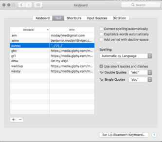
Apple also has its own version of text-snippet expansion within System Preferences -> Keyboard -> Text where you can create small keywords that automatically get replaced with substitutes.

Apple's version feels a little buggy and seems to have a speed element to it. So the shorter the triggered text, the better. I only have one expansion that I use consistently and it's replacing the word 'dunno' with the following donger character: ¯(ツ)

There are a ton of fun things you could do with this. Just recently, I replaced omg and lol to "oh my gosh" and "laughing out loud", but that's just because I'm a terrible person and love being weird. I also just realized that I could use this for a very good prank on someone else's computer...

Another thing I've also been trying is sending gif links for specific responses.

Gifs are a huge part of our company’s culture. But this can get pretty out of control when spending too much time finding gifs for specific responses.

My current method of doing this within Slack was always hitting the /giphy [keyword] command and choosing the best gif from the selection. While I still do this for very specific responses, I've looked into a few alternative methods. At first, I tried sending out giphy links for certain text phrases like gt1. This stands for "gif thanks version 1" and pushes out the following gif link which automatically expands in apps like slack:

Initially, I used Apple’s text expansion system but have grown to dislike it as it requires shorter key-phrases and faster typing to expand accurately. Now I've started to use the aforementioned program TextExpander for my custom gif needs.

I've even found an Applescript snippet for TextExpander on this article from Zapier which spits out a randomly generated gif from an array of gifs you set aside within the snippet. So every time I need a good ol' dab gif, I get a random one from an array of gifs that I previously declared:

The beauty of TextExpander is that it allows custom scripts whether you write it using Applescript, Shellscript or JavaScript. This is great if you wanted to create custom tasks on command. To test this out, I made a small JavaScript script to send URLs for LMGTFY links.

All I do is type ;lmgtfy, then the query, and it generates the link. If a friend asks you something like "Why is the sky blue?" and you don't feel like explaining or just don't know, typing the command ;lmgtfy and the query returns the following link: http://lmgtfy.com/?q=why+is+the+sky+blue?. So now, only 3-5 seconds are wasted instead of 10-15 seconds just opening the website, copying the link, and going back to Slack to paste.

Of course, the uses of TextExpander above are wasted on gifs and LMGTFY. There's way more that you can do with it. First, if you're a recruiter or someone responding to many applicants with rejection or acceptance notices, using something like TextExpander can help create a formal process for things like this. Here's a fictitious example rejection letter:

Hello %filltext:name=First and Last Name%,

We’re so glad you’ve been applied here to Ben and Gerry’s for the position of %filltext:name=Applied Position%. While you did show impressive strides in our interview process, we can’t say the position is right for you.

%fillarea:name=Personal Message%

We hope you try again in the near future.

Thanks again, 
%filltext:name=Your Name:default=Benjamin Mathew%

Here's it in action:

Having a basic structure in place like the one above can help scaffold repeatable processes but can also leave room for personal messages and notes.

There’s an infinite number of ways to cut time using tools like TextExpander, whether it be for work, or just tomfoolery. However, if setup time gets in the way of the task you were trying to save time in, then it’s not worthwhile. For me? I messed with TextExpander in my free time and only use it casually whenever there’s something small that I feel like templating... but mainly I use it for the gifs.

TextExpander is my favorite iteration of custom snippets over Apple's version of text expanding and all the other random 3rd party choices. After an initial trial, TextExpander requires a $5 monthly subscription or a one-time payment of $55. No this is not a paid advertisement, just an exploration of saving moments of time using text-expansion.

If your reasons are to scaffold code, there are way better alternatives in your editor.

My favorite use of experimenting with text-snippets is for productivity when writing code. In this context, they’re better called as they are: code snippets. In my own experience, and from others I’ve spoken to, people usually don’t know how to go about creating a custom code-snippet. In a follow-up, I'll show some use-cases for creating your own custom snippets within Visual Code Studio.

A Guide to Better Conversations with Developers

$
0
0

As an intern at Viget this summer, one of my required tasks was working with a team of other interns from other disciplines to complete a digital product. The experience was fantastic and I am very proud of the end result (check it out here). Surprisingly, however, the largest learning curve wasn’t developing in a new language or using unfamiliar libraries and frameworks or even programming within a new set of standards. It was team communication.

Working with a group of other interns, fresh to the concept of working on a single project and with completely varying educational backgrounds, exacerbated typical professional communication difficulties. Although most of these difficulties were overcome throughout the project, one type of communication breakdown I observed on this project I have seen mirrored in other interactions throughout my time in school, in other internships, and in ongoing professional projects at Viget and other workplaces.

A benefit to good team communication is having multiple sharp minds behind solving problems and making decisions. The communication breakdown I witnessed on the internship project team created an unnecessary single-point-of-failure in otherwise good team decision making. I want to share my observations and lessons learned.

The scenario I observed was when a non-developer (a UX designer, project manager, or creative designer) wanted a new feature added to a project and asked a developer if it could be done. There is a generally a good amount of dialog that results, but the developers response will ultimately boil down to a yes, no, or kind of and a timeline for how long it would take to perform that request.

The problem arises when the developer’s ultimate answer is no, he or she cannot do it. The non-developer blinks, says ok, and scraps the idea.

This is the communication breakdown.

Days or weeks of work put into coming up with a feature or a design can be trashed in a second based on a single developer’s opinion. The developer’s power is unchecked, and creates an imbalance when the team needs to make project decisions.

All developers are human. Developers can feel lazy, they can misunderstand what others are trying to say, and they can miss small changes that can turn a difficult feature into a trivial one.

Both developers and non-developers can change their approach to these conversations to avoid this type of communication breakdown and improve the quality of their decisions.

The Situation

To determine a better communication strategy, it is important to consider the situation. What are each person’s goals in the conversation and what does each person bring to the conversation? In the instance described above, the non-developer is seeking information and feedback from the developer.

The non-developer is, in essence, a solicitor whose end goal is to confirm that a feature is practical and, if it is not, determine what can be changed to make it practical. The non-developer is limited in their technical knowledge, will know some general programming concepts, but will not understand many of the domain-specific terminology that the developer uses on a daily basis.  

The developer is the domain expert. The developer’s end goal is to ensure that the non-developer leaves the conversation with an understanding of whether the feature under discussion is practical, and if not, why not, so that they are capable of properly amending it. Where the non-developer has a limited understanding of programming and related terminology, the developer is flush with it. The developer communicates with domain specific terminology every day and is more familiar referencing these terms than distilling them down into simpler definitions.

Advice for the Developer

If you don’t understand (or if the question is not specific enough) ask for clarification. Making sure you understand the question is the first step in developing a good answer. Trying to answer a question that is too broad, although it may be the question the non-developer asked and will give you a chance to show off your programming knowledge, is a sure way to bore or confuse your listener. This is even more the case when answering the wrong question.

Provide a rough answer to the non-developer’s question before offering an explanation. Giving a yes, no, or kind-of will help scope your explanation. Instead of spending time trying to translate your explanation into a simple yes or no, the non-developer can focus on understanding it.

Define an appropriate context for your explanation. Creating context around the rest of your explanation will help ground the non-developer and keep you focused on answering the specific question that has been asked.

Go into appropriate depth. The depth of your explanation is a balance between being too informative and not informative enough. Going too shallow will leave your listener feeling confused. But, going too deep into the details can overwhelm them and do the same. A good explanation will leave the non-developer with an effective understanding of the relevant topic.

Use understandable language. It’s easy to default to the domain specific language that developers are used to communicating in everyday, but non-developers won’t understand these terms. Make a point of using simple, non-programming terms. If you do have to use a programming term, make sure you explain it well.

Relate programming concepts to everyday experiences. Understanding the logical world of programming can be difficult for newbies to the arena. To get confusing concepts across, draw connections to non-technical experiences or concepts. For example, object-oriented programming is best explained with reference to real world objects. The great scientist Richard Feynman had a theory that the true test of understanding a concept is being able to explain it in simple terms. If Feynman could explain complicated quantum mechanics theory in a single lecture to college freshmen, you can explain a software engineering concept.

Be aware of your listener. In a world with perfect communication, your listener would be constantly engaged and understand everything you say. Unfortunately, that’s not reality. And they may be too nervous to ask questions. Pay attention to their body language. If the non-developer seems disengaged or confused, try to use less technical language and ask them if they understand.

Be patient. Don’t be shocked if non-developers don’t understand some simple programming concepts; the topics are likely unfamiliar to them. Instead, be patient, focus on explaining well and confirming the non-developer understands.

Advice for the Non-Developer

Be explicit, describe your question or problem in detail. A developer’s answer and explanation are only as relevant as the question that is asked of them. In describing a feature, be careful to note when an action would be taking place, how this action would trigger a reaction, and what the result would be. Are there any conditions on the feature? For example, can only some users take this action or can everyone? Use the same descriptive detail when describing a problem as well.

Search for more than a simple yes or no. Important decisions may be reliant on a developer’s answer to a question, but a yes or no answer with no conversation doesn’t do these decisions justice. Strive to understand the reason why the answer is a yes or no, let yourself have the chance to problem-solve. This will also help you improve your own general knowledge. The next time a decision about a feature is about to be made, you will be more aware of how the feature may affect the development buildout or timeline.

Listen. You are asking the developer a question, therefore it is your job to listen. Listening well is difficult, especially when an explanation or answer to your question relies on diving into some of the more technical details of a project. Respect the time and effort the developer is putting into the conversation by putting as much time and effort into listening closely.  

Ask questions. If the developer isn’t going into enough detail, ask them to go deeper. Similarly, if a developer is going TOO deep into an explanation, use a question to re-scope their explanation and bring the conversation back to a relevant level. A developer, like anyone else, will need real-time feedback during a conversation to ensure they are hitting the right level of detail for their audience.

If you don’t understand something, say so. In a series of ongoing conversations, a developer will try to build on elements from previous conversations. Misrepresenting your understanding will cause confusion down the road.  Ask for clarification from the developer, and take responsibility for your professional development as you learn new concepts.

Conclusion

A lot of good communication habits and skills are often overlooked in conversations between developers and non-developers. There are a lot of modern biases that play into how non-developers view and communicate with developers and, likewise, there are biases and opinions the other way. These biases may have come about for valid reasons, but they shouldn’t be a blocker for good communication.

These recommendations sound like straightforward and simple communication principles. In essence, they are. Communication between a non-developer and a developer at the end of the day is communication between a person and another person. The communication concepts that apply in this situation are universal and important in many other situations as well. But that doesn’t diminish their importance.

Improving communication is not easy and it will take time to become proficient at and accustomed to following these recommendations. In the end, the payoff in better team decision making and better team relations will be well worth the effort.

World, Meet Ground Rules

$
0
0

This summer, Viget interns across offices in DC, Durham, and Boulder came together (in spirit) to identify a problem and create a compelling, digital solution. We had ten weeks. We had the combined skills of our five disciplines. We had free snacks.

We started with brainstorming. Through the pixelated magic of Google Hangouts, we bemoaned the lack of taco trucks. We mourned the trials of finding free wifi. We grieved over food that goes to waste in the fridge.

Nothing felt quite right, until we realized that the problem was in front of us, lukewarm and half-drained.

The problem was coffee. As a rule, we drink coffee when we’re tired. But making coffee makes us tired.

First of all, there’s finding the right roast — the quest for the perfect blend that inevitably ends with Folgers. We don’t want Folgers, but at least we know what we’re getting with it, unlike the light roast, organic, fair trade, single-origin enigma on the top shelf.

Then there’s the actual coffee-making. For some people, it’s a labor of love. For tired people, it’s drudgery. We still haven’t recovered from that time we spilled coffee grounds on the carpet. It’s exhausting trying to figure out the right ratio of grounds to water. It’s depleting when the coffee we finally get is either too weak or too strong. To top it all off, there’s the despair when we realize we actually need to clean the coffee machine.

With this in mind, we decided to do something. Armed with coffee, we got to work. Our audience: tired coffee drinkers. Our objective: to provide effortless roast recommendations — and hacks for managing unruly coffee machines.

Our intern team consisted of a UX designer, two front-end developers, a back-end developer, a visual designer, and a copywriter. Over the course of 10 weeks, we braved user research, strategy definition, visual design, front and back end development, QA, and a cross-office  presentation to the entire company.

The result was Ground Rules: a website for helping people make good coffee with minimal effort.

Along the way, we learned:

  • UX: Sometimes, the best solutions aren’t the snazziest ones. Put away your personal biases and focus on users’ needs.

  • Copy: Developing a strong strategy is essential. If you know your audience is already half-asleep, you better have a good reason/plan for getting their attention (they won’t thank you for waking them).

  • Design: Learned about practices for front-end development handoff and SVG formatting, and was able to push layout, type, and color skills to the limit.

  • FEDs: Learned about group collaboration, new technologies, SVG animations, and building with accessibility in mind.

  • Dev: Learned about Content Management System functionality and how they can work to update information. Also learned about team communication and working with people in other disciplines.

At the end of it all, we’re slightly more tired than we were before, but we’re happy. After all, most interns just get coffee.

Want to expand your Google Analytics skills or land a full-time job? Start here.

$
0
0

People often contact Viget about our analytics training offerings. Because the landscape has changed significantly over the past few years, so has our approach. Here’s my advice for learning analytics today.

We’ll break this article into two parts — choose which part is best for you:

1. I’m in a non-analytics role at my organization and looking to become more independent with analytics.

2. I’d like to become a full-time analyst in an environment like Viget’s, either as a first-time job or as a career change.

“I’m in a non-analytics role at my organization and looking to become more independent with analytics.”

Great! One more question — do you want to learn about data analysisor configuring new tracking?

Data Analysis:

At Viget, we used to offer full-daypublictrainings where we covered everything from beginner terminology to complex analyses. Over the past few years, however, Google has significantly improved its free online training resources. We now typically recommend that people start with these free resources, described below.

After learning the core concepts, you might still be stuck on thorny analysis problems, or your data might not look quite right. That’s a great time to bring on a Google Analytics and Tag Manager Partner like Viget for further training. You’ll be able to ask more informed initial questions, and we’ll be able to teach you about nuances that might be specific to your Google Analytics setup. This approach will give you personalized, useful answers in a cost-effective way.

To get started, check out:

1. Google Analytics Academy. The academy offers three courses:

  • Google Analytics for Beginners.This course includes a little over an hour of videos, three interactive demos, and about 45 practice questions. The best part of the course: you get access to the GA account for the Google Merchandise Store. If your organization’s GA account is — ahem — lacking in any areas, this account will give you more robust data for playing around.
  • Advanced Google Analytics.This course includes a little over 100 minutes of videos, four interactive demos, and about 50 practice questions. Many of the lessons also link to more detailed technical documentation than what can be shared in their three-to-five minute videos. Aside from more advanced analytics techniques, this course also focuses on Google Analytics setup. Even if you’re not configuring new tracking, having this knowledge will help you understand what might have been configured in your account — or what to ask be configured in the future.

  • Ecommerce Analytics.If you don’t see yourself working with an e-commerce implementation in the future, you can skip this course. It consists of about 10 written lessons and demos, along with about 12 minutes of video and 15 practice questions.

2. RegexOne.Knowing regular expressions is a crucial skill for being able to effectively analyze Google Analytics data. Regular expressions will allow you to filter table data and build detailed segments. RegexOne gives you 15 free short tutorials explaining how to match various patterns of text and numbers. As you’re doing GA analysis, tools such as Regex Pal or RegExr will help you validate that your regular expressions are matching the patterns of data that you expect.

Configuring New Tracking:

Unless you’re spending 50% of your workweek on analytics and 25% on tracking configuration, I’d recommend leaving most tracking configuration to those who do. Why?

  • First, it’s not worth your time to learn the ins-and-outs if you’re not handling configuration on a regular basis. If you do GA configurations in one-year intervals, you’ll perpetually be playing catch-up with the latest practices.

  • Second, it’s error-prone. If you can afford for your organization’s collected data to be incorrect the first time or two around, then go for it. If you need to get it right the first time, hire someone. There are plenty of ways that GA or GTM can break— and it only takes one potential “gotcha” for the data to be rendered unusable.  

Google has made some great strides over the years to simplify tracking configurations. Unfortunately, it’s still not at the point where anyone can watch a few hours of videos, then execute a flawless setup. I’m excited for the day that happens because it will mean that more clients who hire Viget to redesign their sites will come to us with clean, usable data from the start.

If I still haven’t convinced you, then consider taking the Google Tag Manager Fundamentals course to learn more about GA configuration. It’s mostly video demos, along with about 20 minutes of other videos and about 30 practice questions. Make sure you know the material in “Google Analytics for Beginners” and “Advanced Google Analytics” before starting this course.

Even if you’re not configuring GA tracking on a regular basis, knowing Tag Manager can help you implement other tracking setups. These non-GA setups are sometimes less prone to one mistake having a ripple effect through all the data, and they’re often simpler to configure within Tag Manager than within your code base. Examples include adding Floodlight or Facebook tags to load on certain URLs; trying out a new heatmapping tool; or quickly launching a user survey on certain sections of your website.

“I’d like to become a full-time analyst in an environment like Viget’s, either as a first-time job or as a career change.”

Nice — and even better if you’d like to work at Viget! I’ll explain what we usually look for. First, though, a few caveats:

  • This list of skills and resources isn’t exhaustive. The information below represents core skill sets that most of us share, but every analyst brings unique knowledge to the table — whether in data visualization, inbound marketing knowledge, heavier quantitative skills, knowledge of data analysis coding languages such as R or Python … you name it. It also omits most skills related to quantitative analysis and assumes you’ve gained them through school classes or previous work experience.

  • Every agency is different and may be looking to fill a unique skill set. For example, some agencies heavily use Adobe Analytics and Target; but, we rarely do at Viget.

  • Just because you’re missing one of the skills below doesn’t mean that you shouldn’t consider applying. We especially like hiring apprentices and interns who learn some of these skills on the job.

Resources:

1. Start with the core resources above— three courses within Google Analytics Academy, RegexOne, and the Google Tag Manager Fundamentals course.

2. Get GA certified. Once you’ve completed this training, consider taking the free Google Analytics Individual Qualification. It’s free, takes 90 minutes, and requires an 80% grade to pass. This qualification is a good signal that you understand a baseline level of GA.

3. Learn JavaScript. Codecademy’s JavaScript course is a fantastic free resource. Everyone works at their own pace, but around 16 hours is a reasonable estimate to budget. Knowing JavaScript is a must, especially for creating Google Tag Manager variables.

4. Go deeper on Google Tag Manager.Simo Ahava’s blog is hands-down the best Tag Manager resource. Read through his posts to learn about the many ways you can get more out of your GTM setup, and try some of them.

5. Learn about split testing.We’ve used Optimizely for a long time, but are becoming fast fans of Google Optimize. Its free version is nearly as powerful as Optimizely, and you don’t need to “Contact Sales” to get any of their pricing. There’s no online tutorial yet for Optimize, but you should be able to learn it by trying it out on a personal project.

Other Tips:

1. Find opportunities to put your knowledge into practice.With GA and GTM, the best way to learn is by doing. Try setups and analyses on your own projects, friends’ businesses, or a local nonprofit that would probably appreciate your pro bono help. Find those weird numbers and figure out whether the cause is true user behavior or potential setup issues. If you don’t have any sites that are good guinea pig candidates, another option is the Google Tag Manager injector Chrome extension. This injector lets you make a mock GTM configuration on any site to see how it would work.

2. Ask communities when you get stuck.Both the Google Analytics Academy and Codecademy have user communities where you can ask questions when you get stuck. Simo responds to quite a few of his blog post comments. And, of course, you can always comment here, too!

3. Keep in mind that technical skills make up only part of analysts’ jobs.While those skills are certainly important, a few other attributes we look for in applicants include:

  • Attention to detail and accuracy.For analysts, paying attention to small details is crucial. Your introductory email and résumé are your first opportunities to make a good impression and to demonstrate your attention to detail. Make sure to avoid typos and inconsistencies. Pay attention to parallel structure in your résumé.

  • Strategic UX and marketing thinking.Can you make compelling business cases? Do your recommendations focus on high-impact changes?

  • Communication abilities.Can you confidently speak to your thought process? Do you convey confidence and trustworthiness? Is your writing and presentation style clear and concise? Is your communication tailored to your audience?

  • Data contextualization.Do you avoid overstating or understating the data? For example, do you only say that a change is “significant” if it’s statistically significant? When you’re doing descriptive analytics, instead of predictive analytics, do you avoid statements such as, “people who are X are more likely to do Y”?

  • Efficiency.Because we often bill by the hour, how efficiently you work correlates with how much value you can provide to a client. Can you use most Sheets and Excel functions without needing to look them up? Can you clean, format, and pivot data in no time flat? Can you fluidly use regex?

  • Team mentality. At Viget, we aim to be independent learners and thinkers, but also strong collaborators who rely on, and support, each other. We look for people who are eager to talk through ideas to arrive at the best approach — to be equally as open to teaching others as to learning from them.

  • Passion.Lately, there’s been talk in the industry about finding “culture adds,” rather than “culture fits.” Along similar lines, we love people who care deeply about something we’re not currently doing and who will work to make it more widespread within our team or all of Viget.

I hope this has been a helpful start. Feel free to add your own questions or thoughts in the comments. And maybe we’ll hear from you sometime soon?

Designers Tooling Around: Figma

$
0
0

There are already severalarticles out there explaining Figma and its wide array of features. So I won’t spend too much time explaining what it is, except to say it’s an interface design tool similar to Sketch or, to a lesser extent, Photoshop. But there’s something special that sets it apart. It’s based in the browser and allows for real-time collaboration. For real. 

We’ve been using Figma more and more over the past several months and I wanted to give a brief breakdown of how we’ve been using it at Viget and what we love about it.

Remote Whiteboarding

With teams often spread across three offices, we’ve tried everything to make brainstorming, sketching, and whiteboarding without being together in person feel natural and efficient. Thanks to Hangouts, we have talking and seeing each other down. But drawing and writing together has been harder. Working together in a Google Drawing file was too limiting. Writing in the same Google Doc together works for words, but not so much when you want to sketch. Then there are the options that have left remote people feeling powerless: using special cameras pointed at a piece of paper only one person draws on, or pointing the camera at a whiteboard that the in-person team can work on, while the remote person squints to read the whiteboard and yells their suggestions hasn’t been great.

Try, try, try to remotely collaborate again.


With Figma, we may have finally cracked it. The interface is simple and intuitive enough that non-designers can comfortably create shapes, move text, and work with the tool to visualize their ideas quickly. And with everyone in the same live file, working on it simultaneously, it’s easy to have the natural back-and-forth a team would have on a physical whiteboard in the same room.

The whole team working simultaneously on the same file

Okay, this sounds like it could be a recipe for disaster. But so far, the “hey why are you moving my button??”s have been few and far between. And the efficient and effortless collaborating has outweighed those few awkward moments. The copywriter can adjust content directly, while the UX designer reworks a form, while the visual designer tweaks some styles, and the front-end developer can keep tabs on everything. No more front-end developer finding out they’ve been working from an outdated file all week. No more designers spending hours in a PSD just updating copy because they’re the only ones who can open Photoshop. Life. Changed.

Multiplayer editing in Figma

Image credit: Figma


No seriously, the WHOLE team working simultaneously on the same file.

Our project managers don’t have Photoshop, so they spend a lot of time having to just trust designers when they say they’ve made those tweaks the client asked for. Or having to ask “is home-final-v5.psd the latest comp, or is it home-final-final-v3.psd?” With one canonical link where a project’s design files are live updated, everyone on a team can stay directly involved and in sync.

Doing Everything Faster

I love artboards. My artboards on a project are extensive and plentiful. Unfortunately Photoshop seems to only love 1-5 artboards at a time. After that, Photoshop often grinds to a painfully slow crawl. But I’ve seen Figma handle dozens of artboards (or, in Figma lingo, “frames”) without so much as a hiccup. It’s been amazing to use Figma to essentially storyboard, or design out an entire flow, or keep all the desktop and corresponding mobile designs next to each other to easily compare and update them.


One file, 26 frames, zero lag.


Speaking of responsive designs, Figma’s constraints feature has made adjusting a comp’s width or height really speedy. With it, I can set items to either stick or stretch with a frame. So when I stretch a mobile comp’s frame to desktop width, a lot of the tweaking and adjusting is automatically done for me. Or stick a footer to the bottom of the frame, and I can make the frame longer as a page’s design gets taller without having to manually move the footer down every time.

Constraints keeping the footer stuck to the bottom of the frame

Footer goes up, footer goes down. Footer goes up, footer goes down...


These small things add up to a really fluid, efficient workflow.

And so on!

There are more advanced features that I’m still getting the hang of. And Figma has continued to add more and more. They just introduced simple prototyping the other week, which I didn’t even touch on in this post. I’m excited to see how Figma continues to grow.

If you are a lone designer, Sketch or Photoshop are still great. And for teams, the plug-ins and extensions that have come out in the past couple years for Sketch have made it really powerful and fast for collaboration and presentation. But Figma has stolen the Viget design team’s heart with its flexibility, power, and seamless collaboration.


Triple Threat: The Challenger, The Catalyst, & The Finisher

$
0
0

The “triple threat” is a concept that has fascinated me ever since I was a kid. I heard it used to describe either an athlete or an entertainer who had mastered a combination of three disciplines that together made him or her exceptional. For the basketball player, it was someone who was a great shooter, rebounder, and defender (think Lebron James). For the entertainer, it was someone who was a great actor, singer, and dancer (think Beyonce).

This led me to a curious thought recently: What combination of disciplines in our field would make a person a "triple threat.” My thinking ranged from hard-skill to soft-skill disciplines, and here’s the trio—more on the soft side—that rose to the top for me.

The Challenger

As designers and thinkers, we’re meant to challenge habituation or problems and do something about them. Tony Fadell, designer of the iPod and the Nest, shares that the first secret of design is noticing, but he elaborates further by saying:

Designers, innovators and entrepreneurs... it's our job to not just notice those things, but to go one step further and try to fix them.

Motivate Design out of New York challenges themselves and others to question the status quo with The What If Technique. The challenger is insatiably curious, skeptical of assumptions, and realizes that the real problem may not be readily apparent without deep observation and questioning. He or she digs deep into foundations, systems, roots, and habits, because it’s in these places that insights are often discovered.

The Catalyst

The catalyst moves things forward productively, whether in a leadership role or not. She or he has a gut instinct when it comes to reaching out to and connecting people to get things done. The catalyst does their homework, has focus, and is organized; talks less and does more; knows how to facilitate brainstorming, discussions, and decision-making without having to dominate them; lowers the angst and increases the clarity, productivity, and motivation of the group; and is open to navigating the conflicts and obstacles that come with any worthwhile initiative. Perhaps most of all, the catalyst asks the right questions at the right time.

The Finisher

Many of my coworkers, friends, and I have wrestled with the same problem, especially when it comes to solo passion projects: We have a hundred things started but a real problem finishing them. Creative ideas often die at some sad intersection of not-enough-time, perfectionism, distraction, and second-guessing. Professional projects, on the other hand, have to be finished, but still can feel like they’re barely chugging over the finish line when it comes to team interest and enthusiasm. I so appreciate teammates who bring the same energy and dedication to the exciting early stages of project as they do the last grunt-it-out details of a launch or release. In other words, they know how to finish strong. The finisher seems to mentally prepare for the fact that finishing is hard and even scary. It takes endurance and confidence, and it’s not that different than if you were going to run a marathon. As Robbie Whiting says:

It’s finishing that takes perseverance, and as I’ve found, true brilliance.
Starting is fun. Finishing is grueling.
I look for people who finish things. A portfolio of partially-realized ideas doesn’t fly in today’s design and technology marketplace. One finished thing is worth ten incomplete things.

Have thoughts on your own triple threat combo or maybe even the killer dream team? Shout em out.


Step Up Your Demo Game

$
0
0

When we're working with a client, we need to make sure that they are able to stay informed and involved throughout the entire project process. Conducting periodic demos of our work is one way to keep them in the loop. Whether we're sharing the first piece of functionality that's been built or walking through an entire site before launch, demos give clients the chance to see our development work. It also enables them to provide feedback during the early stages of development so they can help shape the end result.

Demos are a critical part of the design and development process because they turn abstract ideas into a reality, answer questions, address issues, and demonstrate value. They help us communicate with a range of audiences, including core members of the client team, project stakeholders, content creators, or other vendors. From sharing progress and demonstrating functionality to getting approval and providing training, every demo should be tailored to the audience and the purpose.

While demos play an important role, they don’t always get the attention they deserve. Here are some tips to help you make the most of your demos:

Demos should feel polished (even if the functionality isn’t).

Demos often share work that’s in-progress or in the early stages of development. When the work isn’t fully buttoned up, it’s easy to fall into the trap of using an off the cuff approach for demos. But it’s even more important in these cases to make sure that you’re presenting in-progress work in a polished way — just as you would for any major design presentation. Taking the time to think about and prepare for a demo enables you to present your work in a thoughtful way. Development can seem like a black box to many clients and they may not understand why it takes so long to build a certain feature. Demos not only help us bridge that gap but also give us the opportunity to let that work shine.

A good demo doesn’t just magically happen.

If you pull up your staging site a minute before the demo starts, you’re not setting yourself up for success. If you’re trying to achieve a specific goal, you need to establish what that goal is, create a plan, and properly prepare ahead of time. Your preparations might include things like pulling together assets for filler content, conducting a practice run, and touching base with your development team.

Tailor the content and structure to the audience.

Demos — even of the same piece of functionality — are not one size fits all. If you're demoing work with members of your core client team, for example, you can probably jump right in. If a larger stakeholder group is seeing work for the first time, however, you'll need to set the stage by providing context for the project, its goals, and the progress that's been made so far. Make sure you tailor both the content and structure of a demo to the audience.

Set realistic expectations.

Before you start a demo, you need to set expectations with the audience. For example, you might be sharing a marketing site that doesn’t have real content or walking through an application that is functional but not styled. Without the proper framing, the audience won’t know how to respond. You need to establish what they will see and, more importantly, what they won’t see. Reiterate these expectations throughout the demo and add additional context for individual components. You should also help the audience understand when and how they should share their feedback.

Help the audience understand how things work.

Demos provide a great opportunity to not only share the end product but to also help the audience understand how something works. You can break down the work or share behind-the-scenes information to help the client gain a better understanding of the role that a specific piece of functionality plays. For example, you may demo functionality related to uploading images in a content management system and then share how those images are cropped and utilized in multiple places across the site. It can also expose why something that may seem simple when executed well was actually quite complex to develop.

Handle technical issues gracefully.

It’s inevitable. Technical issues are going to happen. If you take time to prepare, you’re less likely to run into issues but you can’t control everything. When technical issues occur, don’t let yourself get flustered. Acknowledge that an issue has occured, provide some details about what might have happened, and try to resolve the issue. If you aren’t able to find a quick resolution, simply move on and let them know that you’ll follow up afterward with more information. It also doesn’t hurt to have a backup plan that will allow you to still share progress and have a productive conversation even if technical issues arise.

Use a checklist.

Hopefully, these approaches will help you step up your demo game. For the checklist lovers out there, here’s a more detailed list of #protips that outlines how I handle demos.

Create a Plan

  • Establish the purpose of the demo.

  • Define what you intend to demo.

  • Decide who will conduct the demo.

  • Draft a loose script.

  • Create supplemental materials.

  • Coordinate with the team.

Prepare for the Demo

  • Review and test functionality.

  • For important demos, conduct a practice run.

  • Gather filler content.

  • Don’t push updates right before or during demo.

  • Clean up your desktop screen.

  • Mute or silence notifications.

  • Close down applications that aren’t required.

  • Start and setup applications.

Conduct the Demo

  • Start recording (if applicable).

  • Review agenda.

  • Provide context for the state of the work.

  • Discuss when and how feedback should be provided.

  • Call out elements that are not functional or working as intended.

  • Provide information about site access.

  • Define next steps.

Follow-Up After the Demo

  • Regroup with internal team.

  • Review client questions.

  • Document notes and next steps.

  • Set up accounts (if applicable).

  • Share notes, relevant links, and credentials.

Want easy access to this checklist? Feel free to make a copy of this spreadsheet and customize it to best fit your needs. If you have other #protips, I’d love to hear about them in the comments.

Managing CSS & JS in an HTTP/2 World

$
0
0

We have been hearing about HTTP/2 for years now. We've even bloggeda little bit about it. But we hadn't really done much with it. Until now. On a few recent projects, I made it a goal to use HTTP/2 and figure out how to best utilize multiplexing. This post isn't necessarily going to cover why you should use HTTP/2, but it's going to discuss how I've been managing CSS & JS to account for this paradigm shift.

Breaking Up The CSS

This is the opposite of what we have done as best practice for years now. But in order to take advantage of multiplexing, it's best to break up your CSS into smaller files so that only the necessary CSS is loaded on each page. An example page markup would look something like this:

<html><head><!-- Global CSS used on every page, header/footer/etc --><link href="stylesheets/global/index.css" rel="stylesheet"></head><body><link href="stylesheets/modules/text-block/index.css" rel="stylesheet"><div class="text-block">
		...</div><link href="stylesheets/modules/two-column-block/index.css" rel="stylesheet"><div class="two-column-block">
		...</div><link href="stylesheets/modules/image-promos-block/index.css" rel="stylesheet"><div class="image-promos-block">
		...</div></body></html>

Yes, those are <link> tags in the <body>. But, don't be alarmed, there is nothing in the spec disallowing it. So for each little block of markup, you can have a separate stylesheet that contains only the CSS for that specific markup. Assuming you are building your pages in a modular fashion, this is really easy to set up.

Managing Files with SCSS

After some experimentation, here is the SCSS file structure I ended up with:

config Folder

I use this folder to set a bunch of variables.

The main file in here is the _index.scss file, and it gets imported to every other SCSS file so that I have access to variables and mixins. That file looks like this:

@import "variables";
@import "../functions/*";

functions Folder

This folder is pretty self explanatory; it contains custom mixins and functions, one file per mixin or function.

global Folder

This folder is where I include CSS that is used on every page. This is good for stuff like the site's header, footer, reset, fonts, and other generic styling.

The index.scss looks like this:

@import "../config/index";
@import "_fonts.scss";
@import "_reset.scss";
@import "_base.scss";
@import "_utility.scss";
@import "_skip-link.scss";
@import "_header.scss";
@import "_content.scss";
@import "_footer.scss";
@import "components/*";

The final line is importing the entire components sub-folder, which is just an easy way to break up additional global styling into more manageable chunks.

modules Folder

This is the most important folder to our HTTP/2 setup. Since I am breaking up the stylesheets into module specific CSS, this folder will contain many, many files. So I start by breaking each module into a sub-folder.

Then, the index.scss file for each module looks like this:

// Pull in all global variables and mixins
@import "../../config/index";

// Pull in all partials in this module's folder
@import "_*.scss";

So I have access to the variables and mixins, and then I can break apart the module CSS into however many partials that are desired, and they all get combined into a single module CSS file.

pages Folder

This is virtually the same as the modules folder, but I use it for page specific content. It's definitely rarer since most of the stuff we build these days is built more modularly, but it's nice to have page specific CSS broken out separately.

Tweaks to Blendid

Pretty much every project we start these days uses Blendid for the build process. In order to get this SCSS setup described above, I need to add the node-sass-glob-importer package. Once I've got that installed, I just need to add it to the Blendid task-config.js.

var globImporter = require('node-sass-glob-importer');

module.exports = {
	stylesheets: {
		...
		sass: {
			importer: globImporter()
		},
  		...
}

And boom, I've got an HTTP/2 setup for managing CSSS.

Bonus: Craft Macro

We've been advocates of Craft for a long time here at Viget, and I made a little macro to make it less repetitive to include stylesheets in this manner:

{%- macro css(stylesheet) -%}<link rel="stylesheet" href="/stylesheets{{ stylesheet }}/index.css" media="not print">
{%- endmacro -%}

When I want to include a module's CSS file, I can just do this:

{{ macros.css('/modules/image-block') }}

That's quite a bit simpler if I need to drop in stylesheet references throughout the site.

Managing JS

So, just as I did with CSS, I want to break the JS into separate modules so that only the necessary JS is loaded per page. Again, using the Blendid setup, I just need to make a few tweaks to get everything working correctly.

Instead of using Webpack's require(), I need to use import(). So the modules/index.js file now needs to look like this:

const moduleElements = document.querySelectorAll('[data-module]');

for (var i = 0; i < moduleElements.length; i++) {
	const el = moduleElements[i];
	const name = el.getAttribute('data-module');

	import(`./${name}`).then(Module => {
		new Module.default(el);
	});
}

As noted in the Webpack documentation: "This feature relies on Promise internally. If you use import() with older browsers, remember to shim Promise using a polyfill such as es6-promise or promise-polyfill."

So I can easily drop in the es6-promise polyfill into my main app.js file and have it polyfill automatically:

require('es6-promise/auto');

That's really it. Then you can use the same pattern mentioned in the Blendid out of the box setup to trigger module specific JS

<div data-module="carousel">

Is this perfect?

Nope. But it at least gets you to a place where you can start managing HTTP/2 assets in a sane way. I fully expect that this setup will evolve over time as we consider how to break code apart to best utilize HTTP/2.

Unpacking the Mysteries of Webpack -- A Novice's Journey

$
0
0

I'd worked on a handful of JavaScript applications withwebpack before I inherited one in particular that had painfully sluggish builds. Even the incremental builds were taking up to 20 seconds...every single time I saved a change to a JS file. Being able to detect code changes and push them into my browser is a great feedback loop to have during development, but it kind of defeats the purpose when it takes so long.

so-slow

What's more, as a compulsive saver and avid collector of Chrome tabs, I basically lit my computer on fire as it screamed like an F-15 every time webpack ran one of these builds. I put up with this for awhile because I was scared of webpack. I shot a handful of awkward glances at webpack.config.js over the course of a few weeks. Right before permanent madness set in, I resolved to make things better. Thus started my journey into webpack.

What are you, webpack?

First off, what exactly is this webpack and what does it do? Let's askwebpack:

webpack is a module bundler for modern JavaScript applications. When webpack processes your application, it recursively builds a dependency graph that includes every module your application needs, then packages all of those modules into a small number of bundles - often only one - to be loaded by the browser.

In development, webpack does an initial build and serves the resulting bundles to localhost. Then, as mentioned earlier, it will re-build every time it detects a change to a file that's in one of those bundles. That's ourincremental build. webpack tries to be smart and efficient when building assets into bundles. I had suspicions that the webpack configuration on the project was the equivalent of tying a sack of bricks to its ankles.

First off, I had to figure out what exactly I was looking at inside my webpack config. After a bit of Googling and a short jaunt over to mypackage.json, I discovered the project was using version 1.15.0 and the current version was 2.4.X. Usually newer is better -- and possibly faster as well -- so that's where I decided to start.

Next stop, webpack documentation! I was delighted to find webpack's documentation included amigration guide for going from v1 to v2. Usually migration guides do one of two things:

  1. Help.
  2. Make me realize how little I actually know about the thing and confuse me further.

Thankfully, upgrading webpack through the migration guide wasn't bad at all. It highlighted all the major configuration options I'd need to update and gave me just enough information to get it done without getting too in the weeds.

here-we-go

10/10, would upgrade again.

At this point, I had webpack 2 installed but I still had an incomplete understanding of what was actually in my config and how it was affecting any given webpack build. Fortunately, I work with a lot of smart, experienced Javascript developers that were able to point out a few critical pieces of configuration that needed attention. Focusing in on those, I started to learn more about what was going on under the hood as well as ways to speed things up without sacrificing build integrity. Before we get there though, let's take a pit stop and discuss terminology.

webpack, you talk funny.

As I was going through this process, I encountered a lot of terminology I hadn't run into before. In webpack land, saying something like "webpack dev server hot reloads my chunks" makes sense. It took some time to figure out what webpack terms like "loaders", "hot module replacement", and "chunks" meant.

Here are some simple explanations:

  • Hot Module Replacement is the process by which webpack dev server watches your project directory for code changes and then automatically rebuilds and pushes the updated bundles to the browser.
  • Loaders are file processors that run sequentially during a build.
  • Chunks are a lower-level concept in webpack where code is organized into groups to optimize hot module replacement

Paul Sherman's post was helpful early on for giving me some perspective on webpack terminlogy outside ofwebpack's own documentation. I'd suggest checking both of them out.

Now that we all understand each other a little better, let's dig into some of the steps I took during my dive into webpack.

Babel and webpack

Babel is a Javascript compile tool that let's you utilize modern language features (like Javascript classes) when you're writing code while minimizing browser and browser-version support concerns. Coming from Ruby, I love so much about ES6 and ES7. Thanks Babel!

But wait, weren't we talking about webpack? Right. So Babel has a webpack loader that will plug into the build process. In webpack 2, you use loaders inside rules in the top-level module config setting. Here's a sizzlin' example:

// webpack.config.js
{
  module: {
    rules: [
      {
        test: /\.jsx?$/,
        exclude: /node_modules/,
        loader: 'babel-loader',
        options: {
          cacheDirectory: '.babel-cache'
        }
      }
    ]
  }
}

There are two particularly spicy bits in there that'll speed up your builds.

  1. Exclude /node_modules/ (directory and everything inside it) -- most libraries don't require you to run Babel over them in order for them to work. No need to burden Babel with extra parsing and compilation!
  2. Cache Babel's work -- turns out the Babel loader doesn't have to start from scratch every time. Add an arbitrary place for the Babel loader to keep a cache and you'll see build time improvements.

The speed, I can almost taste it. Let's not stop there though, because Babel has its own config -- .babelrc that needs tending to. In particular, when using the es2015 preset for Babel, turning the modules setting to false sped up incremental build times:

// .babelrc
{"presets": ["react",
    ["es2015", { "modules": false }],"stage-2"
  ]
}

Turns out that webpack is capable of handling import statements itself and it doesn't need Babel to do any extra work to help it figure out what to do. Without turning the modules setting off, both webpack and Babel are trying to handle modules.

workin

Riding the Rainbow with Webpack Bundle Analyzer

While searching the interwebs for webpack optimization strategies, I stumbled acrosswebpack-bundle-analyzer. It's a plugin for webpack that will -- during build -- spin up a server that opens a visual, interactive representation of the bundles generated by webpack for the browser. Feast your eyes on the majestic peacock of the webpack ecosystem!

bundle-visual

So majestic. If you're like me, eventually you'd ask yourself, "But.. what does it mean!?". Got u fam.

Each colored section represents a bundle, visualizing its contents and their relative size. You're able to mouse over any of the files to get specifics on size and path. I didn't really know how to organize bundles and their contents, but I did notice a few things immediately based on the visual output of the analyzer:

  1. Stuff from node_modules in both bundles
  2. Big .json files in the middle of bundle.js
  3. A million things from react-icon bloating node_modulesinside my mainbundle.js. Ack! I'm sure react-icons is a great package, but are we really using hundreds of distinct icons? Not even close.

My next task was straightforward -- in concept -- but it took me awhile to figure out how to address each of those issues. Here's what I ended up with:

result

Thanks to the bundle analyzer, I learned some helpful things along the way. I'll step through the solutions to each of the problems I listed above.

Vendor Code Appearing in Multiple Bundles

Solution: CommonsChunkPlugin

Using CommonsChunkPlugin, I was able to extract all vendor code (files innode_modules and manifest-related code (webpack boilerplate that helps the browser handle its bundles) into their own bundles. Here's some of the related config straight out of my webpack.config.js:

{
  plugins: [
    new webpack.optimize.CommonsChunkPlugin({
      name: 'vendor',
      minChunks: function(module) {
        return module.context && module.context.indexOf('node_modules') !== -1
      }
    }),

    new webpack.optimize.CommonsChunkPlugin({
      name: 'manifest'
    })
  ]
}

Big .json Files in the Main Bundle

Solution: Asynchronous Imports

The app was only using the JSON files in a few React components. Rather than using import at the top of my React component files, I moved the import statements into the componentWillMount function (lifecycle callback). When webpack parses import statements inside functions, it knows to separate those files into their own bundles. The browser will download them as needed rather than up front.

Unused Dependencies

Solution: Single File Imports

With react-icons in particular, there are multiple ways to import icons. Originally, the import statements looked like this:import CloseIcon from 'react-icons/md/close'

react-icons also has a compiled folder (./lib) where pre-built icon files can be imported directly. Updating the import statements to use the icons from that path eliminated the extra bloat:js import CloseIcon from 'react-icons/lib/md/close'

That covers the things I learned from the bundle analyzer. To wrap up, I'll cover one other webpack config option that made a big difference.

Pick the Right devtool

Last, and certainly not least, is thedevtool config setting in webpack. The devtool in webpack does the work of generating source maps. There are a number of options that all approach source map generation differently, making tradeoffs between build time and quality/accuracy. After trying out a number of the available source map tools, I landed on this configuration:

// webpack.config.js
{
  devtool: isProd ? 'source-map' : 'cheap-module-inline-source-map',
}

webpack documentation recommends a full, separate source map for production, so we're using source-map in production as it fits the bill. In development, we use cheap-module-inline-source-map. It was the fastest option that still gave me consistently accurate, useful file and line references on errors and during source code lookup in the browser.

Journey Still Going (Real Strong)

At this point, I'm still no expert in webpack and its many available loaders/plugins, but I at least know enough to be dangerous -- dangerous enough to slay those incremental build times, am i rite?

yes

Where Do New Jobs Come From?

$
0
0

Each position has its own origin story. Some roles existed when Viget first came to be, but many broke off from other positions as the internet industry evolved and specialization increased -- like Front-End Developers and UX Designers (whose responsibilities were, long ago, rolled up into the Designer role). Just recently, we started recruiting for the new-to-us Digital Content Producer position, not in response to the industry evolving as much as Viget evolving. I thought I’d share the background and context out of which this new role came to be.

The position arose from conversations about wanting to do more with our abundant treasure chest of awesome client work, admirable company traditions, beautiful office spaces, and talented employees. We have great content and fertile ground for more great content, but we needed to address some gaps and answer some questions. Here are some of the conversations we were having:

  • For seven years, Zach has filled Viget flickr albums with such specialgems and put together videos that make my heartache with Viget pride. But as his career has flourished, he has focused more on business development. Who can take the photo and video baton from Zach, and keep it as their #1 priority?
  • Ben is responsible for our publicity (which means we now have regular newsletters and occasional webinars!), but content creation isn’t his focus. With Ben thinking about marketing strategy and success metrics, who will generate the content he needs to execute the vision?
  • We have always put a lot of energy and love into epic company events and traditions, most of us focused on being in the moment while they’re happening. Are we missing out on opportunities to capture content from these?
  • Viget invests time and money into hosting industryevents at our offices, sending people to conferences, doing experimental side projects, etc. Could we get more value from these efforts?

  • The best job candidates are attracted to Viget not by the antics, but by the prospect of doing challenging, interestingwork. How can we share the stories of our collaboration more effectively?

  • The most exciting clients come to us because they are impressed with our track record for doing high quality, high value work. How can we share the stories of our clients’ success more effectively?

Like so many things at a small, fast-paced, privately-owned company, we ultimately said, “Let’s try something new. We’ll see what we learn. The right person would love this work and could be hugely valuable for the company.”

We wrote up the job description and talked about how this person will collaborate with our business development, marketing, recruiting, and internal events teams. We outlined an evaluation process for candidates and started promoting the position. While the role is brand new to us, a lot of the responsibilities are familiar -- we want to take what we’ve been doing and do it better.

I’m confident we can find someone with solid photo and video skills, familiarity with the right tools, the ability to learn quickly, and an interest in collaborating with our super-smart team. The core, burning-hot flame of talent we’ll be holding out for -- and the most critical part of evaluating candidates for this position -- is the ability to see what story is waiting to be told, and the initiative and hustle to get it done.

Revisiting our Fantasy Football Exploration

$
0
0

In 2015 Viget launched one of our most popular explorations around the future of fantasy football. As avid fans and players, we were interested in exploring the intersection of three of our biggest passions: technology, experience design, and sports. Our goal was to consider improvements to the fantasy football interfaces as well as concepts to push the fantasy experience beyond the screen. Through our research we specifically focused on designs for a more immersive draft experience, enhanced league communications, and better access to more statistical analysis. Two years has passed and the fantasy landscape is still booming with no signs of slowing down. As we start our 6th season of fantasy football at Viget we decided to dust off the ole exploration from the trophy shelf and see whether or not our ideas still hold water—or gatorade—or, well, you get the point.

Looking back, what began as a “wouldn’t it be great if…” exploration garnered positive and validating feedback asking if Viget was building out this experience as a new fantasy app. We were a bit overwhelmed with how many people really wanted to use this interface and the concepts we proposed. While the development of a new fantasy app was not necessarily (and is not) an immediate goal of our exploration, it did provide evidence that the 56 million fantasy players across the US and Canada care deeply about their fantasy experience and desire an experience that more closely matches their mature digital expectations.

A BRIEF HISTORY of FANTASY FOOTBALL

To understand the social expectations of fantasy players it’s important to understand the history of the fantasy experience. Fantasy sporting was born 55 years ago in Oakland from of a cocktail of sport fanaticism and statistical geekery. Drafts were completed in-person (often as full day events or parties), notepads and rulebooks were the recorders, and calculations each week were manually calculated by the league commissioner—the experience was as social as it was competitive. Yes, there was a strong analytical emphasis to the game, but it was surrounded by the social and emotional characteristics of a bowling league.

CREDIT: https://www.toyotahalloffame.com/history

The experience eventually found its way on the web in the mid-90s and broadened the appeal with new possibilities. No longer bound by geographic proximity, leagues could be formed with players across the country and drafts, calculations, and statistics could be automated in real time. Twenty years later, fantasy interfaces have adapted and evolved with new technologies, but the emphasis has mostly been on analytics and ubiquitousness.

Which brings us back to our fantasy exploration and considerations around what’s next for the fantasy experience. The debate on the best fantasy application is common water cooler fodder (and largely just a personal preference), but the feedback from our exploration did make us realize that users are quite savvy about digital. Ignoring the highly customizable experience sought by power users, most players really just want a fantasy experience that’s reflective of their everyday digital experiences.

More specifically, they’re seeking an experience full of social interactions, crowdsourced decision making, rich data visualizations, unique insights, and an experience that provides immediate enhancement of the live game through their virtual league. Surveying the industry again, we feel confident saying that our exploration and proposed features are still relevant in these areas. There’s still no single application that addresses all of these ideas, but we’re definitely seeing feature movement towards the sentiments we outlined in our work.

CURRENT TRENDS

Beyond this, we see three major areas of focus emerging in fantasy sports. These are marginally related to the broad themes we outlined in our exploration, and in many ways, reflective of the digital marketing industry as a whole. In no particular order, they are:

  1. Diversified Content
  2. Social Experiences
  3. Micro/In-Game Fantasy

DIVERSIFIED CONTENT

The trends in fantasy content aren’t all that different than broader trends in content consumption. To say that “content is king” in fantasy would be an understatement. One could even argue that it is becoming one of the biggest differentiators in fantasy platforms (i.e. the provider’s ability to distribute and integrate unique fantasy content and analysis into their platform or channels). All of the major platforms are looking for every possible way to both create proprietary content and deliver it through their own unique mediums (devices, podcasts, user-generated, data-visualizations, etc.).

Consider the amount and range of content that ESPN is rolling out for the 2017 fantasy football season across all of their platforms—daily podcasts, 24 hour fantasy commentary, weekly recurring editorials, paid insider analysis, proprietary metrics and video analysis, tv programming, radio programming, expert chat access, and even fantasy conventions. This isn’t just a few tables of data to glance over each week and an article to read in your leisure. Players are consuming content from every angle and major content creators are providing it across every medium. 

 What was a fifteen minute commitment per week to set a line-up has turned into an all-consuming fantasy experience from every medium. Analysis and insights still reign supreme in weekly decision making and trading, but players don’t want to feel as if they are researching a term paper just to determine if player A or player B will lead them to victory. The experience itself needs to be more entertaining and distinct than academic, and people want it delivered within and outside of the platform. 

Besides your traditional stats, graphics, and editorial content, here are a few highlights of distinct content delivery in fantasy:

  • In-App Game Video Highlights
    In one of the more intriguing content-related twists, the NFL.com will show their users, just-happened video highlights of NFL games as their fantasy players’ score. Not only will players get real-time notifications when their fantasy players earn them points, but they’ll be able to watch those scores happen (somewhat akin to having your personal DirectvRed Zone coverage of your fantasy game.) While it helps that they can leverage their ownership of this footage, it is certainly beginning to blur the line between fantasy and reality, and greater proof that investment in this kind of content experience is a key differentiator.
  • Fleaflicker Charts
    While Fleaflicker is a smaller platform, they are investing in unique content like comparative player charts. Using historical and in-season data, Fleaflicker visualizes your players performance against both the average and best players at this position. Armed with this information, owners can make more informed decisions on starting or cutting their players without multiple clicks to make similar observations. 

SOCIAL INTEGRATION

As mentioned earlier, fantasy sports is as much about competition, statistical geekery, and glory as it is about socialization and camaraderie. Choosing a team name is as much a show of pop-culture urbanity and social commentary as it is a vehicle for insider jokes and references among of shared community of participants. Just peruse Reddit and you’ll find people discussing topics from best team names to draft strategies to people sharing their own custom calculated cheat sheets. Once the season begins, these discussions will change into projecting new players to pick up or using tools on 3rd-party content sites like Fantasy Pros to determine who you should start. Whatever the case may be, the social aspects of the fantasy experience are as critical to the experience as delivering quality content and analytics. Otherwise, would people go to these lengths for their draft day experiences?

  • Crowd-Sourced Decision Making
    Crowd-sourced decision making is a staple in fantasy sports. Typically players have relied on 3rd-party sites for this informaiton, but the slightly newer platform offered by NFL.com has tapped into this behavior with their Fantasy Genius tool. Using the power of the crowd, their well-designed, dashboard-like interface presents thousands of user generated questions, answers, and polls through a variety of interactive components. All forms of prognostication are game while also tapping into the millions of hours of community knowledge in the process.
  • GIF Love 
    Nothing says more with less than a well-timed gif. Yahoo! Fantasy knows this and recently introduced the ability to not only post these gems into an integrated chat application, but they’ve smartly provided keywords to the most common range of Sunday football watching emotions: winning, losing, gloating, crying, failing or just plain whatevering.
  • Social Interaction Focus
    Sleeperbot might be a newcomer to the fantasy world but they are putting great effort into maximizing social interactions within their app. They are aware that almost all of the fantasy experience is conducted on mobile and their choice to focus on the small screen experience distinguishes them from every competitor in the field. It’s well designed and modern with an integrated chat tool that is reminiscent of a fully featured application. Their approach to a mobile-first draftboard experience and new features like blockbuster trade support (to encourage more social interactions during the season) are steps towards a fantasy experience that encourages a range of game-day social interactions.

MICRO/IN-GAME FANTASY

In-game fantasy is not necessarily a trend that is featured in any major weekly fantasy platform up to this point, but there is movement towards more game-within-game, micro fantasy interactions. Fanamana has already built this technology/experience within baseball, and they are introducing a stand-alone experience for the NFL this fall. Additionally, start-ups like Pointstreak Sports Technologies are focused on using predictive contests to engage a younger, tech-savvy fan base as well as the more passive game watching fan. While this trend is more an extension of the overall growth of daily fantasy the implications or integration across all fantasy platforms has merit.

Short of interacting with their friends through social platforms and chat, the bulk of post-roster fantasy interactions are relatively passive. Players will check scores, watch highlights, and make a few minor roster tweaks, but largely they’re just consumers during the games. But what if additional, micro fantasy decisions could be introduced during this time? Additional fantasy decisions like in-game roster adjustments, predictions on player outcomes during specific moments in the game, or even predictions on outcomes within the fantasy match itself could result in additional points or prizes. This could potentially keep players even more actively engaged and keep them interacting with even more content throughout the entire fantasy experience.

WRAP-UP

When considering the current state and interest areas for many fantasy platforms, our fantasy football exploration from 2015 is still surprisingly relevant (in that most tech-related visions become quickly obsolete). The overall experience of fantasy still centers on intriguing content, rich data presentation, and social interactions. Unfortunately there hasn’t been much improvement in reimagining the bookends of the experience (the draft and post-game) but given the concentration on the trends above, there’s hope that they will be integrated into those aspects of the experience soon. We might have been a bit wide-eyed to dream that one application might tackle (pun intended) all of these aspects in a single platform, but we’ll take progress nonetheless.

We love fantasy sports at Viget and couldn’t be more excited about the upcoming season. That being said, we do hope the future continues to acknowledge that fantasy, is well...fantasy. Our dream is that new features and ideas enhance the physical and social experience through the virtual, but do so in a responsible manner. Focusing on digital improvements that augment the social roots of the game are of the utmost imperative. We’re proud to craft enjoyable, responsible, and engaging experiences at Viget whether they’re centered on fantasy or a very strict reality, and we hope our contribution in this area will have that type of impact.

Your Trackpad Can Do More

$
0
0

For those who make a living on the computer, aspiring to be a power user is a no-brainer. We tend to associate that term with things like keyboard shortcuts, and, at Viget, we unsurprisingly are huge fans of incorporating them into our workflow to speed things up. Seriously. We've written about it a lot.

Keyboard shortcuts are undeniably important, but they're not our only option to boost efficiency. What about when your hands aren't on the keys? If you're using your right hand to scroll down this page right now, what would be the quickest way to switch tabs? If that hand is resting on a trackpad, the answer should be obvious -- yet, inexplicably, we've been conditioned to think of that magical rectangle as capable of just a select few actions.

Let's change that.

BetterTouchTool is an inexpensive macOS menu bar app from Andreas Hegenberg that allows you to map a wide variety of trackpad gestures -- using anywhere from one to five fingers -- to a keyboard shortcut or predefined system action (think maximizing a window or even adjusting the volume). You can also pair them with modifier keys, like command and shift, for another layer of flexibility.

These mapped gestures can be global or scoped to a single application, so you could apply the same gesture to complete an action across apps which individually may achieve that action differently (e.g. switch tabs). But let's move away from the abstract and take a look at some examples I use on a daily basis.

What are we even talking about?

For the most part, "gestures" refers to a combination of taps, slides and clicks. There are far too many supported to cover them all here, but I'll introduce the ones I use the most and then provide specific examples of how you might employ them:

3-Finger Swipe Up

3-Finger Swipe Down

TipTap Left (1 Finger Fixed)

TipTap Right (1 Finger Fixed)

TipTap Left (2 Fingers Fixed)

Custom Tap Sequence: [1] [2] [3] [4]

Custom Tap Sequence: [4] [3] [2] [1]

Global

Fill left 50% of screen with window

Trackpad Gesture: Tap Sequence: [4] [3] [2] [1]

Fill right 50% of screen with window

Trackpad Gesture: Tap Sequence: [1] [2] [3] [4]

Maximize window (on current screen)

Trackpad Gesture: [shift] + Tap Sequence: [4] [3] [2] [1]

Maximize window on next monitor

Trackpad Gesture: [cmd] + Tap Sequence: [4] [3] [2] [1]

Trackpad Gesture: [cmd] + Tap Sequence: [1] [2] [3] [4]

I use both directions so it feels more natural no matter which monitor I'm moving to.

Bonus: Move & resize windows

Under Advanced Settings > Window Moving & Resizing, select hot keys to enable these actions with cursor movement without relying on finding the top or edge of the window. Example usage:

Move window: [shift] + [option] + cursor

Resize window: [shift] + [cmd] + cursor

Google Chrome

New tab

Trackpad Gesture: 3-Finger Swipe Up

Assigned Shortcut: [cmd] + t

Close tab

Trackpad Gesture: 3-Finger Swipe Down

Assigned Shortcut: [cmd] + w

Google Chrome, Sublime Text, iTerm2, Figma, Finder

Go to Previous Tab

Trackpad Gesture: TipTap Left (1 Finger Fixed)

Assigned Shortcut: [cmd] + [shift] + [

Go to Next Tab

Trackpad Gesture: TipTap Right (1 Finger Fixed)

Assigned Shortcut: [cmd] + [shift] + ]

Photoshop

Go to Previous Tab

Trackpad Gesture: TipTap Left (1 Finger Fixed)

Assigned Shortcut: [ctrl] + [shift] + tab

Go to Next Tab

Trackpad Gesture: TipTap Right (1 Finger Fixed)

Assigned Shortcut: [ctrl] + tab

Tie it all together

An example of how these relatively few shortcuts can improve your workflow:

Next steps

If you'd like to try these out, you can import this config. Clearly, there are countless more apps and shortcuts out there so get creative! If you are looking to similarly customize other input tools -- say a Magic Mouse or the Touch Bar -- BetterTouchTool offers support for those as well. You can even add more keyboard shortcuts if you disagree with an app's choices (I mapped [shift] + tab and tab to Slack's previous/next unread channel shortcuts...game changer).

Good luck!

The Little Schemer Will Expand/Blow Your Mind

$
0
0

I thought I'd take a break from the usual web dev content we post here to tell you about my favorite technical book, The Little Schemer, by Daniel P. Friedman and Matthias Felleisen: why you should read it, how you should read it, and a couple tools to help you on your journey.

Why read The Little Schemer

It teaches you recursion. At its core, TLS is a book about recursion -- functions that call themselves with modified versions of their inputs in order to obtain a result. If you're a working developer, you've probably worked with recursive functions if you've (for example) modified a deeply-nested JSON structure. TLS starts as a gentle introduction to these concepts, but things quickly get out of hand.

It teaches you functional programming. Again, if you program in a language like Ruby or JavaScript, you write your fair share of anonymous functions (or lambdas in the parlance of Scheme), but as you work through the book, you'll use recursion to build lambdas that do some pretty amazing things.

It teaches you (a) Lisp. Scheme/Racket is a fun little language that's (in this author's humble opinion) more approachable than Common Lisp or Clojure. It'll teach you things like prefix notation and how to make sure your parentheses match up. If you like it, one of those other languages is a great next step.

It's different, and it's fun.TLS is computer science as a distinct discipline from "making computers do stuff." It'd be a cool book even if we didn't have modern personal computers. It's halfway between a programming book and a collection of logic puzzles. It's mind-expanding in a way that your typical animal drawing tech book can't approach.

How to read The Little Schemer

Get a paper copy of the book. You can find PDFs of the book pretty easily, but do yourself a favor and pick up a dead-tree copy. Make yourself a bookmark half as wide as the book, and use it to cover the right side of each page as you work through the questions on the left.

Actually write the code. The book does a great job showing you how to write increasingly complex functions, but if you want to get the most out of it, write the functions yourself and then check your answers against the book's.

Run your code in the Racket REPL. Put your functions into a file, and then load them into the interactive Racket console so that you can try them out with different inputs. I'll give you some tools to help with this at the end.

Skip the rote recursion explanations. This book is a fantastic introduction to recursion, but by the third or fourth in-depth walkthrough of how a recursive function gets evaluated, you can probably just skim. It's a little bit overkill.

And some tools to help you get started

Once you've obtained a copy of the book, grab Racket (brew install racket) and rlwrap (brew install rlwrap), subbing brew for your platform's package manager. Then you can start an interactive session with rlwrap racket -i, which is a much nicer experience than calling racket -i on its own. In true indieweb fashion, I've put together a simple GitHub repo called Little Schemer Workbook to help you get started.

So check out The Little Schemer. Just watch out for those jelly stains.


Creating Your First WebVR App using React and A-Frame

$
0
0

Today, we'll be running through a short tutorial on creating our own WebVR application using A-Frame and React. We'll cover the setup process, build out a basic 3D scene, and add interactivity and animation. A-Frame has an excellent third-party component registry, so we will be using some of those in addition to writing one from scratch. In the end, we'll go through the deployment process through surge.sh so that you can share your app with the world and test it out live on your smartphone (or Google Cardboard if you have one available). For reference, the final code is in this repo. Over the course of this tutorial, we will be building a scene like this. Check out the live demo as well.

A-Frame Eventide Demo

Exciting, right? Without further ado, let's get started!

What is A-Frame?

A-Frame Banner

A-Frame is a framework for building rich 3D experiences on the web. It's built on top of three.js, an advanced 3D JavaScript library that makes working with WebGL extremely fun. The cool part is that A-Frame lets you build WebVR apps without writing a single line of JavaScript (to some extent). You can create a basic scene in a few minutes writing just a few lines of HTML. It provides an excellent HTML API for you to scaffold out the scene, while still giving you full flexibility by letting you access the rich three.js API that powers it. In my opinion, A-Frame strikes an excellent balance of abstraction this way. The documentation is an excellent place to learn more about it in detail.

Setup

The first thing we're going to be doing is setting up A-Frame and React. I've already gone ahead and done that for you so you can simply clone this repo, cd into it, and run yarn install to get all the required dependencies. For this app, we're actually going to be using Preact, a fast and lightweight alternative to React, in order to reduce our bundle size. Dont worry, it's still the same API so if you've worked with React before then you shouldn't notice any differences. Go ahead and run yarn start to fire up the development server. Hit up http://localhost:3333 and you should be presented with a basic scene including a spinning cube and some text. I highly suggest that you spend some time going through the README in that repo. It has some essential information about A-Frame and React. It also goes more into detail on what and how to install everything. Now on to the fun stuff.

A-Frame Setup

Building Blocks

Fire up the editor on the root of the project directory and inspect the file app/main.js (or view it on GitHub), that's where we'll be building out our scene. Let's take a second to break this down.

The Scene component is the root node of an A-Frame app. It's what creates the stage for you to place 3D objects in, initializes the camera, the WebGL renderer and handles other boilerplate. It should be the outermost element wrapping everything else inside it. You can think of Entity like an HTML div. Entities are the basic building blocks of an A-Frame Scene. Every object inside the A-Frame scene is an Entity.

A-Frame is built on the Entity-component-system (ECS) architecture, a very common pattern utilized in 3D and game development most notably popularized by Unity, a powerful game engine. What ECS means in the context of an A-Frame app is that we create a bunch of Entities that quite literally do nothing, and attach components to them to describe their behavior and appearance. Because we're using React, this means that we'll be passing props into our Entity to tell it what to render. For example, passing in a-box as the value of the prop primitive will render a box for us. Same goes for a-sphere, or a-cylinder. Then we can pass in other values for attributes like position, rotation, material, height, etc. Basically, anything listed in the A-Frame documentation is fair game. I hope you see how powerful this really is. You're grabbing just the bits of functionality you need and attaching them to Entities. It gives us maximum flexibility and reusability of code, and is very easy to reason about. This is called composition over inheritance.

Entity-component-system

But, Why React?

Sooooo, all we need is markup and a few scripts. What's the point of using React, anyway? Well, if you wanted to attach state to these objects, then manually doing it would be a lot of hard work. A-Frame handles almost all of its rendering through the use of HTML attributes (or components as mentioned above), and updating different attributes of many objects in your scene manually can be a massive headache. Since React is excellent at binding state to markup, diffing it for you, and re-rendering, we'll be taking advantage of that. Keep in mind that we won't be handling any WebGL render calls or manipulating the animation loop with React. A-Frame has a built in animation engine that handles that for us. We just need to pass in the appropriate props and let it do the hard work for us. See how this is pretty much like creating your ordinary React app, except the result is WebGL instead of raw markup? Well, technically, it is still markup. But A-Frame converts that to WebGL for us. Enough with the talking, let's write some code.

Setting Up the Scene

The first thing we should do is to establish an environment. Let's start with a blank slate. Delete everything inside the Scene element. For the sake of making things look interesting right away, we'll utilize a 3rd party component called aframe-environment to generate a nice environment for us. Third party components pack a lot of WebGL code inside them, but expose a very simple interface in the markup. It's already been imported in the app/intialize.js file so all we need to do is attach it to the Scene element. I've already configured some nice defaults for us to get started, but feel free to modify to your taste. As an aside, you can press CTRL + ALT + I to load up the A-Frame Scene Inspector and change parameters in real-time. I find this super handy in the initial stage when designing the app. Our file should now look something like:

import { h, Component } from 'preact'
import { Entity, Scene } from 'aframe-react'

// Color palette to use for later
const COLORS = ['#D92B6A', '#9564F2', '#FFCF59']

class App extends Component {
  constructor() {
    super()

    // We'll use this state later on in the tutorial
    this.state = {
      colorIndex: 0,
      spherePosition: { x: 0.0, y: 4, z: -10.0 }
    }
  }

  render() {
    return (
      <Scene
        environment={{
          preset: 'starry',
          seed: 2,
          lightPosition: { x: 0.0, y: 0.03, z: -0.5 },
          fog: 0.8,
          ground: 'canyon',
          groundYScale: 6.31,
          groundTexture: 'walkernoise',
          groundColor: '#8a7f8a',
          grid: 'none'
        }}></Scene>
    )
  }
}

A-Frame Environment

Was that too easy? That's the power of A-Frame components. Don't worry. We'll dive into writing some of our own stuff from scratch later on. We might as well take care of the camera and the cursor here. Let's define another Entity inside the Scene tags. This time, we'll pass in different primitives (a-camera and a-cursor).

<Entity primitive="a-camera" look-controls><Entity
    primitive="a-cursor"
    cursor={{ fuse: false }}
    material={{ color: 'white', shader: 'flat', opacity: 0.75 }}
    geometry={{ radiusInner: 0.005, radiusOuter: 0.007 }}
  /></Entity>

See how readable and user-friendly this is? It's practically English. You can look up every single prop here in the A-Frame docs. Instead of string attributes, I'm passing in objects.

Populating the Environment

Now that we've got this sweet scene set up, we can populate it with objects. They can be basic 3D geometry objects like cubes, spheres, cylinders, octahedrons, or even custom 3D models. For the sake of simplicity, we'll use the defaults provided by A-Frame, and then write our own component and attach it to the default object to customize it. Let's build a low poly count sphere because they look cool. We'll define another entity and pass in our attributes to make it look the way we want. We'll be using the a-octahedron primitive for this. This snippet of code will live in-between the Scene tags as well.

<Entity
  primitive="a-octahedron"
  detail={2}
  radius={2}
  position={this.state.spherePosition}
  color="#FAFAF1"
/>

You may just be seeing a dark sphere now. We need some lighting. Let there be light:

<Entity
  primitive="a-light"
  type="directional"
  color="#FFF"
  intensity={1}
  position={{ x: 2.5, y: 0.0, z: 0.0 }}
/>

This adds a directional light, which is a type of light emitted from a certain point in space. You can also try using ambient or point lights, but in this situation, I prefer directional to emulate it coming from the sun's direction.

A-Frame 3D Object

Building Your First A-Frame Component

Baby steps. We now have a 3D object and an environment that we can walk/look around in. Now let's take it up a notch and build our own custom A-Frame component from scratch. This component will alter the appearance of our object, and also attach interactive behavior to it. Our component will take the provided shape, and create a slightly bigger wireframe of the same shape on top of it. That'll give it a really neat geometric, meshy (is that even a word?) look. To do that, we'll define our component in the existing js file app/components/aframe-custom.js.

First, we'll register the component using the global AFRAME reference, define our schema for the component, and add our three.js code inside the init function. You can think of schema as arguments, or properties that can be passed to the component. We'll be passing in a few options like color, opacity, and other visual properties. The init function will run as soon as the component gets attached to the Entity. The template for our A-Frame component looks like:

AFRAME.registerComponent('lowpoly', {
  schema: {
    // Here we define our properties, their types and default values
    color: { type: 'string', default: '#FFF' },
    nodes: { type: 'boolean', default: false },
    opacity: { type: 'number', default: 1.0 },
    wireframe: { type: 'boolean', default: false }
  },

  init: function() {
    // This block gets executed when the component gets initialized.
    // Then we can use our properties like so:
    console.log('The color of our component is ', this.data.color)
  }
}

Let's fill the init function in. First things first, we change the color of the object right away. Then we attach a new shape which becomes the wireframe. In order to create any 3D object programmatically in WebGL, we first need to define a geometry, a mathematical formula that defines the vertices and the faces of our object. Then, we need to define a material, a pixel by pixel map which defines the appearance of the object (color, light reflection, texture). We can then compose a mesh by combining the two.

Three.js Mesh

We then need to position it correctly, and attach it to the scene. Don't worry if this code looks a little verbose, I've added some comments to guide you through it.

init: function() {
  // Get the ref of the object to which the component is attached
  const obj = this.el.getObject3D('mesh')

  // Grab the reference to the main WebGL scene
  const scene = document.querySelector('a-scene').object3D

  // Modify the color of the material
  obj.material = new THREE.MeshPhongMaterial({
    color: this.data.color,
    shading: THREE.FlatShading
  })

  // Define the geometry for the outer wireframe
  const frameGeom = new THREE.OctahedronGeometry(2.5, 2)

  // Define the material for it
  const frameMat = new THREE.MeshPhongMaterial({
    color: '#FFFFFF',
    opacity: this.data.opacity,
    transparent: true,
    wireframe: true
  })

  // The final mesh is a composition of the geometry and the material
  const icosFrame = new THREE.Mesh(frameGeom, frameMat)

  // Set the position of the mesh to the position of the sphere
  const { x, y, z } = obj.position
  icosFrame.position.set(0.0, 4, -10.0)

  // If the wireframe prop is set to true, then we attach the new object
  if (this.data.wireframe) {
    scene.add(icosFrame)
  }

  // If the nodes attribute is set to true
  if (this.data.nodes) {
    let spheres = new THREE.Group()
    let vertices = icosFrame.geometry.vertices

    // Traverse the vertices of the wireframe and attach small spheres
    for (var i in vertices) {
      // Create a basic sphere
      let geometry = new THREE.SphereGeometry(0.045, 16, 16)
      let material = new THREE.MeshBasicMaterial({
        color: '#FFFFFF',
        opacity: this.data.opacity,
        shading: THREE.FlatShading,
        transparent: true
      })

      let sphere = new THREE.Mesh(geometry, material)
      // Reposition them correctly
      sphere.position.set(
        vertices[i].x,
        vertices[i].y + 4,
        vertices[i].z + -10.0
      )

      spheres.add(sphere)
    }
    scene.add(spheres)
  }
}

Let's go back to the markup to reflect the changes we've made to the component. We'll add a lowpoly prop to our Entity and give it an object of the parameters we defined in our schema. It should now look like:

<Entity
  lowpoly={{
    color: '#D92B6A',
    nodes: true,
    opacity: 0.15,
    wireframe: true
  }}
  primitive="a-octahedron"
  detail={2}
  radius={2}
  position={{ x: 0.0, y: 4, z: -10.0 }}
  color="#FAFAF1"
/>

A-Frame Lowpoly

Adding Interactivity

We have our scene, and we've placed our objects. They look the way we want. Now what? This is still very static. Let's add some user input by changing the color of the sphere every time it gets clicked on.

A-Frame comes with a fully functional raycaster out of the box. Raycasting gives us the abiltiy to detect when an object is 'gazed at' or 'clicked on' with our cursor, and execute code based on those events. Although the math behind it is fascinating, we don't have to worry about how it's implemented. Just know what it is and how to use it. To add a raycaster, we provide the raycaster prop to the camera with the class of objects which we want to be clickable. Our camera node should now look like:

<Entity primitive="a-camera" look-controls><Entity
    primitive="a-cursor"
    cursor={{ fuse: false }}
    material={{ color: 'white', shader: 'flat', opacity: 0.75 }}
    geometry={{ radiusInner: 0.005, radiusOuter: 0.007 }}
    event-set__1={{
      _event: 'mouseenter',
      scale: { x: 1.4, y: 1.4, z: 1.4 }
    }}
    event-set__1={{
      _event: 'mouseleave',
      scale: { x: 1, y: 1, z: 1 }
    }}
    raycaster="objects: .clickable"
  /></Entity>

We've also added some feedback by scaling the cursor when it enters and leaves an object targeted by the raycaster. We're using the aframe-event-set-component to make this happen. It lets us define events and their effects accordingly. Now go back and add a class="clickable" prop to the 3D sphere Entity we created a bit ago. While you're at it, attach an event handler so we can respond to clicks accordingly.

<Entity
  class="clickable"
  // ... all the other props we've already added before
  events={{
    click: this._handleClick.bind(this)
  }}
/>

Now let's define this _handleClick function. Outside of the render call, define it and use setState to change the color index. We're just cycling between the numbers of 0 - 2 on every click.

_handleClick() {
  this.setState({
    colorIndex: (this.state.colorIndex + 1) % COLORS.length
  })
}

Great, now we're changing the state of app. Let's hook that up to the A-Frame object. Use the colorIndex variable to cycle through a globally defined array of colors. I've already added that for you so you just need to change the color prop of the sphere Entity we created. Like so:

<Entity
  class="clickable"
  lowpoly={{
    color: COLORS[this.state.colorIndex],
    // The rest stays the same
/>

One last thing, we need to modify the component to swap the color property of the material since we pass it a new one when clicked. Underneath the init function, define an update function, which gets invoked whenever a prop of the component gets modified. Inside the update function, we simply swap our the color of the material like so:

AFRAME.registerComponent('lowpoly', {
  schema: {
    // We've already filled this out
  },

  init: function() {
    // We've already filled this out
  }

  update: function() {
    // Get the ref of the object to which the component is attached
    const obj = this.el.getObject3D('mesh')

    // Modify the color of the material during runtime
    obj.material.color = new THREE.Color(this.data.color)
  }
}

You should now be able to click on the sphere and cycle through colors.

A-Frame Interactivity

Animating Objects

Let's add a little bit of movement to the scene. We can use the aframe-animation-component to make that happen. It's already been imported so let's add that functionality to our low poly sphere. To the same Entity, add another prop named animation__rotate. That's just a name we give it, you can call it whatever you want. The inner properties we pass are what's important. In this case, it rotates the sphere by 360 degrees on the Y axis. Feel free to play with the duration and property parameters.

<Entity
  class="clickable"
  lowpoly
  // A whole buncha props that we wrote already...
  animation__rotate={{
    property: 'rotation',
    dur: 60000,
    easing: 'linear',
    loop: true,
    to: { x: 0, y: 360, z: 0 }
  }}
/>

To make this a little more interesting, let's add another animation prop to oscillate the sphere up and down ever so slightly.

animation__oscillate={{
  property: 'position',
  dur: 2000,
  dir: 'alternate',
  easing: 'linear',
  loop: true,
  from: this.state.spherePosition,
  to: {
    x: this.state.spherePosition.x,
    y: this.state.spherePosition.y + 0.25,
    z: this.state.spherePosition.z
  }
}}

Polishing Up

We're almost there! Post-processing effects in WebGL are extremely fast and can add a lot of character to your scene. There are many shaders available for use depending on the aesthetic you're going for. If you want to add post-processing effects to your scene, you can utilize the additional shaders provided by three.js to do so. Some of my favorites are bloom, blur, and noise shaders. Let's run through that very briefly here.

Post-processing effects operate on your scene as a whole. Think of it as a bitmap that's rendered every frame. This is called the framebuffer. The effects take this image, process it, and output it back to the renderer. The aframe-effects-component has already been imported for your convenience, so let's throw the props at our Scene tag. We'll be using a mix of bloom, film, and FXAA to give our final scene a touch of personality:

<Scene
  effects="bloom, film, fxaa"
  bloom="radius: 0.99"
  film="sIntensity: 0.15; nIntensity: 0.15"
  fxaa
  // Everything else that was already there
/>

A-Frame Post Processing

Boom. we're done. There's an obscene amount of shader math going on behind the scene (pun intended), but you don't need to know any of it. That's the beauty of abstraction. If you're curious you can always dig into the source files and look at the shader wizardry that's happening back there. It's a world of its own. We're pretty much done here. Onto the final step...

Deployment

It's time to deploy. The final step is letting it live on someone else's server and not your dev server. We'll use the super awesome tool called surge to make this painfully easy. First, we need a production build of our app. Run yarn build. It will output final build to the public/ directory. Install surge by running npm install -g surge. Now run surge public/ to push the contents of that directory live. It should prompt you to log in or create an account and you'll have the choice to change your domain name. The rest should be very straightforward, and you will get a URL of your deployed site at the end. That's it. I've hosted mine http://eventide.surge.sh.

Surge Prompt

Fin

I hope you enjoyed this tutorial and you see the power of A-Frame and its capabilities. By combining third-party components and cooking up our own, we can create some neat 3D scenes with relative ease. Extending all this with React, we're able to manage state efficiently and go crazy with dynamic props. We've only scratched the surface, and now it's up to you to explore the rest. As 2D content fails to meet the rising demand for immersive content on the web, tools like A-Frame and three.js have come into the limelight. The future of WebVR is looking bright. Go forth and unleash your creativity, for the browser is an empty 3D canvas and code is your brush. If you end up making something cool, feel free tweet at @_prayash and A-Frame @aframevr so we everyone else can see it too.

Additional Resources

Check out these additional resources to advance your knowledge of A-Frame and WebVR.

Using JUnit on CircleCI 2.0 with Jest and ESLint

$
0
0

We're big believers in automated testing and deployment. However it can generate a staggering amount of information. Being able to quickly determine the source of an issue saves time and avoids headaches.

In this post I'll share how we use JUnit reporting to get concise feedback out of CircleCI. Instead of crawling through lengthy output, CircleCI tells us precisely what failed at the top of our build pages.

Here's what I mean:

If you're just looking for a CircleCI config, take a look here. Otherwise brace yourself for the wild and wonderful world of test reporting!

What is JUnit?

JUnit is a unit testing framework for Java. Yes, Java. While we don't use it for testing JavaScript, the reporting format it generates has become a standard that many tools support (including CircleCI). Most JavaScript tools can generate JUnit reports – perfect for our needs.

JUnit reports are XML files. They look like this:

<testsuites name="jest tests"><testsuite name="My test suite" tests="7" errors="0" failures="0" skipped="0" timestamp="2017-09-05T23:56:38" time="2.534"><testcase classname="My test" time="0.013"></testcase></testsuite></testsuites>

Why is this so great?

When tests fail, CircleIC can use JUnit reports to give you concise feedback on what went wrong. Additionally, it fuels CircleCI's new Insights feature, helping you to identify flakey and slow tests and analyze overall project health:

Setting it up

For CircleCI 2.0 to know that we have a test report, first we have to generate it.

Generating JUnit Reports with Jest

We use the jest-junitnpm package. In local development, this code is never executed, however by passing the --testResultsProcessor flag we can tell Jest to generate a Junit report:

jest --ci --testResultsProcessor="jest-junit"

Make sure to add this as a development dependency! I've also included the --ci flag, which improves the behavior of certain Jest operations like snapshot testing during continuous integration.

If you run this locally, you'll probably see a test-results.xml document at the root of your project. However on CircleCI we'll put it in a consistent directory with all other reports.

In .circleci/config.yml, our test command looks something like:

# See the full version here:
# https://github.com/vigetlabs/junit-blog-post/blob/master/.circleci/config.yml
version: 2
jobs:
  build:
    # Docker image and other setup steps ommitted
    steps:
      # Setup steps omitted
      - run:
          name: "JavaScript Test Suite"
          # yarn here makes sure we are using the local jest binary
          command: yarn jest -- --ci --testResultsProcessor="jest-junit"
          environment:
            JEST_JUNIT_OUTPUT: "reports/junit/js-test-results.xml"
      - store_test_results:
          path: reports/junit
      - store_artifacts:
          path: reports/junit

This configuration tells CircleCI to run the command we mentioned earlier, setting an environment variable for where jest-junit should put the report. store_tests_results tells CircleCI that there is a test report. I also like to include store_artifacts to make the generated reports accessible later.

This concludes setting up Jest with JUnit on CircleCI 2.0.

Generating JUnit Reports with ESLint

While we lean on Prettier to rule out the possiblity of code formatting inconsistencies, we still use ESLint to catch common mistakes in our code, including bad variable references or incorrectly imported modules. ESLint also tends to give more specific feedback on the location of these issues that might otherwise by glossed over in a failed unit test.

Generating a JUnit report for ESLint is simple. It does this out of the box!

eslint --format junit -o reports/junit/js-lint-results.xml

Following our previous example, hooking this up in CircleCI 2 is just as easy:

# See the full version here:
# https://github.com/vigetlabs/junit-blog-post/blob/master/.circleci/config.yml
version: 2
jobs:
  build:
    # Docker image and other setup steps ommitted
    steps:
      # Setup steps omitted
      - run:
          name: "JavaScript Linter"
          # yarn here makes sure we are using the local jest binary
          command: yarn lint -- --format junit -o reports/junit/js-lint-results.xml
      # Note: this hasn't changed. Don't add this twice!
      - store_test_results:
          path: reports/junit
      - store_artifacts:
          path: reports/junit

That's it. We did it.

That's really all it takes! Here's the full CircleCI configuration for good measure:

version: 2
jobs:
  build:
    docker:
      - image: circleci/node:7.10
    working_directory: ~/repo
    steps:
      - checkout
      - restore_cache:
          keys:
          - v1-dependencies-{{ checksum "package.json" }}
          - v1-dependencies-
      - run: yarn install
      - save_cache:
          paths:
            - node_modules
          key: v1-dependencies-{{ checksum "package.json" }}
      - run:
          name: "JavaScript Linter"
          command: yarn lint -- --format junit -o reports/junit/js-lint-results.xml
      - run:
          name: "JavaScript Test Suite"
          environment:
            JEST_JUNIT_OUTPUT: reports/junit/js-test-results.xml
          command: yarn test -- --ci --testResultsProcessor="jest-junit"
      - store_test_results:
          path: reports/junit
      - store_artifacts:
          path: reports/junit

Wrapping up

Taking these extra measures on our projects has yielded tremendous improvements to our workflow. I'd love to hear what you are doing to improve your experience with continuous integration services as well!

How-To: URL State Sharing / Deep Linking using Microcosm

$
0
0

How many times have you received a link to a website from a loved one, you visit it, and the site doesn't know how to load the proper data? I'm looking at you airline sites...

We should be nice to our users and make it so our application can share search state with another user by simply sharing a URL.

I'm going to show you one solution that I recently used while working on a client-side-app (lots of JavaScript) using Microcosm.


  1. Trigger the Microcosm action to update the app state (and URL query)
push(storeQuery, queryData)

2. Create and add a Microcosm Effect (which will do the listening):

setup(repo) { repo.addEffect(UrlPersistenceEffect) }

Note: I add the Effect in a Presenter's setup method because setup has access to repo and as you'll see later I only want this behavior in a certain part of my app. Otherwise, I'd recommend adding the Effect to your main app Repo initialization.

The Effect:

import { merge } from 'microcosm'
import qs from 'qs'
import {
  windowHashAsObject
} from 'lib/url'

class UrlPersistenceEffect { 
  register() {
    return {
      [storeQuery] : this.patchQuery
    }
  }
  
  patchQuery(queryData) {
    let queryHash = windowHashAsObject()
    queryHash = merge(queryHash, queryData)
    window.location.hash = qs.stringify(queryHash)
  }
}

// lib/url.js
import qs from 'qs'

export function windowHashAsObject() {
  let windowHash = window.location.hash.substring(1) // remove the '#'
  return qs.parse(windowHash)
}

3. (Optional): If you also want to store the search state in your application's state, register this action in a regular 'ole domain:

export default const SearchDomain { 
  ... 
  register() {
    return {
      [storeQuery] : this.storeQuery
    }
  }
  ...
}

4. (BONUS!!! 🎉) If you want the URL search state query to "come and go" when the UI state is in a certain mode (like I did), in your Effect do:

setup(repo) {
  this.populateUrlHashFromAppState(repo)
}

teardown(repo) {
  history.pushState("", document.title, window.location.pathname + window.location.search);
}

populateUrlHashFromAppState(repo) {
  let { queryData } = repo.state.search

  this.patchQuery(repo, queryData)
}

5. To populate the user who received the URL's app state when visiting the shared link, in your Effect do:

setup( {
  if (urlHasHashObject()) {
    this.populateAppStateFromUrlHash(repo)
  } else {
    this.populateUrlHashFromAppState(repo)
  }
}

populateAppStateFromUrlHash(repo) {
  let queryData = windowHashAsObject()
  repo.push(storeQuery, queryData)
}

This could have been done using only react-router's history or location and react, but we would lose the benefit of having this feature encapsulated in a single file, a Microcosm Effect.

Do you have an alternate solution or appreciate this one? If so, please leave a comment below!

Blendid HTTP/2 Upgrade

$
0
0

After spending about a year experimenting and blogging about how HTTP/2 is going to improve performance and finding ways it can be applied to projects, we have added an HTTP/2 upgrade to Blendid so you can try for yourself. If you are unfamiliar with Blendid, Blendid is full-featured modern asset pipeline powered by Gulp that utilizes many helpful stand-alone tasks. At Viget, we use it for many front end builds for its ease of use and simple configurability.

To use Blendid with the HTTP/2 upgrade, follow these steps:

  1. On a new project, run yarn init from your terminal in the project’s directory, which adds a package.json and yarn.lock file to your directory
  2. Then run yarn add blendid to add the Blendid package to the project
  3. After that, run yarn run blendid — init to ensure the Blendid directories are in place
  4. Finally add in yarn run blendid — http2-upgrade and you are donezo

The Blendid HTTP/2 upgrade takes advantage of multiplexing, which allows for multiple assets to be called at once without bogging down the network. HTTP/2 can take multiple requests and fetch them simultaneously. Previously, Blendid concatenated all of your stylesheets and JavaScripts into single files to be loaded on every page. Now, the HTTP/2 upgrade processes CSS and JavaScript as separate files so that you can load them individually and only on pages where they are needed.

One large point before you get going is that this HTTP/2 upgrade will only work as expected if your server is HTTP/2 compliant. If you are not sure, I recommend you check in with your hosting provider. Most do offer HTTP/2 servers, so in some cases, it may be as simple as flipping a switch. It's also worth noting that all browsers require HTTPS to open HTTP/2 connections, so it's best to make that server side update as well to get the benefits of multiplexing on projects that use this.

Now that we have that out of the way, let's take a look at how this works.

Working with the styles

Once you run yarn run blendid, take a look in src/assets/stylesheets and you will notice the stylesheets broken into three main directories: config, global and components.

The config directory will hold all of your variables, mixins, functions, and other helpers needed at compile time.

The global directory will hold CSS that is global across your site or app. This can be the reset, header and footer styles, typography, layout and even button styles. If it appears on every page, place it in this directory. Ensuring that you bring in the helpers defined within config allows you to have access to all the variables and functions defined here. Everything in the global directory will be automatically compiled and placed in the <head> tag.

Finally, the components directory. A component can be anything from a hero image to a set of dialog modals. It is really up to you. This directory is the one that fully takes advantage of HTTP/2. It creates a separate stylesheet for every directory within components. Much like the global, you should include a reference to config helpers in each component. Once you have done that, you can make your components as big or as small as you see fit.

Working with the HTML

As mentioned, the global styles will automatically be inserted on every page. It is up to you to add the component styles. Since HTTP/2 does not get clogged when you try to make multiple requests at the same time, we should take advantage of this! For every HTML component you make, write a CSS component that only includes the styles and classes defined in the HTML. With a nunjucks CSS helper written specifically for this task, you can pull in the CSS component inline at the top of every HTML component.

Check it out in action here:

{# base stuff here #}
{% extends 'layouts/application' %}
{# your css helper which loads the styles only applicable to this component #}
{{ macros.css('example-component') }}
​
{# the HTML of your component #}
<div class="example-component"><p>Some text</p><p><strong>Some strong text</strong></p><p><a href="www.link.com">a link</a></p></div>

Everything in the example-component CSS defined on line 4 should only be applicable to this specific HTML component. This prevents your site or app from loading styles that are not currently on the page. This cuts down load times and improves performance.

To get a better understanding of how the CSS helper works, see its definition here. All it is doing is looking for a component in the CSS components directory with the same name and outputting its index file in a <link> tag.

One thing to note, is the HTTP/2 upgrade task is currently built to work out of the box for the default init task. It won’t work right away with the Craft, Drupal or Rails tasks, but implementing them there should be simple. All you would need to do is link to specific component level stylesheets at the top of each HTML component, either with a helper you write yourself or just a straight <link> tag that references it.

One last note

I encourage you to install the package and play around with it, but I have to remind you that you really won't get any benefits from using this without configuring your server for HTTP/2. In fact, it will actually hurt you by bottlenecking the network with a bunch of requests. But once you have a server that is HTTP/2 ready and secured using HTTPS, have at it and create leaner, more performant sites that give your users only the assets they need as they need them.

Low Volume Sourcing Techniques

$
0
0

Low volume manufacturing can be a logistical nightmare. You might think that vendors who could help you simply won’t because you don’t represent a significant quantity of work. You might also think that you’re doing something incredibly brainy and only YOU can tackle the challenge and ensure quality. To a degree both of these are valuable and tempering thoughts. But what these thoughts often mean is that you’ve started to think about sourcing towards the tail-end of a project. These thoughts actually represent a totalitarian go-it-alone-until-it’s-perfect-in-my-eyes approach which is consequently 100% ignorant of vendor capabilities and appetite.

The reality, as i’ve seen it, is that strong vendor relationships underpin success. I look at manufacturing sprints as crucial to the design and engineering process, even, if for no other reason, it gets me or another engineer on a real phone with a real person talking about real tangible things. It helps get my head out of the clouds and it helps to build real relationships. At the end of the day shipping hardware requires many hands no matter how much is automated. The stronger those relationships are the more the manufactured solution will represent the most appropriate solution.

Here are some practicals tips for finding the right vendor and working together:

Make your list

Figure out what you need and when you need it by. Then, identify those components with strict manufacturing tolerances and separate those from the ones that don’t. Finally, take note of similar items that can likely be sourced from one vendor. I typically create a large spreadsheet with rows for every PO I intend to issue and columns for vendor name, quoted price, and other relevant information. This becomes my shopping list and running budget sheet. The one we ran for the interactive Lightwalk project was over 150 POs long.

Vet with samples

Many vendors have great manufacturing chops they want to put to good use. The trick is breaking through the bureaucracy of sales that hides those great talents. The best trick i’ve found is to start by issuing a PO for samples during the very first conversation with a prospective vendor. This allows me to evaluate tangible samples early, and often also connect directly with a manufacturing manager or engineer. From those early conversations we’re able to explore tangential services, discuss tolerances, negotiate pricing, and ultimately build a relationship that wasn’t dragged through a long sales process. Instead, it was built up on mutual interest and aligned strengths while referencing a real PO.

Usually I’ll start with an introductory email that reads something like this:

Hello,
We are manufacturing  ___. We will utilize roughly ___ units of ___ with ___ customizations. Can you please provide me an invoice for: ____ samples at your soonest convenience? We will be evaluating on quality and comparing a number of vendors with similar components.

My email is: ___
My phone number is ___
Our company tax id is ___
Our Fedex account number is ___
Our delivery address is ___

[If domestic] We can process payment for samples over the phone via credit card.
[If overseas] We can process payment for samples via Paypal. Please provide the payment email address.

Get on the same page

After finding a vendor i’m excited to work with I’ll quickly transition into a nitty-gritty discussion around the component or sub-assembly itself. I’ll prepare relevant documentation that outlines exactly what is needed as well as firm delivery date expectations. Those expectations are always buffered when time allows. Next, i’ll provide batch delivery dates spaced a week or two apart. Even for quick-turn projects it’s unreasonable to expect to jump to the head of the queue and completely dominate a vendor’s machine or manufacturing line. This encourages a vendor to give me some time on a machine early on. This actually allows me to further evaluate production quality parts and maybe even get started on larger assemblies which incorporate those parts. Finally, batch delivery dates also temper our own delivery expectations to be more reasonable so their manufacturing manager can more appropriately fit us into their schedule.

Once we’re on the manufacturing schedule we’ll often receive word that we missed something during our initial conversations that needs clarified before they can get started. That means we’re in the queue and an engineer is waiting on us. At these times a quick sketch at 2:30 AM is often better than revising detailed schematics that could take a day or two to turn around. We’ve taken this to some extremes with great results.

2:30 AM - We realize our timeline is still too tight and ask if vendor may be able to also source and solder low-voltage connector and mating sub-assembly.

5:30 AM - Vendor re-articulates goal.

Next day - Vendor produces a photo of their produced sample.

Payment

As a rule of thumb I think it is wise to pay invoices quickly. Vendors are not interested in floating large sums for Net 30+ terms. Instead I like to offer better terms (when I can) in exchange for some peace of mind. Here are some levers you can throw for processing payments quickly while you are working with new vendors and time is of the essence:

  1. Offer to buy more at a lower price - helps the sales manager look better.
  2. Offer to pay a greater percent down and the remainder on receipt of delivery - cash shows commitment
  3. Use credit cards for small domestic purchases and paypal for international purchases - a small buffer against fraud
  4. Offer to pay all transaction fees for samples - avoids getting hung up on small things for small quantities
  5. Offer wire transfers ONLY when you are working with a trusted vendor - better transaction fees

Taking Delivery

Most vendors will have a dedicated shipping department that pack, ship, and track your packages. For international shipments it is also important to communicate relevant tax and duty information so customs forms can be filled out correctly and be included with the shipment. Thankfully both Fedex and DHL both have great import teams that help bring in shipments snagged in customs. We’ve hit a few snags that could have been completely avoided with a little bit of coordination prior to shipment. One bulk-tracking service I use is named Aftership. This service updates the status of your packages regularly and includes a mobile application which is particularly useful for alerting you of any issues.

Share Back

Most of the vendors we work with will never see the fruits of their labor incorporated into larger assemblies. Whenever possible I like to share back our work, our videos, and even the nitty-gritty how-it-was-made content so they have a better sense for how their deliverables were used. This paves the way for future projects and creates some space for critique with the aim of improving future deliverables. Ultimately working with vendors is about building relationships that are mutually beneficial and persist beyond one engagement.

Viewing all 939 articles
Browse latest View live