Quantcast
Channel: Viget Articles
Viewing all 935 articles
Browse latest View live

Why Connecting Hardware with the Web is So Neat

$
0
0

lightwalk-demo

We just wrapped up development on Lightwalk, an interactive art installation living at Abilene Christian University in Abilene, Texas. For a number of reasons, this has been one of the most interesting projects I've ever worked on. There is the obvious wow factor of the installation itself, but we also developed a whole suite of dev tools running behind the scenes that not only keep the installation running, but also enable engagement from ACU students in multiple ways. It's this tie between hardware and software that makes the project truly shine, it's taking art and making it sm-art, it's the internet of things but it's actually interesting, and it's what I'm going to be talking about today.

So what are "dev tools" anyway? Short for "developer tools", the system we built to power the Lightwalk installation provides a couple of critical services:

  • Allow students to choose the effects and colors on the installation
  • Allow students to create new effects
  • Provide health metrics and historical data of devices in the field

Let's take a look at each of these items more closely.

The Power of Interaction

The hardware packed into waterproof boxes buried under the ground offer motion detection as one layer of interaction. If motion is detected anywhere along the path, the entire installation knows about it. What it does with that information however, is up to the students. There is a list of effects that students can choose from, and options for customization within each effect.

add-effect

So if you're Joe Smith walking down the path and want to see your favorite shade of teal following you around, that power is available in your pocket. The microcontrollers running the installation are all produced by Particle, which come with wifi capabilities out of the box. In practice, that means we can take a form submission, serialize it down to a small string of characters, and send it to the installation all within a matter of seconds.

queue

Creating Effects

Student engagement was an important aspect of the project, but we didn't want to stop at allowing basic interactions with the installation. For the more programmatically-inclined students at ACU, they have the power to make the installation as cool as their imaginations allow.

create-effect

The dev tools allow the students to create and modify as many effects as they'd like, assuming they're familiar with C++ (the language running on the field devices). Behind the scenes, the dev tools take those effects and do a handful of things in order to deploy them to the field.

There's an isolated set of firmware code that actually runs on the field devices. The dev tools append all the created effects to that firmware, and write some glue code (yes, code is writing more code) to ensure that the effects fit in nicely and play well with the larger application. In a separate thread, all of the UI data each effect is created with is assembled, and used to generate usable form elements for the public front end.

Thanks again to the wifi capabilities of the Particle microcontrollers, the dev tools also handle mass deployment to the 30+ tiny computers buried underneath the installation. Once a new batch of effects are deployed to the installation, the front end is updated to line up and everything is ready to go.

Metrics and Data

Making pretty lights do fun things is neat, but it is an inevitability that parts of the installation will fail eventually. In order to provide the ACU team with all the tools they need to make things right again, the dev tools provide a nice dashboard displaying the current health status of each device. There are a few diagnostic actions available from the dashboard as well providing the user with in-depth control of the devices from the comfort of their chair.

dashboard

Since every device is buried below a foot of crushed granite and dirt, the ability to assess problems and send updates remotely is mission critical to the long term success of this project.

Wrapping Up

That about sums it up. In true indieweb fashion, there are plans in place for building up the dev tools to bigger and better places: full installation simulators, trend analysis on collected data, panini making. But for now, the tooling serves its original purpose in connecting top of the line hardware with cutting edge software that Viget's been fostering for years.


Making Interactive Art

$
0
0

This summer, we built an interactive art installation in the middle of a college campus — a journey designing, manufacturing, and installing Abilene Christian University’s Lightwalk. Now that it’s complete, and since the opportunity came by way of sharing knowledge, I thought I would do the same here and pause to reflect on our process and lessons learned along the way.

Vision

The vision for the Lightwalk installation at Abilene was nearly two years in the making when we first had a conversation with their team. In that time, a good amount of consideration had already been given to various aspects of the installation, including a concerted effort from Abilene to prototype their vision and actually bury it in the ground.

We knew the installation would be located below-grade on the East side of a jagged concrete path and consist of many “reeds” or light poles that would illuminate. The twist to all our previous work was that it would also have to be hackable so students could continue to improve the installation over time. In all frankness, it would be a one-of-a-kind installation that couldn't easily borrow from stock components — it was custom art on a massive scale.

Constraints

We visited the site and kicked the project off on-site in Abilene, Texas. We settled on a rough vision, discussed high-level functionality and settled on an installation date which was exactly 11 weeks later (avoiding the worst of a Texas summer, but still a relatively quick turnaround all things considered). Here were the project constraints as we understood them at the time:

Primary aspects:

  1. A hardware layer you can see and not hesitate to touch.
  2. Firmware that coordinates and animates the entire installation.
  3. Fleet management for health monitoring and code GUI for students.
  4. A responsive web app for pedestrians to control the installation from.

In addition it needed to be:

  1. Striking. It needs to look stellar both day and night and from all angles.
  2. Durable. It needs to survive life outdoors on a college campus.
  3. Flexible. Literally. It needs to survive everything from curious toddlers to frisbee accidents to go-carts.
  4. Interactive. It needs to respond to the movement of pedestrians as they walk past.
  5. Synchronized. It needs to coordinate complex effects without appearing visually out-of-sync.
  6. Hackable. It needs to be a platform that enables students to write their own effects.
  7. Mobile. It needs a mobile website where visitors can request their own effects in real-time.
  8. Theft proof. It will look like 350 lightsabers sticking out of the ground… temptation for college pranksters.

Design for Installation

We knew the real push would come in the final days and hours when on-site logistics meshed with last-minute testing. They say “no plan survives first contact with implementation”, and I’d agree. This could’ve created a real pressure cooker-type situation. So, hoping to avoid that crisis, we designed our components and software with an installation-first mindset that would also make ongoing maintenance easier. This began with a distributed system architecture.

In this architecture, we provided power and data to a chain of five nodes (computer “brains” boxed in the ground). Each node in turn controlled ten reeds. Added up, this worked out to 7 chains, 35 nodes, and 350 reeds. All of the nodes were exactly the same, and all of the reeds were similar because they only differed in length (different lengths between 2 - 4ft). We anticipated manufacturing problems would result in a 5-10% failure rate at the assembly level, so we built 40 nodes and ~400 reeds and connected everything together with about 70 custom-molded cables. As a result, installation was as simple as putting together about a dozen different parts and swapping out those that didn’t work. 

The entire installation (35 nodes) will boot and vote to determine which of the nodes should become master. This master node effectively becomes the spokesperson for the entire installation. Typically, the lowest node (by unique identifier) becomes master. But imagine something mechanical happens to the installation— a golf-cart drives through it… or the sprinkler guys take an excavator through the middle. If there is ever a physical break in the communication bus, effectively splitting the installation into two or more smaller segments, each isolated segment will immediately notice the change and vote for a new master. After voting these master nodes then attempt to connect over wifi to our cloud service.

When a visitor queues an effect for the installation this cloud service relays that command to all master nodes. Those master nodes then relay the command to slave nodes along the bus and thereby coordinate when to begin the effect. This all happens very quickly and provides a reliable means for ensuring the installation remains functional even when the unexpected takes place.

Substitute Hardware Brawn with Software Wit

Lightwalk has two primary features: lights and interactivity. This is obviously an over-simplification, but these were the two features that ultimately needed to be most closely coupled together. A third feature, a tempering omnipresent feature that became a constant design constraint was a notion of robustness. This feature dealt with the physical, the tangible. What we termed the hardware layer needed to withstand brutal environmental conditions outside in Texas for two years. As a result, our challenge was to balance the need for the installation to be both functional as well as bombproof. Our approach was to simplify the hardware and invest heavily in smart software. This enabled our hardware team to focus on designing and sourcing fewer (but more reliable) components and our software team to focus on building robust software for a redundant and distributed architecture. Here are two examples where software wit simplified the hardware layer and improved overall robustness:

Robust Comms

Lighwalk leveraged a common CANBus across all nodes for communication. We wrote a simple protocol above the CANBus protocol to abstract our message routine, enable nodes to work together, and ultimately display complex effects at >120Hz. Take that, Javascript in the browser! Further, this protocol allows nodes to broadcast motion interactions (when a person walks past) to all nodes. This enables installation gamification -- where intelligent effects triggered by motion dynamically respond to motion happening anywhere, or everywhere, along the installation.

Smallest (#winning) Motion Sensor

We had a few options when it came to detecting motion, and we considered everything from machine vision to sonic sensors. We found that most of the off-the-shelf solutions for detecting motion were fragile, large, and obvious. However, we wanted a form factor that was small and discreet… something robust we could integrate into the installation itself. This was a tall order when considering the small diameter of a single reed. Consequently we looked at different sensors as well as separating the sensor from software-level motion-processing and motion-triggering tasks which normally take place on volume-greedy silicon. This ultimately led to our final approach which tightly coupled software with hardware by keeping the sensor above ground and processing below ground. We leveraged very small PIR sensors that were incorporated into the reeds themselves and processed raw sensor data with firmware on the connected node so we had total control over determining when there was motion and when to broadcast motion interactions.
Some Assembly Required

But engineering alone couldn’t bring something like this to life without a concerted manufacturing and QA effort. The final mile, or in our case the entire second month of the project, was largely dedicated to building and testing reeds and nodes. This was as much a manufacturing effort as it was a relationship building effort. I’ll explain.

The Multiplier Problem

A challenge we faced was the sheer scale of the installation. Everything that needed to be accomplished either needed to be done once, 40 times, or 400 times. And the vast majority of tasks lived in those final two buckets. Because we were up against hard deadlines and strict performance criteria we needed to simultaneously tackle design, sourcing, and assembly all at once and all in-step with one another. This meant bringing on trusted partners we could collaborate with during design so we could most fully leverage their expertise and capacity during assembly.

Tight Feedback Loops

The things we looked for in partners were the same things you might consider in any important relationship. Fundamentally we needed to both speak a common language, have quick access to decision makers, and be able to dutifully execute against a schedule. We’ve found that this often looks like the partner that may not be the most well known but is the hardest working. This work ethic, or mutual commitment to the project, enabled our teams to work closely together and quickly iterate on solutions until they were both performant and manufacturable.

Reed Assembly

The process of manufacturing reeds was one example. One partner provided reeds which began as two individual LED boards put back-to-back and soldered to a flexible IP-68 rated custom cable assembly from another partner. This subassembly then mated with a custom turned aluminum cap from another partner. Viget added a diffusion tube which created the functional lighted assembly we could test and provide final QA on. The resulting reeds could be mass-produced, were optically awesome, weatherproof, UV resistant, and we hoped college proof.

Final Thoughts

Creating large-scale interactive art is itself an art. I characterize it as a balance between creative design and practical engineering. It’s a collaboration of the two disciplines so that they meet somewhere in the middle and only really compromise on the truly unreasonable. Yes, this sets the bar high and keeps the aim on a truly inspiring and immersive experience. Yes, this makes it more difficult. But, in my opinion, interactive art should both capture the imagination of the visitors it hopes to wow as well as the engineers that bring it to life. Artists, software engineers, hardware engineers, and supply chain folk alike all enjoy a unifying challenge. And, we had the absolute pleasure of collaborating with Abilene Christian University while acting as their trusted partner to craft an interactive experience  we hope their visitors will enjoy for a long time to come.

A Bone to Pick with Skeleton Screens

$
0
0

In the fight for the short attention span of our users, every performance gain, whether real or perceived, matters. This is especially true on mobile, where despite our best efforts at performance, a spotty signal can leave users waiting an interminable few seconds (or more) for content to load.

Design’s conventional answer to unpredictable wait times has long been the loading spinner; a looping animation that tells the user to “Hold on. Something’s coming,” whether that something is one or ten seconds away.

More recently, a design pattern known as progressive loading has gained popularity. With progressive loading, individual elements become visible on the page as soon as they’ve loaded, rather than displaying all at once. See the following example from Facebook:

Progressive loading on the Facebook app

In the Facebook example above, a skeleton of the page loads first. It’s essentially a wireframe of the page with placeholder boxes for text and images. 

Facebook's skeleton screen

Progressive loading with skeleton screens is thought to benefit the user by indicating that progress is being made, thereby shortening the perceived wait time. Google, Medium, and Slack all use skeleton screens to make their apps feel more performant.

So, should we all be using skeleton screens to make our apps feel faster? To answer this question, we decided to do some lean research into the effects of different loading techniques on perceived wait time.

Test Design

We created a short test for mobile devices that measured users’ perceived wait time for three different loading animations of identical length: a loading spinner, a skeleton screen, and a blank screen.

The quickest way to build the test was to use animated GIFs to simulate each loading animation and put them inside an existing testing framework. (We chose Chalkmark by Optimal Workshop.) Users who opted into the test from a mobile device were asked to complete a simple task and then randomly shown one of the GIFs. Following the task, which was a red herring, they were asked a series of follow-up questions about how long they waited for the page to load.

The skeleton screen variant in the test we deployed

Follow-up questions:

  1. Based just on what you can recall, please respond to the following statement: “The recipes loaded quickly for me." [Strongly agree, Moderately agree, Neutral, Moderately disagree, Strongly disagree, I didn’t notice]

  2. From what you can remember, estimate the amount of time it took for the meals to load. [1 second, 2 seconds, 3 seconds, 4 seconds, 5 seconds]

We also measured the time it took users in each group to complete the red herring task. Based on some of the literature we’d read, it seemed plausible that a skeleton loader might actually speed up task completion by orienting users more quickly to the structure of the page.

Roughly half (70) of the participants were sourced through Amazon Mechanical Turk and paid for their participation. The rest were organically sourced through Viget’s social channels. The results were replicated across both groups of participants.

Hypotheses:

  1. Users in the skeleton screen group will perceive the shortest wait time.

  2. Users in the skeleton screen group will complete the task most quickly.

Results

We gave the test to 136 people, and the skeleton screen performed the worst by all metrics. Users in the skeleton screen group took longer to complete the task, were more likely to evaluate their wait time negatively (by answering the first question with “Strongly disagree” or “Moderately disagree”), and guessed that the wait time had been longer than users who saw the loading spinner or a blank screen.

Table 1. Test Results

 Skeleton screenLoading spinnerBlank screen
 Skeleton screenLoading spinnerBlank screen

Number of participants

393958

Percentage who agreed with the statement,
"The meals loaded quickly for me."

59%74%66%

Percentage who disagreed with the statement,
"The meals loaded quickly for me."

36%10%26%

Average perceived wait time (seconds)

2.822.412.29

Post-load task completion time (seconds)

10.549.499.50
This table shows how participants responded, on average, to each of the three simulated loading animations.
All three variations of the test

Participants in the loading spinner group were most likely to evaluate their wait time positively (by answering the first question with “Strongly agree” or “Moderately agree”) and had a shorter average perceived wait time than those in the skeleton screen group.

Analysis

The unexpectedly weak performance of the skeleton screen may be due to one or more of the following reasons:

  1. Skeleton screens are somewhat novel and attract more attention than the ubiquitous loading spinner.

  2. Skeleton screens work better in familiar interfaces and can be off-putting in new settings when users don’t know what to expect.

  3. Skeleton screens work best when wait times are very short.

Our hunch is that each of these reasons has some merit, but more testing is needed to know for certain. Either way, skeleton screens aren’t a silver bullet for increasing perceived performance and should be used thoughtfully.

Have you implemented or experienced skeleton screens in the wild? We’d love to hear your thoughts. Please leave us a comment.

Can a Blockchain Help Charities?

$
0
0

Imagine a world where your charitable donations always made a difference. A world where a charity could be run with minimal overhead. This charity would allow you to see what path your donation took, from the moment it was given, to the moment it was spent by the boots on the ground making a difference. A better charity is possible with blockchain technology, and ethereum. Using these technologies we can build a decentralized autonomous charity that can accept donations in any currency, hold onto its funds in a non-volatile form and deploy them globally while maintaining complete transparency of individual donations.

There’s a set of problems a better charity needs to address, we’ll look at three of them. If I donated a Bitcoin about a month ago it would have been worth less than half of what is worth now, and if I donated it yesterday it would be worth $400 less today. This is The Volatility Problem. This isn’t exclusive to cryptocurrencies, it applies to fluctuating foreign currency markets and donations in the form of stocks. Next, The Triage Problem: we have a pool of money, we need to make decisions on how to use it. Some things will get the funding they need, but others won't, who makes that decision? Finally, the The Transparency Problem, how do you know your money didn’t mostly go to a giant painting of the charity’s namesake?

The Volatility Problem

If only we had a more stable coin. The price volatility of cryptocurrencies (or foreign currency markets or stocks) introduces risk that your donation will be worth something wildly different the moment it is needed. This could be really good if the value increases, or devastating if it decreases. Charities usually aren’t able to “just hodl” through a Bitcoin crash caused by China’s ever changing views of Bitcoin (or whatever else is moving the price that week). When they need to use their funds, they have to use them. This risk can be a disincentive for a donor to make donations in their favorite cryptocurrency.

Luckily, the guys at Maker have created SAI, a more stable coin. Maker is working towards creating the DAI, a decentralized stablecoin, and SAI is their first generation stablecoin. By using SAI (eventually DAI) for donations we could alleviate the volatility problem. I definitely recommend looking at the video explainers on their site, and if you are interested, reading through their whitepaper and purple paper for technical details.

Our charity needs a mechanism for converting all donations into SAI/DAI to stabilize the purchasing power of donations. Right now there is no one solution for converting any type of donation into SAI. There are, however, ways of converting ERC20 compatible token or Ether into SAI. For example, we could use the 0x.js api to convert an Ether donation to SAI. The SAI could then be stored in our charity’s account, safe from the whims of cryptocurrency markets.

The Triage Problem

This is a governance issue that our charity could solve by issuing voting rights to donors depending on a combination of donation sizes and a reputation system. The implementation of the solution to this problem would likely be easier than coming up with the governance model itself, so it’d be great to talk to charities like GiveDirectly (they are great, check them out), or GiveWell who have experience with processes for picking charities and how donations can go further.

Regardless of what the governance model ends up looking like, we could build it on the blockchain. The ideas is that perhaps having higher donor involvement would make them more invested in projects. Of course, every donor may not want to do this. A system to delegate your vote to other donors or to the charity itself would need to exist.

The Transparency Problem

The blockchain is inherently transparent, transactions are in a public ledger anyone can see. This is often cited as a weakness but for our charity this is a feature, it takes care of most of the transparency problem. Being able to see transactions is not quite enough though, we want to track a donation (the exact donation) down a chain of transactions connecting the donor to the exact good the donation was used for.

Imagine our charity works with hospitals. Say there are 10 hospitals. Each hospital has 3 volunteers and each of those volunteers in charge of purchasing different things. This is a wildly oversimplified example, but at a high level this is the flow of a single donation:

  1. The charity receives a donation (in SAI).

  2. It puts that in a fundraiser reserve until a fundraiser goal is met.

  3. Each donation triggers the creation of 2 tokens:

    1. The first token we can call the title token, and it represents the donation amount given. (eg. if you donated 10 SAI, a title token worth 10 SAI is created, basically it’s an IOU that can be traded back for SAI). More on title tokens in a bit.

    2. The second token is a voting token and it would be used for voting and governance. This token is given to the donor unless the donor chooses a representative, gives it back to the charity, or excludes themselves from the system.

  4. Once a fundraiser SAI goal is met title tokens begin to be distributed to hospitals according to the voting that has taken place by our governance model.

  5. Hospitals receive title tokens and then decide how to allocate them amongst their volunteers.

  6. Volunteers then trade title tokens for SAI from the charity SAI reserves.

So why introduced this title token complexity to the system? Because they are a new standard for a hypertrackable token. Each title token minted keeps track of it’s history on the blockchain by making use of Ethereum’s event logs, a title token always keeps track of its originator (the donor). The donor can log on to an app and see everywhere her donation has gone. This wouldn’t be possible if we simply transferred SAI from charity to hospitals to volunteers. With SAI (or any other cryptocurrency) there would be a pool of donations, and donors would be able to calculate what percentages went where by looking at the ledger. Donors, wouldn’t be able to see where their exact donation ended up.

We think, creating this level of transparency would make donors feel more comfortable about giving. Applications for the title token standard go beyond donations, they could be used to solve supply chain problems.

Prototyping This at a Hackathon

Recently I had the chance to prototype this idea at ETHWaterloo, the largest ethereum hackathon in the world. For 36 hours Matt Lockyer, Tomas Vrba, Michaelangelo Yambao, and I put together what we ended up calling “The DAC.”  

Ethereum and blockchain is a relatively new space and we were surprised at the tooling available. We were introduced to SAI  by the MakerDAO team. We entered and won first place in their API prize for our use case for the SAI Stablecoin. We were also introduced to the 0x protocol which we used to do Ether to SAI conversions. The rest of our stack included using the Truffle framework coupled with Vue.js which allowed us to quickly put together a UI.

I had never been to a hackathon before and ETHWaterloo was a great first experience. The organizers did an amazing job. Our team did an awesome job putting a prototype together, you can see our devpost entry and you can checkout or contribute to “The DAC” on github.

I hope that as technology evolves, regulators catch up, and adoption grows that we will see a real life decentralized autonomous charity in the wild. If I have it my way, we will help build it here at Viget.

How to Be Good at Being New

$
0
0

Starting a new job is hard. You have to get to know new people, follow new processes, and learn new tools all within an unfamiliar environment. You have to learn what is expected of you, how expectations are communicated, and how to gauge your progress. On top of all the other stress, there is the challenge of navigating the dynamic of simply being new. I’ve noticed some people are more comfortable than others in this dynamic. I think it’s a skillset worth considering more closely.

Being good at being new isn’t the same as being a great teammate, or being great at your specific discipline.  If you’re good at being new, you can accelerate the pace at which you build trust and connect to the team. You bring positive, inspiring energy to the people around you (which we love). You solidify your reputation faster and, by extension, get to ditch that awkward feeling of being new sooner. 

Here are some ideas for the next time you’re new:

Connect through difference.
As a new hire, your perspective is valuable, in part, because it’s different from everyone else’s. When we’re out of ideas for how to approach something, you might see a path forward. When we’re on autopilot, you can wake us up to opportunities for improvement.

At the same time, don’t just share, but connect through your different experiences and perspectives. Whatever new idea, opinion, or approach you’re offering, try to frame it as something that could ultimately strengthen the team. While sharing something like, “that’s not how I’ve done it,” look for ways to add the sentiment, “I want to understand why you do it your way,” or “I wonder which way makes sense in this situation.”

Even feelings of inexperience can be chances to build connections and a stronger team. Seek out the person who joined most recently before you and catalog your shared lessons learned. Ask peers who have a particular expertise that you lack to tell you how they got to that level of expertise. Or document questions you have (and answers you find), so that the next new person can benefit. 

Find ways to show that the differences in your background can be understood and used to the advantage of the whole team.

Think tiny.
You want to prove you’re awesome, and that you’re capable of doing big things. We want that too. But in the early days, the best place to show that you’re awesome might be in tiny ways. RSVP to meeting invites swiftly. Arrive to meetings early. Ask a question when presenters invite questions. Take notes. Push your chair in as you leave. Put your glass in the dishwasher. Follow up with someone the next day, asking more about some nugget of insight they said in the meeting. Reference that nugget days later to someone else entirely.

All these tiny behaviors are manifestations of someone being thoughtful, conscientious, self-aware, invested, curious, optimistic. A single one of these actions doesn’t mean much, but when seen in combination, they add up.

We wouldn’t have hired you if we didn’t think you were capable of doing big things. But when you’re new, find tiny ways to reflect your potential. The big stuff will come with time.

Give us something to talk about.
People talk about you when you’re new. On the People Team, we’re focused on doing everything we can to make your onboarding experience positive. “How is she doing?” we ask each other. “Does she seem happy?” Your manager and teammates are also eager to see you engaged. “Do you think she’s feeling challenged?” they might ask. Be proactive about building your reputation. Do your part to influence these conversations.

What do you want your reputation to be? Maybe you want us to say, “I think she’s finding the onboarding sessions engaging.” Come to those sessions prepared to engage. Ask questions or share observations; show you’re listening and interested. 

Maybe you want us to say, “She seems focused on ramping up as quickly as possible.” Be deliberate about getting exposure to people, processes, tools, and knowledge. You could start a training log for yourself and share it with others. Or you could ask for project retrospective documents or team meeting recap notes, so you can catch up on recent lessons learned.

If you simply show up, do as you’re asked, and don’t say much, I predict we’ll be saying, “I’m not sure how she’s doing, it’s hard to tell,” which isn’t bad, but could be so much better.

Err on the side of caring too much.
When you’re new, you might notice that your coworkers are impressive, talented, and smart … but they may also be quite laid-back. It might seem like they’re doing awesome work without trying all that hard. You may not have immediate opportunities to show how smart and capable you are, so you may be tempted to show that you fit in by asserting your casualness.

Resist the temptation. Instead, show that you care very much about doing great work, even if it means revealing some stress. Acknowledging your drive to perform well isn’t a contradiction to our casual culture. I believe most successful professionals are much more protective of their commitment to high quality work than they care about the appearance of being nonchalant. The new person who admits feeling nervous about a presentation makes a stronger impression than one who acts aloof and above it.

As Viget alum Anna Lewis wrote, “Our casual environment is effective only because, at our core, we maintain high standards of professionalism in our interactions with each other and in our work.” When you’re new, you may need to demonstrate those high standards for professionalism overtly until we have a chance to seem them evident in your daily work. Don’t worry; nobody will ding you for caring too much. 

Be curious.
This is the most important one: be curious. Study up on case studies; dig back into old threads; read old proposals (ones we won as well as ones we didn’t); sit in on all kinds of meetings. Don’t just be curious about the things directly related to you or your role, be curious about the whole company. Don’t just focus on right now, try to gain perspective on our past and our future. Ask questions. Follow up on things you hear or notice that don’t make sense. Ask for clarification on why things are the way they are. 

When we welcome a new person to the team, we’re hoping he or she will make a mark and, over time, influence the company. It takes time to have that kind of impact, of course, and it’s wise to get solid footing before you start rocking the boat. By being curious you’re telling us that you’re seeking that footing. Time will tell whether your curiosity leads you to being a champion of upending the status quo, or a champion of fine-tuning existing processes. Either way, we’re encouraged by your desire to know our work and all the thought behind it. A new person’s lack of curiosity is easily mistaken as indifference, apathy, or even arrogance.


Being new is hard no matter how good you might be at the dynamic. By acknowledging the circumstances, being self-aware, and attempting a deliberate approach to being new, I expect you’ll do great. I really do! 

We are excited to get to know you and to see how your contributions will make us stronger.

XR: VR, AR, MR—What's the Difference?

$
0
0

What is XR?

Extended Reality (XR) refers to all real-and-virtual environments generated by computer graphics and wearables. The 'X' in XR is simply a variable that can stand for any letter. XR is the umbrella category that covers all the various forms of computer-altered reality, including: Augmented Reality (AR), Mixed Reality (MR), and Virtual Reality (VR).

Virtual Reality

For ease, let’s start with a topic many of us are already familiar with—Virtual Reality (VR). VR encompasses all virtually immersive experiences. These could be created using purely real-world content (360 Video), purely synthetic content (Computer Generated), or a hybrid of both. This medium requires the use of a Head-Mounted Device (HMD) like the Oculus Rift, HTC Vive, or Google Cardboard.

VR has its own spectrum in and of itself. On one end you have WebVR, the simplest and most accessible form, and on the other you have Fully-Immersive VR, like Multi-sensory Cinema. Don't ask me how they incorporate taste, but apparently "Virtual Vineyards" are a thing now.

Augmented Reality

Augmented Reality (AR) is an overlay of computer generated content on the real world. The key note here is that the augmented content doesn't recognize the physical objects within a real-world environment. In other words, the CG content and the real-world content are not able to respond to one another.

​ Google Translate’s AR feature “Word Lens” uses your camera to translate signs, menus, and similar items in real-time from one language to another. Source: Google

Using Google Translate as an example, we can identify images and detect planes to place computer generated content, but the graphics can’t interact with the environment beyond what the camera captures. Let’s look at another example.

IKEA's latest mobile app, IKEA Place, uses AR to make a profound impact on the way we shop for furniture at home. The basic premise is, shoppers select an item from the catalogue, then, using the camera on their mobile device, can place digital furniture anywhere in a given room. The product is automatically sized to fit the space (which IKEA claims is 98% accurate) and can be moved or rotated within view. Amazing, right?

Where IKEA and AR generally fall short, though, is that the computer generated content is only anchored to the camera view. Using IKEA Place as an example, if I crouched behind a physical table or a chair to get a better look, the render would not 'disappear' behind the real-world object. That's where Mixed Reality comes in.

Mixed Reality

Mixed Reality (MR) removes the boundaries between real and virtual interaction via occlusion. Occlusion means the computer-generated objects can be visibly obscured by objects in the physical environment—like a virtual robot scurrying under your coffee table. 

This is where things get interesting, because "hey, isn't all of this technically 'reality' that has been 'augmented' with computer graphics?" Technically, sure. But there is a key distinction in user experience (and developmental complexity) that does not afford these terms to be interchangeable. 

Occipital, a Boulder-based spatial computing startup, is advancing the field of computer vision. Their premier product, Bridge, is a Mixed Reality headset that gives users the ability to map any given room and place computer generated objects within it.

In the Bridge introduction video, we meet a friendly virtual robot named Bridget. In the Bridget application, available on iTunes, Bridget can fetch a ball and navigate around physical objects in the room (Occlusion!). With accurate room mapping, MR offers something AR doesn't—a whole new level of real-virtual interaction.

In conclusion, Augmented Reality and Mixed Reality are not interchangeable terms. The general distinction is: all MR is AR, but not all AR is MR. AR is a composite. MR is interactive.


To recap, a quick glossary:

  • Extended Reality (XR) refers to all real-and-virtual environments generated by computer technology and wearables. The 'X' in XR is a variable that can stand for any letter.
  • Virtual Reality (VR) encompasses all immersive experiences. These could be created using purely real-world content (360 Video), purely synthetic content (Computer Generated), or a hybrid of both.
  • Augmented Reality (AR) is an overlay of computer generated content on the real world that can superficially interact with the environment in real-time. With AR, there is no occlusion between CG content and the real-world.
  • Mixed Reality (MR) is an overlay of synthetic content that is anchored to and interacts with objects in the real world—in real time. Mixed Reality experiences exhibit occlusion, in that the computer-generated objects are visibly obscured by objects in the physical environment.

Cut the Noise - Five Slack Features You Need to Use

$
0
0

Slack is a core part of my day-to-day. It's the tool that I spend the most time in and it's how I handle all internal communication, including project, team, and company discussions, from 1:1 conversations to group chats. It's increasingly become a primary client communication tool, as well. 

With so many purposes and so many participants, it can be challenging to not only stay on top of Slack discussions but balance meetings, communication in other tools (Basecamp, Github, email), and work itself. I've found these five features to be key in cutting through the noise and making Slack a valuable communication tool:

/leave

This one's going to earn me some 👋  reactions, I know, I know. I'm still going do it though, and here's why: It's important for me to be present in project channels and client teams when I'm playing an active role. When that time has passed, though, I've found that I can reduce Slack noise simply by leaving channels that I no longer need to be a part of. Sure, I could stay in every channel and try and follow along on what's happening on every project, but the time required to keep up isn't met by a large reward. I'm better served by clearing my Slack (and my brain) and allowing teams to loop me back in when necessary.

/mute

Not ready to commit to /leave or fear the public shaming that comes with that exit? Mute might be more your speed. Mute allows you to temporarily silence a distracting channel so that you can return when you're ready.

/star

This is a crucial one for me, and I don't give out my stars lightly. A starred channel is one that I prioritize first and one that needs my most immediate attention. I try and keep my Starred Channels list to 10-15 channels. Then, when I'm focused on Slack, I can tackle unread activity in those channels first.

/remind

See something on Slack but know you can't tackle it right away? /remind allows you to set a reminder of your choosing, and it's a great way to quickly snooze something for future you to address.

Command + Shift + K

The Direct Messages menu is a lifesaver for me in those moments where I know I saw a message from someone while I was [insert multitasking activities here], and I simply can't remember who it was from or what it was about. This menu shows your most recent DMs, so you can easily catch up on your latest conversations. No more lost messages.

Bonus: Notification Preferences

Setting up notification preferences that work for you is the foundation for any good Slack setup, so spend some time getting familiar with the available options. You can customize your notification preferences at channel and team levels. You can also set different preferences for desktop versus mobile. I personally don't like a ton of notifications because I'm in Slack so frequently, so I choose to set them carefully. I like notifications for direct messages, mentions, and keywords in client teams, which I have pushed to mobile if I've been inactive on my desktop for a few minutes. I don't get notifications at all on my desktop for the Viget team. I rely on the badge icon to let me know when there's a DM or mention that needs my attention. Find what works for you and don't be afraid to adjust it over time. Notifications don't need to be a set it and forget it feature.

These features, combined with these preferences, are the key to my Slack sanity. They help me stay on top of the most relevant discussions without feeling overwhelmed by the noise and activity happening across channels and teams.

To Meet or Not to Meet...That is the Question

$
0
0

One of the most frequent dilemmas I experience as a Digital Project Manager (DPM) is whether something warrants having a meeting...and if it does, who do I invite?

Nobody likes having too many meetings, especially if they aren't valuable, but we also don't want to have epic Slack or Basecamp threads on one topic that could have been easily resolved with a quick meeting. That balancing act is tricky, but it's important. When you find the right balance and schedule meetings for your team only when needed, you will likely see a couple of benefits. First, there will be a higher level of engagement within the meetings, and second, the team may experience a positive morale boost given they are able to better focus on their work.

Here are four things I consider when deciding whether to schedule a meeting or not and four things I consider when determining who to invite.

Should we have a meeting?

Who will this meeting be valuable for? And how valuable will it be?

When it comes to ad hoc meetings, it can be tempting to schedule them to gain clarity for yourself or a single team member. Before gathering everyone for a "quick check-in," consider the true purpose of the meeting. As an example, if I'm watching a conversation in Slack and I'm confused but the team members involved in the discussion all appear to be on the same page, I should probably wait to schedule a meeting. In this case, I would make a note to clarify decisions/action items/next steps once the discussion is done. If you think critically, you can usually determine if a meeting is convenient for just one or two people, or if it would be helpful for all that would need to attend.


Is it an important client meeting / do we need client "face time"?

Not every meeting that every person attends is going to be clearly valuable for them. There are instances where it's important we meet as a team, even if everyone won't have an active part in the meeting. For example, there may be times when the client is concerned or panicking and we need to include team members on a meeting to help put them at ease -- even if as a PM you could just as easily clear up whatever is going on. Sometimes, we just need to meet (especially with clients) and team members should be open to that assuming it does not happen all the time.

If I do have to invite someone to a meeting where they will mostly be an observer, I try to reach out after scheduling the meeting and explain why I need them there.


If I'm considering a recurring meeting, can we start with another tactic or fewer meetings first?

Daily stand-ups at Viget are not the standard, as some team members (including the Project Managers) may be on several projects at once. If every project had daily standups, that could result in an hour or more of meetings every morning for some team members, which may not be sustainable. As a result, our "standups" typically consist YTBs (posting what you did Yesterday, Today, and any Blockers) in Slack.

When thinking about scheduling recurring meetings (daily, twice a week, weekly, etc.) first see if there is another way to accomplish what's needed in that meeting that would require less time. Can we utilize Slack or start with fewer meetings first? If those don't work, can we try meeting a couple times a week before moving to daily standups? Pulling back on the number of meetings (especially when teams or clients are used to it) can be a lot harder than adding meetings.


What does the team think?

Getting team buy-in on the presence or absence of a meeting is one of the best things you can do. If you aren't sure if a meeting is necessary, ask for the team’s input. More often than not, when I ask, teams request I set the meeting up. Knowing everyone is on the same page can help get a meeting off to the right start and keep it efficient and valuable. Again, it's awesome to head into a meeting with a shared understanding of why it's important and why it will be valuable. When in doubt, just ask.

Who should attend the meeting?

Okay, so you've thought through and determined a meeting is necessary … now, who all needs to be there?

Who will realistically be an active participant?

Sometimes a team member can get value out of a meeting by being a silent participant, but in most cases if they'd never have something to say, they aren't going to gain much from joining. If you can't really think of how someone might contribute to a meeting and you just want them to "feel included" it's probably best to leave them off the invite.


Will solid notes be enough for non-active participants?

So, I just mentioned that simply wanting someone to "feel included" is not a good reason to take up their time with a meeting. However, what if they wouldn't likely be an active participant but what's being discussed is important for them to know? The big question to ask here is if you know your notes would give them the information they need from that meeting. Sometimes conversations are too intricate and notes can't really convey all the necessary information, but that should be a pretty rare situation. Take good notes and give some time back to team members who aren't required at the meeting.


What is the likelihood of the discussion veering off of the agenda?

There are plenty of times that I have an agenda set for a meeting that points to a particular team member not being necessary, but I know the client has a habit of talking about whatever is on their mind. If you believe there's a good chance a client or team member is going to take the meeting in a new direction, it may make sense to invite more folks to the meeting.


What does each team member think?

Once again, if you aren't sure, the best thing you can do is ask the team member. Tell them what the meeting is about and why you think they may (or may not) want to attend. If they have all the information, they can make a decision based on their schedule that day and what they have going on. They will appreciate being able to make their own call, and if they do attend, you will know they are interested and engaged.

When scheduling meetings, remember to think critically, err on the side of not forcing folks to take part in a meeting they don't need to attend, and definitely don't be afraid to ask folks directly if they think it'll be a valuable use of their time. I think you'll find including only those team members that need to be in a meeting will result in better, more interactive meetings as well as happier teammates.

Are there any considerations I missed? I've love to hear them in the comments!


A Look Back at Viget’s First Apprenticeship Cohort

$
0
0

This week, our first cohort of apprentices wrap up their 10 week-long Viget experience.  The apprentices are filling out feedback surveys, their advisors are preparing their final review lunches, and Erica is starting to connect with applicants for our next cohort.  Before we all move on to our next challenge, I want to take a step back and reflect on our program design and the exceptional folks who joined in our first official cross-disciplinary apprenticeship class.

Our Program

We designed the Viget apprenticeship program with three main areas for learning, each one reinforcing the other:

  • Discipline-specific learning & training
  • Global curriculum
  • Client work

Discipline-specific learning & training

Each apprentice had a dedicated mentor with whom they met each week. Mentors were responsible for helping apprentices ramp up on specific skills with increasing levels of autonomy. This discipline-specific training was provided 1:1 and was based on the apprentice’s knowledge and needs. For example, Mia, our UX apprentice, came in with a lot of experience doing user research, so her advisor, Jackson, gave more attention to mentoring her interaction design skills. As another example, after our Front-End Dev apprentice, Ben, gained substantial experience with Craft through his personal project, his advisor, Megan, felt confident putting him on time-sensitive requests with a client’s Craft site. In this way, we’re able to provide a customized learning curriculum to each apprentice.

Global curriculum

Our global curriculum consists of a series of weekly microclasses that cover the foundational elements of working at a digital agency. The classes were multi-disciplinary, relevant to all roles, and surprisingly well attended by non-apprentices who wanted the chance to hear their peers drop knowledge on their favorite subjects. Topics ranged from The Consulting Mindset to Facilitation & Idea Generation to Accessibility and How the Web Works. Each topic was accompanied by a reading list, a discussion, and often some hands-on workshop (like sketching). Apprentices were also expected to interview a full-timer (someone other than the facilitator) on the topic each week, gaining insight for how the topic plays out in day-to-day work.

The global curriculum might be the secret sauce to the program — it wasn’t just informative for apprentices, it was valuable for the presenters to put the sessions together, and valuable to Viget to solidify our collective fluency for these fundamental topics. The global curriculum content might not resonate as much with apprentices in the moment, as they are so focused on building skills and gaining hands-on experience. Long-term, however, I predict this will be the content our apprentice alums think back on the most.

Client work

Thirdly, our program is built on the fact that there is no substitute for “real work” and at Viget, the most important thing we do is deliver high quality work to our clients. When apprentices were ready, we brought them into the fold and, with supervision and guidance, gave them the opportunity to contribute to client work. It’s the best of both worlds: apprentices get the pressure of client deadlines and the motivating stress of wanting to uphold the team’s high standards; but, they also get the support and attention of a committed mentor.

The client work aspect of the program is unpredictable — there is no way I could tell an apprentice applicant what he or she might work on 3 months from now — but it’s critically important. The unpredictability of agency life is a reality, and apprentices benefit from riding that roller coaster a bit while they are here.  More than anything else, client work was a chance for our apprentices to take what they were learning and practicing and put it into action.

We put a lot of thought and care into these three pillars of our program, particularly the global curriculum. We knew, however, that a lot of the value we’d provide to our apprentices would be difficult to plan in advance, because it would hinge on the knowledge, aptitude, needs, and interests of our actual class of apprentices.

So, let me tell you a little bit about them, where they came from, and what they did during the last 10 weeks!

Elyse KamibayashiCopywriter Apprentice in Falls Church, VA

Elyse studied English at William & Mary and graduated in May. She was a summer intern with us and then returned for the Apprenticeship in September. Through other internships and part-time jobs, Elyse had already taken steps to convert her study of literature to job-ready skills. By coming to Viget, Elyse took those skills one step further by fine-tuning her ability to work within our 100% digital context.

Top highlights: Elyse started working on a client project within her first week. Also, she was paired with a full-time visual designer and helped lead a 3-week brand strategy engagement.

Ben ModayilFront-End Developer Apprentice in Falls Church, VA

Ben was a Broadcasting and Digital Media major at Cedarville University. Ben was also a summer intern at Viget, and we were pleased to have him back this fall. Throughout college, Ben took any and all classes available to expand his web development knowledge, and was a veteran at self-teaching. He came to Viget looking for another kind of education — close mentorship and a team of experts.  

Top highlights: Ben experienced many urgent client requests, and helped put out some fires with quick fixes and deployments. He also built a Craft site as his personal project.

Mia FrascaUX Design Apprentice in Boulder, CO

Mia majored in Mechanical Engineering and minored in Design at Northwestern. During college, she was active in Design For America. She was looking for an opportunity to solidify the UX skills she’d already developed and accelerate her growth in other areas of design.

Top highlights: Mia got to see everything from pitch to kickoff to project completion on one project, and was involved in presenting final deliverables to another.

Tim McLeodProject Manager Apprentice in Durham, NC

Tim studied English Literature at Indiana University and went on to earn a Master’s degree at Duke’s Divinity school. After a brief career with the Episcopal Church, however, Tim sought a new adventure. Specifically, he was looking for an opportunity to build on his core skills in communication and planning, get training on specific tools and processes, and start practicing the art of managing digital products.  

Top highlights:  Tim got to be the lead on a brand strategy project, as well as experience firsthand how tricky planning and estimating can be on a complex digital product.


We loved having Elyse, Ben, Mia, and Tim on board these last 10 weeks. They’ve exceeded our expectations with their curiosity, professionalism, and enthusiasm for new challenges. Just last week, both Ben and Elyse opted to speak in front of the whole company our Free Lunch Friday meeting.  We couldn’t have asked for a better inaugural cohort. We are grateful for their contributions at Viget, welcome them to our Viget alumni network, and look forward to watching their careers unfold.

We’re always happy to hear from prospective apprentice applicants. If you’re interested in our program, we hope you’ll get in touch.

What Matters Most When You Apply: Six Myths Debunked

$
0
0

Job searching is daunting. Polishing your cover letter(s), perfecting your resume, and finding a professional photo for your LinkedIn is practically a full-time job in itself. Sure, college career centers and bootcamps have great resources and networks, but most job seekers are doing the majority of the legwork themselves. As a recent(ish) college grad who now sits on the other side of the job search, I want to debunk some of the myths that I had heard coming into my first job search. If you’re applying to a small or medium-sized agency like Viget, you can confidently disregard these myths and, hopefully, have a more successful job search.

#1: Job Applications Go Straight Into the Ether

Most applications go through an Applicant Tracking System (ATS) or into an HR specific-email. It’s easy to think that because you’re not submitting your resume directly to a person that your application just disappears into an abyss of other resumes. While a company might get a massive volume of candidates at once (we receive anywhere from 5 to 40 applicants a week here), they do go somewhere. I spend most of my day in our ATS, so I’m always in the know about our candidates pipeline, whether they’re first applying or updating me about their availability for in-person interviews. Even if an application doesn’t come directly into a recruiter’s inbox, you should feel confident that it does, in fact, get reviewed. 

#2: Does Anyone Read These???

A tip I heard once was to “hide words from the job description in white text behind your resume, so the bots let you through.” Hiding “javascript” and “team-player” in your resume will not help you at Viget — there is no automated filtering system. We aim to make our recruiting process as personal and human as possible, so while we’re excited about machine learning and AI, we don’t have our computers reviewing you. I read every bullet point on every resume (usually at least 4 times). My goal in reviewing resumes is to discern if your overall experience, background, and interests match what we’re looking for. I’m not just looking for a short list of keywords.

#3: I Should Put EVERYTHING On My Resume

It’s easy to think if you leave anything off your resume, the person reading it might not fully appreciate your experience, and won’t hire you. Instead, you put everything you can think of on your resume, and suddenly even though you have less than a year of professional experience, your resume is 5 pages long. I know, it happened to me. As I tried to distill down my courses, my internships, and the part-time job I held through college, I thought there was no way a recruiter would get me. Yet, every resource I looked at said one page resumes were ideal. So, I curated and edited until I got it to a single page. Now that I’m on the other side of reviewing resumes, I get it. I know that even the lengthiest resume won’t tell me everything you actually did, give me a full insight into your work ethic, and let me know exactly who you are. In fact, I’ll read your full 5, 10, even 15 page resume. But I’ll be probably be even more impressed if you can trim your experience down to one page.

#4: Recruiters Love Buzzwords

The internet loves to make fun of words like “synergy” and “bleeding edge” because nobody really knows what they mean. I’m included in that population. Clarity is key in writing resumes and cover letters. If you worked on group projects in most of your classes, definitely let us know, but don’t let us know you “cultivated and ideated synergy.” One tip is to imagine a recruiter asking for an example of anything listed on your resume or cover letter. If you'd struggle to provide a quick, specific anecdote to illustrate the claim, you should take it out. And if you can provide the anecdote, it might be best to list that specific accomplishment rather than the vague, trendy words about it.

#5: I Should Only Talk About Myself

This is a tough one to balance in the job search. Your job search is about you, your interests, and your needs. But keep in mind that every new hire will impact a company’s work and culture. From the beginning of an evaluation process, the employer will want to know – Why do you want to work here? What kind of impact do you aspire to make? When I was applying to work at Viget, as a Cleveland Cavaliers fan, I kept coming back to the work we did with ESPN for LeBron James. In your cover letter, it’s a good idea to address (even briefly) why you want to work here, so I know you’re excited about it. Everyone at Viget is passionate, and we want to find other passionate folks to join our team.

#6: Being Professional Means Being Formal

It’s important to be professional and respectful in job applications, but it’s important to let us know who you are, too. You can lose the “To Whom It May Concern,” and be personal. Let us know what makes you, you. We get to know applicants throughout our recruiting process in a variety ways. If you can bring your personality into your application, we’ll start getting to know you sooner, which is always a good thing. It means that as soon as you apply, we can start to know that you might be a good hire. It means I can get energized when I start to read your application and Slack Emily that, “We might have found the one!”


If you’re applying for your first job, or maybe a first job in the tech industry, I encourage you to disregard these 6 myths (and any other suspect advice you might hear). Be personal, authentic, and enthusiastic. Be succinct. Be meticulous — run everything by someone with a critical eye before reaching out — so you can be confident that we’re seeing you at your very best. Rest assured that we are real, live (imperfect) humans reading your resume and cover letter, and we are genuinely eager to get to know you. Good luck!


Benchmark Your Unmoderated User Testing with Nagg

$
0
0

Unmoderated user testing is an important tool in any user researcher’s toolkit. At Viget, we often use Optimal Workshop’s unmoderated tree-testing tool, Treejack, to make sure that users can find what they’re looking for in a website’s navigation menu. In this article, I’ll be talking specifically about Treejack, but you can substitute in the unmoderated testing tool of your choice.

There are two basic ways to use Treejack: to evaluate the labeling system of an existing site, or to evaluate a new, proposed labeling system. But the most powerful way to use Treejack is to do both at once. That way, we can not only identify problems with the existing information architecture, we can see if our proposed redesign actually solves those problems. The existing tree acts as a benchmark against which we can compare our new tree.

Optimal Workshop doesn’t currently provide a way to test more than one tree in a single study or to split participants randomly between two studies, though they do suggest some sample Javascript for randomizing a link destination between two or more study URLs. But if you’re recruiting via email or social media, you’ll need a way to handle that destination-splitting without front-end code. That’s where nagg comes in.

Nagg (na.gg) is a simple utility that generates a custom nagg URL that splits traffic between up to four URLs at specified percentages. For the purposes I’m describing, you would enter two URLs at 50% to distribute traffic evenly. Nagg also lets you view a breakdown of link traffic by time, country, browser, and more.

The destination URLs you’ll enter should be for separate Treejack studies, one with the existing tree and one with your proposed new tree. Both studies should use the exact same tasks, so that you can accurately compare the results of each study. Optimal Workshop makes all of this easy by letting you duplicate studies and import/export trees from/to a spreadsheet. This is extra helpful when there are a lot of tasks or very large trees.

This isn’t A/B testing per se, since participants know they’re taking a test, rather than being observed without their knowledge. As such, your test design is still susceptible to bias, so you should follow Treejack best practices like randomizing tasks and avoiding using target terms in your task prompts. 

Automatic link destination-splitting with Treejack and nagg is a missing piece of the puzzle that allows you to benchmark your new labeling system against the one that already exists. Regardless of whether your unmoderated test is Treejack or something else, you can use nagg to easily test against a benchmark when evaluating a new design.

Hat tip to Paul, who pointed me to nagg.

Triggering Individual Animations on a Timeline with Bodymovin.js

$
0
0

In our recent collaboration with the Ad Council and AARP, we created a chatbot experience to walk users through a set of questions and serve them personalized action items to prepare for retirement. The tricky thing about retirement is that few people are truly prepared for it. To address this issue, we created an animated character that felt alive, showed empathy, and helped users stay engaged with the conversation. It’s name? Avo!

Below is a set of emotions we needed to animate and bring into our web experience. Enter Bodymovin.js. Bodymovin is an After Effects plugin that exports animation data and translates it into Javascript. Bodymovin is exceptional when animating complex vector-based animations, especially with all the parts of Avo’s face.

Because we had to convey many emotions, we needed a way to link them all together without distracting the user. Our approach was to have every animation return to what we called a “default state” — that allowed us to seamlessly transition from one animation to the next.

Highlighted in blue is the “default state” that Avo would return to after each animated emotion in the timeline.

After animating all the emotions on one timeline in After Effects, we exported the Javascript through Bodymovin. We divided all the frames into segments by emotion and named them.

Highlighted in green are the “animations” that needed to be identified and named.
class Bot extends React.PureComponent {
  static animations = {
    roll: [[0, 65]],
    blink: [[65, 85]],
    eyebrows: [[95, 125]],
    lookRight: [[125, 165]],
    lookLeft: [[165, 204]],
    joy: [[204, 244]],
    spin: [[272, 310]],
    wink: [[310, 351]],
    hmm: [[351, 400]],
    nice: [[400, 438]],
    celebrate: [[440, 530]],
    glasses: [[530, 595]],
    sparkle: [[595, 662]],
    money: [[665, 725]],
    love: [[725, 780]],
    nod: [[785, 870]]
  }

We identified ['roll', 'blink', 'eyebrows', 'lookRight'] as “neutral animations” and had those loop whenever Avo was waiting for an answer. Then we tied the rest of the animations to questions as a response.

Overall, Bodymovin.js was great. 5/5 I recommend.

A More Data-Informed, Action-Prone Culture

$
0
0

According to SoDA’s recent study, “acting on the data” was the most common data challenge — ahead of “getting the data I need,” “accuracy,” “timeliness,” and “interpreting the data that I have.” If an organization has necessary, accurate, timely, and understandable data, shouldn’t acting on it be the easiest step? And if an agency can’t act on its own data, can it credibly guide clients to do so?

The “actionability” challenge seemingly occurs at the end of the data collection and analysis process, but the underlying issues often happen earlier.

Three upfront factors, described below, must be in place before people can take action on data.

1. Prioritized goals that clarify assumptions

Stakeholder feedback should focus on asking: will this approach best achieve our target outcomes, compared to other possible approaches? Instead, stakeholders’ differing assumptions about goals and priorities often cause conflicting feedback — each person may be solving for a different outcome. 

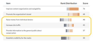
Establishing upfront consensus on project goals — before they’re discussed in the context of a specific deliverable — will set up your team to receive more productive feedback in the future. Ahead of a project kickoff, we survey stakeholders about all known goals: from the RFP, sales discussions, or otherwise. Stakeholders force-rank the goals ahead of the kickoff. We prefer Surveygizmo because it provides results visualizations like this:

Each color represents the number of people who ranked a goal first (dark orange), last (gray), and in-between. As the image shows, even for the highest- and lowest-priority items, people almost never unanimously agree.

When presenting these findings, we use a tool such as Trello to have a live reprioritization discussion. Later, we formalize the Trello board into a document inspired by analytics evangelist Avinash Kaushik’s Digital Marketing and Measurement Model:

Target improvements are based on past experience and assumptions we agree are reasonable. The stakeholder team then approves this framework.

2. Candid upfront conversations about ends, means, and tradeoffs

We encourage upfront conversations about these topics because almost no decision can improve every goal. For example:

  • Is total traffic a goal, or a means to another goal? If you could get twice as many signups, but at the expense of half your traffic, would you do it?

  • Why improve navigability? Is the goal purely altruistic for the user, or do you expect that improved navigability will drive other goals?

  • Why more organic search traffic? If the traffic came from referrals or sharing, would you be equally satisfied? Is new awareness the underlying goal?

3. An “AHA” (ask-hypothesis-action) approach to using the data

There are two types of data:

  • indicators that serve as a health-check of the organization
  • answers that inform a decision

Indicators, while more common, can’t help people take action. A dashboard number that’s up or down won’t tell stakeholders what to do next. Many people look at data and expect insights to emerge, but in reality, the process must be flipped.  

Enter the (kitschy, but hopefully memorable) AHA framework, which uses answers to spur action:

  • The ask: What question do you need to answer? 
  • The hypothesis: What do you think is the answer? 
  • The action: What will you do if your hypothesis proves true? If false, what will you do differently?

Before setting foot in a data set, one should be able to answer these three questions. They help people analyze in search of an answer, rather than waiting for the answer to reveal itself.

In Summary

With these three factors in place, organizations will be primed to efficiently act on their data. Good luck!

This article was originally published in the SoDA Report on Agency Metrics that Matter.

Copywriter Seeking Rejection

$
0
0

There are few things I fear more than rejection. In the past, my method for dealing with the dreaded “no” resembled my method for dealing with spiders: if I saw one coming, I ran.

Why? Because rejection hurts. It makes us blush, fidget, and fantasize about sinking beneath the floor (where there are undoubtedly spiders). It makes us feel small and worthless. And avoiding it isn’t all that hard. You can not ask for things that might result in rejection. You can apologize profusely before asking for anything. You can make yourself feel small and worthless before anyone else has a chance.

But, as I discovered during my copywriting apprenticeship at Viget, that approach can be problematic. After roughly a week, my advisor sent me a TED talk by Jia Jiang on overcoming the fear of rejection. She then told me that I would be devoting the following week to “rejection therapy.” The goal was not to run away from rejection, but to run towards it. I was to rack up as many rejections as I could, simply by asking for things.

Once my fight-or-flight response had subsided, I decided to make a list. I scheduled my rejection attempts for lunch breaks and after work. It looked like this:  

  • Request a tour of the Phillips Collection from the curator
  • Ask for a free meal refill from a restaurant I like
  • Get a ballroom pro to waltz with me (preferably to the strains of “Moon River”)
  • Request a lesson in latte art from a barista.
  • Ask a random stranger to have a staring contest with me.
  • Ask to sit in on an English class at Georgetown (Fitzgerald and His Circle, please)
  • Ask to work in a bookstore for 30 minutes
  • Try to get Happy Tart’s recipe for gluten free chocolate cupcakes.
  • Mount a llama head somewhere in the office.
  • Request an interview with the cool book collector dude from Bridge Street Books
  • Exchange movie reviews with someone from the New Yorker movie club
  • Chat with a copywriter or designer I admire

As I brainstormed, I realized that I kept going back to my bucket list, rummaging around in a neglected corner where once beautiful ideas die alone and unloved. These were the things I had always wanted to do, but never had because it meant risking rejection. In other words, by avoiding rejection, I had been inviting regret.

With that in mind, I jumped right in. While riding the metro, I spotted an elderly businessman, and decided to improvise. Scooching over, I offered him my notebook, and asked him to draw me a picture of a flower...

He said no. Very busy. Sorry. In the silence that followed, I realized that, all in all, that wasn’t as bad as I expected. It was awkward, but now it was over. Like a belly flop from the low-dive, it stung — but just for about five minutes. And only a few people saw.

As the week progressed, I discovered that you can build up a resistance to rejection. Each time you ask an awkward question, receive an uncomfortable glance, and brace for the sock to the stomach that is rejection, you become a little less afraid. You gain confidence, and with that confidence, the ability (occasionally) to convert a “no” into a “yes.”

Every few weeks, taco-loving Vigets make a pilgrimage to Taco Bamba — a tiny, beloved taqueria in Falls Church. One of these trips happened during my week of rejection hunting. About half-way through my second taco, I realized that 1) I wanted another, and 2) I could easily turn this into my request for a meal refill. I hadn’t planned on having an audience of coworkers, but love of tacos makes one do foolish things. I marched up to the register, and asked the lady if I could please have another taco, and could it please be free. “Uhhhh no,” she said. “Never surrender,” I thought. I told her I was from California, that I missed good tacos, and that theirs were the best in the area (all true). We started chatting, and at the end, she handed me a bag of chips, and a container of guacamole. Lesson: when one door closes, a tub of guac opens.

The lady at Taco Bamba wasn’t the first to seem genuinely interested in being helpful. One morning, I showed up at the coffee shop across the street, and asked the barista to teach me how to do latte art. It was 6:30 a.m., and I received the impression she hadn’t had her coffee yet. Nevertheless, she proceeded to give me an in-depth, step-by-step tutorial. She patiently walked me through demonstrations with soy, then with whole milk (fun fact: soy makes subpar foam). I felt like a barista apprentice, and left the coffee shop high on espresso and the milk of human kindness.

Later that week, I approached a woman outside my building, and challenged her to a staring contest. She agreed without hesitation. We locked eyeballs, and she immediately began chanting “dead puppies, dead puppies, dead puppies,” until I broke. A disturbing approach, but effective.

In happier news, the llama head I bought at Target found a new home in the biz dev office. Many thanks to our Digital Strategist and Director of Digital Strategy. To be fair, I didn’t actually think I’d be rejected on that one.

Main takeaway: people want to say yes. By the end of the week, I was convinced that rejection doesn’t hurt nearly as much as the failure to ask. And it doesn’t have to translate to requests for free tacos.  Sometimes it means asking for feedback, and accepting when the feedback is “you can do better.”  Sometimes it means taking risks, and refusing to be discouraged by a “no” or “I don’t like this.”

There’s a piece of paper taped above my desk. On it, writ large and extra bold, it says “CLOSED MOUTH NO FOOD.” It means that if I let the fear of rejection guide my decisions, I’m essentially closing my mouth. I’m refusing all the things that are supposed to help me grow — things like advice, critique, foamy lattes, and, of course, chips and guac.

Triggering Individual Animations on a Timeline with Lottie-web

$
0
0

In our recent collaboration with the Ad Council and AARP, we created a chatbot experience to walk users through a set of questions and serve them personalized action items to prepare for retirement. The tricky thing about retirement is that few people are truly prepared for it. To address this issue, we created an animated character that felt alive, showed empathy, and helped users stay engaged with the conversation. It’s name? Avo!

Below is a set of emotions we needed to animate and bring into our web experience. Enter Lottie-web. Lottie-web is an After Effects plugin that exports animation data and translates it into Javascript. Lottie-web is exceptional when animating complex vector-based animations, especially with all the parts of Avo’s face.

Because we had to convey many emotions, we needed a way to link them all together without distracting the user. Our approach was to have every animation return to what we called a “default state” — that allowed us to seamlessly transition from one animation to the next.

Highlighted in blue is the “default state” that Avo would return to after each animated emotion in the timeline.

After animating all the emotions on one timeline in After Effects, we exported the Javascript through Lottie-web. We divided all the frames into segments by emotion and named them.

Highlighted in green are the “animations” that needed to be identified and named.
class Bot extends React.PureComponent {
  static animations = {
    roll: [[0, 65]],
    blink: [[65, 85]],
    eyebrows: [[95, 125]],
    lookRight: [[125, 165]],
    lookLeft: [[165, 204]],
    joy: [[204, 244]],
    spin: [[272, 310]],
    wink: [[310, 351]],
    hmm: [[351, 400]],
    nice: [[400, 438]],
    celebrate: [[440, 530]],
    glasses: [[530, 595]],
    sparkle: [[595, 662]],
    money: [[665, 725]],
    love: [[725, 780]],
    nod: [[785, 870]]
  }

We identified ['roll', 'blink', 'eyebrows', 'lookRight'] as “neutral animations” and had those loop whenever Avo was waiting for an answer. Then we tied the rest of the animations to questions as a response.

Overall, Lottie-web was great. 5/5 I recommend.


Seven Tips to Make the Most of Close Mentorship

$
0
0

“I know I'm capable of doing great things, but I’m not sure how to start. If only I had a mentor!” This is a common refrain from talented early-career folks.

Mentors are, indeed, transformative. I’ve seen a lot written about how to be an effective mentor, or how to find and pursue a mentor suited to you. But what about how to be an effective mentee, once the relationship is secured?

Close mentorship is enormously valuable to anyone trying to make gains and fine-tune their skills. A core aspect of the Apprenticeship and Internship programs we offer at Viget is the attention and support of a dedicated Advisor. We provide a willing, eager mentor and essentially say to apprentices and interns, “Come. We’ll take you under our wing. You’ll learn so much. It’s going to be magical.”

I want to take some of the mystery out of the magic of close mentorship. I want future interns and apprentices come into our programs with a plan for how to get a ton of value out of the experience. Here are seven tips for how to be a successful mentee.

1. Engage
Demonstrate that you’re enthusiastic about learning from your advisor. Don’t be concerned with being impressive or well-liked; focus on being respectful, curious, but most of all engaged.  Your mentor will probably respect you immediately if you can demonstrate your eagerness to work hard and learn a lot.

2. Retain
A common frustration for a mentor is when a mentee doesn’t seem as serious about learning as the mentor feels about teaching. Demonstrate your intent to learn and retain information by taking notes, bookmarkings links, keeping a training log, maybe even drafting a blog post or two about the process. Think about not only retaining the info, but making that process somewhat visible to others so they aren’t left to wonder.

3. Practice
Don’t just demonstrate that you’re working to retain what you’re learning — put it into practice as soon as possible. If you’re a Project Manager Apprentice, for example, and you’ve learned how to generate status reports, ask if you can generate the next batch yourself. Do your best work, of course, but anticipate that you’ll make mistakes. Learn from the mistakes and try the task again soon. As you improve, look for ways to help your advisor. By taking things off her plate, you’re getting more practice, she’s seeing more evidence of your progress, and you’re lightening her load.

4. Feedback
Make peace with your inexperience — you’re so new to this! — and get excited about the gift of feedback. Through trial, error, and persistence, you will make gains over time. But through close mentorship and constructive feedback, you can make huge strides. “How can this design be better?” “Could I have added more value to the discussion?” “How can I answer the client’s question more clearly?” Feedback isn’t personal critique — it’s a treasure. Seek it out and hold it dear. 

5. Transparency 
It’s essential that you admit when you mess up, get stuck, or just don’t understand. This is an extension of being engaged — you’re demonstrating that you’re serious about learning. Most people find humility to be a positive trait, and your mentor may actually enjoy the opportunity to rescue you from being stuck. Don’t be reluctant to admit when you need help.

6. Balance
Soliciting feedback and asking for help are important, but it’s also important to respect other people’s time. Balance how involved your mentor is with some good old-fashioned self-direction and perseverance. Don’t ask questions before attempting to answer them yourself, and don’t ask for help unless you’ve struggled to solve the problem first. And if you hear the same feedback more than twice, an alarm should go off in your head. You need to put that feedback into practice ASAP. 

7. Communicate
Your advisor should know what you’re doing, how it’s going, and what blockers you have. Being a proactive communicator is part of being a good teammate, no matter your experience level. But when you’re “under the wing” of an advisor, be even more intentional about sharing your progress. Make it easy for your mentor and the other people around to know what you’re doing, even if it’s simply making expected progress. 

I hope these seven tips shed light on how to best approach the unique circumstances of close mentorship. Most of these skills will serve you well throughout your career, even as you collect expertise of your own and begin to mentor others. If nothing else, I hope this post highlights that mentees should have a deliberate, thoughtful approach to learning, just as mentors should have to teaching. 

If you like the idea of 10 weeks of close mentorship from an industry expert advisor, you might want to learn more about Viget’s Apprenticeship or Internship programs.

How to Implement Accessibility in Agency Projects: Part 2

$
0
0

In part 1 of my series, How to Implement Accessibility in Agency Projects, I discussed some of the high-level challenges faced when implementing accessibility in client service companies and how we’re approaching them at Viget.

Talking about accessibility is relatively easy, but when project constraints like timelines and budgets are involved, putting it into practice can be challenging. We've been working on this at Viget and in part 2 of this series, I’ll share some concepts and tips that we're using to make accessibility part of every project.

Thinking About Accessibility

Making accessibility part of your team’s work can be challenging and requires a deliberate effort. At Viget, we've found that building empathy, company-wide education, and re-framing how we think to be valuable strategies.

Cultivate Empathy

If you’re reading this, you likely work at a computer… a lot. You also may have customized your setup to enhance the way you like to work. In short: you’re a “power user”. That’s great for productivity but bad for empathy. The more ingrained we are in our setup the harder it is to understand how other people use and experience their computer and the web. We can easily forget that we are not like our users. It's challenging enough to keep in mind that most people are less savvy, use less-than-cutting-edge hardware, or don’t have a high-speed internet connection. If you don’t have direct experience with disabilities (either yourself or someone in your life), it takes deliberate effort gain empathy for people who interact with the web in ways that are different from you.

You may be able-bodied now, but things happen as we journey through life that can cause us to become temporarily or permanently disabled. Has anything ever prevented you from using your computer in your normal way? Perhaps a broken thumb affected your ability to use the mouse, LASIK surgery made it difficult to focus on your screen for a week or two, or maybe your trackpad just gave out (all of these happened to me). Having even temporary dependence on accessible technologies, like I did with keyboard access and font zooming, can give us a new perspective and appreciation for the importance of building accessible products.

Try these tips for gaining better insight into how people with various disabilities use the Web:

  • Take the #NoMouse challenge and spend some time navigating by keyboard.
  • Learn the basics of how to use a screen reader and try listening to how pages are read.
  • Install Chrome extensions like NoCoffee or Funkify to experience browsing with various disabilities.
  • Check out many of the other simulations from WebAIM.
  • Hold an empathy-building workshop for your team or company where you challenge the group to perform a specific task, like selecting a round-trip flight, using only the keyboard or with one of the Funkify personas enabled.

Educate Across the Company

Lone accessibility advocates, however passionate, aren't going to make much of a lasting impact on accessibility awareness company-wide — they can’t be everywhere all the time, and if they leave the company their influence goes with them. At Viget, we found that the most successful strategy for creating a lasting company value was to harness those with a passion for accessibility to speak, write, and lead training sessions. By framing accessibility knowledge as a higher level of expertise and empowering everyone to own their role’s portion of accessibility, we quickly saw a higher level of buy-in and enthusiasm.

To that end, we built the Interactive WCAG: a tool for filtering and sharing the daunting Web Content Accessibility Guideline (WCAG) spec in a digestible format. The spec can be filtered to only view a certain level (A, AA or AAA) and a role's responsibility (copywriting, visual design, user experience design, development, or front-end development). It also creates a shareable URL so that it can be easily sent to a colleague or client.

Try these ideas for getting a discussion going in your office:

  • Lead by example — begin with your own work and show what good accessibility looks like.
  • Do a lunch-and-learn presentation or offer to speak at a team or company all-hands meeting.
  • Depending on how your company is structured, approach other discipline or project teams and ask if an accessibility presentation can get on an upcoming meeting agenda. Make sure the presentation is tailored to the concerns of that group.
  • Write about accessibility on your company's blog.
  • Hold an empathy-building session or build an empathy lab where coworkers can get a better understanding of some people's barriers to using the web.
  • Attend a local accessibility Meetup and offer to host a meeting at your office.
  • Invite an outside accessibility expert to speak at a company or team meeting (in person or remote).

Think of Accessibility as a Core Part of Usability

The introduction of the iPhone and the explosion of internet-connected portable devices that followed was a sea-change moment for web developers. At the time, we were too busy re-learning how to build for the web to realize how beneficialthesedeviceswouldbe for people with disabilities. Our need to start accounting for new patterns of input and output beyond the desktop computer and mouse wound up being a boon to accessibility on the web. We're now accustomed to thinking about patterns that coincide with a variety of disabilities:

  • Better readability and responsive designs for small screens also benefit those with low vision who might prefer to zoom their browser to see content better.
  • Making targets, like buttons, large enough for a finger on a touchscreen also makes it easier for users with fine motor control disabilities that can still use a mouse to target and click.
  • Considering content in smaller chunks and writing tight for small screens is great for helping those with cognitive or memory disabilities, like ADD/ADHD, focus on the page's task.
  • The popularity of touch devices largely killed hovers as a primary way of revealing and interacting with content. This was good for keyboard users because it meant that we stopped relying on the mouse hover and started designing and coding for the click as the primary way to interact with things.

Tips for Making Accessibility Part of Your Day-To-Day Work

Here are some curated tips from the Viget team on how we're implementing accessibility in our daily work:

Design

“Check your palette at every step of the way so that you don't have to adjust for contrast later on. Keep the contrast checker open in a tab for easy access.”

- Mindy Wagner, Art Director

Content

“Keyboard testing is a quick and important way to QA a site. When going through pages using your keyboard, remember to use shift+tab to make sure keyboard users can move both down and up a page in a logical way. You can find some sneaky things that way, especially when elements appear/disappear when scrolling.”

“Always dig into contrast errors when using WAVE or a similar tool. Don’t consider it an error just because it is flagged as one - look at the details and see what level and font size it's failing.”

- Becky Tornes, Senior Project Manager

User Experience

  • Question :hover with extreme prejudice.
  • Edit labels and microcopy for simplicity and directness.
  • Disable CSS to see if a UI "reads" logically when color, shape, alignment, emphasis, and other visual design elements are absent.
  • Balance working memory with the amount of content on a page.
  • Be consistent and predictable, particularly with navigation.
  • Poke yoke your data inputs. Error prevention > error resolution.

- Todd Moy, Former Senior User Experience Designer

Front-End Development

“Purposely become a keyboard-only user as often as possible. You can start small. Try giving yourself a user goal, like "As a user, I need to be able to search for careers" and try to complete it using only the keyboard. If you're developing on a Mac, you may need to adjust browser and OS settings before getting started.”

- Chris Manning, Senior Front-End Developer

Don't Reserve Accessibility for Just Production Code

When prototyping or test-coding a new feature, always build it to be accessible. Even if it's for a small internal audience or just yourself, considering accessibility at a nascent stage will get it baked in from the beginning and, most importantly, means you won't have to re-think a feature's structure or interaction model later. And who are we kidding... when the going gets tough these prototypes sometimes make their way into production.

Learn HTML and Use It Semantically

Using the correct markup for the task is the easiest way to get accessibility for free. This can be pretty straightforward if you're coding by hand but more challenging if you're using a framework or helper that outputs markup for you. The benefits, though, are significant:

  • Sectioning elements allow screen reader users to jump around the page quickly.
  • Good use of headings, similarly, lets screen reader users understand a page's content structure and jump to just want they want.
  • Using frequently built-from-scratch elements like <button>, <a> and <select> correctly instead of meaningless <div>'s provides all of the expected interactivity (keyboard focusable, clickable and correctly read by a screen reader) without the extra work of having to add it in with JavaScript.

Not using the correct element, or trying to reproduce a native control from scratch, can lead to bigger headaches down the road and a true adding-accessibility-takes-more-time result.

Support Flexibility

Building for accessibility isn't about just one disability. There's a broad range of disabilities to keep in mind and it can feel overwhelming at times. Building flexibility into your interfaces and interactions helps ensure broader access. What does that mean? To an extent, with responsive design, we're already doing it. Accounting for multiple kinds of input (mouse and touch) and output (small to large screens) makes our sites better able to accommodate a variety of situations.

Sometimes we unknowingly disable flexibility. For example, one common practice is locking a mobile browser's zoom level to ensure that the site fits the screen or to prevent some gestures from interfering with interactions. This has the unintended consequence of preventing users with vision disabilities from zooming the page to make text or images easier to see.

Prioritize Accessible Content Over Accessible Experience

We're frequently tasked with creating richly interactive sites. That's the fun part of what we do, right? In a perfect situation with plenty of time, we'd be able to make that experience accessible to everyone. I don't know about you, but I'm still waiting for that unicorn project to come along (hint: it won't). When the task of making a complex piece of functionality or experience accessible is daunting, prioritize making sure that the content is accessible. With enough time, we could make anything accessible. But when faced with deadlines and budgets, making something accessible over nothing is the better tradeoff.

An example of this concept in practice was a map page we created for a client. This page was designed with a map of clickable pushpins that brought up a little info overlay. Rather than trying to figure out how to make the SVG map accessible to keyboards and screen readers, the design already included an identical text list that we were able to rely on. The solution was to make the map inaccessible to keyboards and screen readers. The map script that we used created the pushpins as <span>'s (see using semantic HTML above) rather than <button>'s so it was already inaccessible out-of-the-box. To make it invisible to screen readers we added aria-hidden="true" to its outermost wrapper.

The result is perfectly accessible content without the added time and expense of trying to make the map accessible. This was a win for accessibility and a win for the budget! Now, of course it's possible to make the map accessible with some extra effort, but instead, those hours could be spent on other features and contributed to delivering the site on time and on budget.

Conclusion

Creating more accessible products and experiences is an essential and rewarding endeavor but carries unique challenges for those of us working in client service companies. Rather than give up or wait for clients to ask, we’ve found that the practices I outlined in this article lead to a lasting culture at Viget that values thinking about accessibility throughout a project and throughout the company. Here are just a few examples from our experience working on some fun, beautiful and disability-specific projects. Do you have any tips to share? Comments? Criticism? We'd love to hear about it below!

How to Pull off a Pointless Crime

$
0
0

It’s the most wonderful time of the year. There are tiny Christmas trees interspersed throughout the office, folky holiday tunes on the speakers, and tubs of special popcorn in the kitchen. But most importantly, there’s Pointless Weekend.

If you’re unfamiliar with the origins of Pointless Corp, read this. In brief, Pointless Corp is neither pointless nor a corporation. It’s a chance for Vigets to come together like techy Seuss Whos and create amazing things. We brainstorm ideas, and work in teams to bring them to life over the course of one magical weekend.  

Our team (consisting of two developers, a project manager, a digital analyst, a designer, and a copywriter) wanted to create an escape room experience users could play on their phones. We referred to it as “Dial M for Murder” — but the title, like so many aspects of the game, changed rapidly once we got started.

We realized immediately that iteration would be essential. We had an ambitious though broad idea, a large team, and little time. While bringing many disciplines together at the same time can be tricky, in this case, it allowed us to move through concepting quickly. As we brainstormed, we could get immediate feedback on feasibility from our designer and developers.

This became especially important when deciding on the overall setting for our escape room adventure. Through rapid prototyping, and responding to ideas with “yes, and” instead of “I don't like that,” we went from a retro-futuristic 1950s diner with interactive jukeboxes, a robot waitstaff, and time travel, to a shady 1980s motel. This setting, we knew, would be interesting and engaging without requiring a week of design and development work.

From the outset, we knew we wanted three things for our app: we wanted it to be multiplayer, we wanted to build features that would engage user’s phones (tapping, shaking, etc), and we wanted an accompanying plot that would provide an engaging structure for each task. Working with the developers, we were able to create a list of features we could conceivably build in time. We then reverse-engineered the plot, building it around the features. For instance, we knew we wanted people to tap their phone screens, so part of the story involved a night manager who loved E.T. and spent perhaps too much time at the movies.

And, of course, a crucial part of bringing the story to life involved visual design. We wanted to replicate the immersive environment of a real-life escape room...but we had only one visual designer, and one weekend in which to complete designs and build them out. In the end, our designer used a combination of imagery, fonts, and colors to create a world of synth-y seediness that didn’t require extra development time. We paired this with copy that matched the bold, playful, slightly edgy feel of the design. The result teased the user’s imagination, inviting them to visualize the setting and characters themselves.

In between gulps of egg nog this holiday weekend, we invite you to grab a friend (or foe) and take No Vacancy for a spin. If/when you successfully complete the mission, don't forget to check out the other brilliant project born out of Pointless weekend — Emojionary.

Creating Your First WebVR App using React and A-Frame

$
0
0

Today, we'll be running through a short tutorial on creating our own WebVR application using A-Frame and React. We'll cover the setup process, build out a basic 3D scene, and add interactivity and animation. A-Frame has an excellent third-party component registry, so we will be using some of those in addition to writing one from scratch. In the end, we'll go through the deployment process through surge.sh so that you can share your app with the world and test it out live on your smartphone (or Google Cardboard if you have one available). For reference, the final code is in this repo. Over the course of this tutorial, we will be building a scene like this. Check out the live demo as well.

A-Frame Eventide Demo

Exciting, right? Without further ado, let's get started!

What is A-Frame?

A-Frame Banner

A-Frame is a framework for building rich 3D experiences on the web. It's built on top of three.js, an advanced 3D JavaScript library that makes working with WebGL extremely fun. The cool part is that A-Frame lets you build WebVR apps without writing a single line of JavaScript (to some extent). You can create a basic scene in a few minutes writing just a few lines of HTML. It provides an excellent HTML API for you to scaffold out the scene, while still giving you full flexibility by letting you access the rich three.js API that powers it. In my opinion, A-Frame strikes an excellent balance of abstraction this way. The documentation is an excellent place to learn more about it in detail.

Setup

The first thing we're going to be doing is setting up A-Frame and React. I've already gone ahead and done that for you so you can simply clone this repo, cd into it, and run yarn install to get all the required dependencies. For this app, we're actually going to be using Preact, a fast and lightweight alternative to React, in order to reduce our bundle size. Dont worry, it's still the same API so if you've worked with React before then you shouldn't notice any differences. Go ahead and run yarn start to fire up the development server. Hit up http://localhost:3333 and you should be presented with a basic scene including a spinning cube and some text. I highly suggest that you spend some time going through the README in that repo. It has some essential information about A-Frame and React. It also goes more into detail on what and how to install everything. Now on to the fun stuff.

A-Frame Setup

Building Blocks

Fire up the editor on the root of the project directory and inspect the file app/main.js (or view it on GitHub), that's where we'll be building out our scene. Let's take a second to break this down.

The Scene component is the root node of an A-Frame app. It's what creates the stage for you to place 3D objects in, initializes the camera, the WebGL renderer and handles other boilerplate. It should be the outermost element wrapping everything else inside it. You can think of Entity like an HTML div. Entities are the basic building blocks of an A-Frame Scene. Every object inside the A-Frame scene is an Entity.

A-Frame is built on the Entity-component-system (ECS) architecture, a very common pattern utilized in 3D and game development most notably popularized by Unity, a powerful game engine. What ECS means in the context of an A-Frame app is that we create a bunch of Entities that quite literally do nothing, and attach components to them to describe their behavior and appearance. Because we're using React, this means that we'll be passing props into our Entity to tell it what to render. For example, passing in a-box as the value of the prop primitive will render a box for us. Same goes for a-sphere, or a-cylinder. Then we can pass in other values for attributes like position, rotation, material, height, etc. Basically, anything listed in the A-Frame documentation is fair game. I hope you see how powerful this really is. You're grabbing just the bits of functionality you need and attaching them to Entities. It gives us maximum flexibility and reusability of code, and is very easy to reason about. This is called composition over inheritance.

Entity-component-system

But, Why React?

Sooooo, all we need is markup and a few scripts. What's the point of using React, anyway? Well, if you wanted to attach state to these objects, then manually doing it would be a lot of hard work. A-Frame handles almost all of its rendering through the use of HTML attributes (or components as mentioned above), and updating different attributes of many objects in your scene manually can be a massive headache. Since React is excellent at binding state to markup, diffing it for you, and re-rendering, we'll be taking advantage of that. Keep in mind that we won't be handling any WebGL render calls or manipulating the animation loop with React. A-Frame has a built in animation engine that handles that for us. We just need to pass in the appropriate props and let it do the hard work for us. See how this is pretty much like creating your ordinary React app, except the result is WebGL instead of raw markup? Well, technically, it is still markup. But A-Frame converts that to WebGL for us. Enough with the talking, let's write some code.

Setting Up the Scene

The first thing we should do is to establish an environment. Let's start with a blank slate. Delete everything inside the Scene element. For the sake of making things look interesting right away, we'll utilize a 3rd party component called aframe-environment to generate a nice environment for us. Third party components pack a lot of WebGL code inside them, but expose a very simple interface in the markup. It's already been imported in the app/intialize.js file so all we need to do is attach it to the Scene element. I've already configured some nice defaults for us to get started, but feel free to modify to your taste. As an aside, you can press CTRL + ALT + I to load up the A-Frame Scene Inspector and change parameters in real-time. I find this super handy in the initial stage when designing the app. Our file should now look something like:

import { h, Component } from 'preact'
import { Entity, Scene } from 'aframe-react'

// Color palette to use for later
const COLORS = ['#D92B6A', '#9564F2', '#FFCF59']

class App extends Component {
  constructor() {
    super()

    // We'll use this state later on in the tutorial
    this.state = {
      colorIndex: 0,
      spherePosition: { x: 0.0, y: 4, z: -10.0 }
    }
  }

  render() {
    return (
      <Scene
        environment={{
          preset: 'starry',
          seed: 2,
          lightPosition: { x: 0.0, y: 0.03, z: -0.5 },
          fog: 0.8,
          ground: 'canyon',
          groundYScale: 6.31,
          groundTexture: 'walkernoise',
          groundColor: '#8a7f8a',
          grid: 'none'
        }}></Scene>
    )
  }
}

A-Frame Environment

Was that too easy? That's the power of A-Frame components. Don't worry. We'll dive into writing some of our own stuff from scratch later on. We might as well take care of the camera and the cursor here. Let's define another Entity inside the Scene tags. This time, we'll pass in different primitives (a-camera and a-cursor).

<Entity primitive="a-camera" look-controls><Entity
    primitive="a-cursor"
    cursor={{ fuse: false }}
    material={{ color: 'white', shader: 'flat', opacity: 0.75 }}
    geometry={{ radiusInner: 0.005, radiusOuter: 0.007 }}
  /></Entity>

See how readable and user-friendly this is? It's practically English. You can look up every single prop here in the A-Frame docs. Instead of string attributes, I'm passing in objects.

Populating the Environment

Now that we've got this sweet scene set up, we can populate it with objects. They can be basic 3D geometry objects like cubes, spheres, cylinders, octahedrons, or even custom 3D models. For the sake of simplicity, we'll use the defaults provided by A-Frame, and then write our own component and attach it to the default object to customize it. Let's build a low poly count sphere because they look cool. We'll define another entity and pass in our attributes to make it look the way we want. We'll be using the a-octahedron primitive for this. This snippet of code will live in-between the Scene tags as well.

<Entity
  primitive="a-octahedron"
  detail={2}
  radius={2}
  position={this.state.spherePosition}
  color="#FAFAF1"
/>

You may just be seeing a dark sphere now. We need some lighting. Let there be light:

<Entity
  primitive="a-light"
  type="directional"
  color="#FFF"
  intensity={1}
  position={{ x: 2.5, y: 0.0, z: 0.0 }}
/>

This adds a directional light, which is a type of light emitted from a certain point in space. You can also try using ambient or point lights, but in this situation, I prefer directional to emulate it coming from the sun's direction.

A-Frame 3D Object

Building Your First A-Frame Component

Baby steps. We now have a 3D object and an environment that we can walk/look around in. Now let's take it up a notch and build our own custom A-Frame component from scratch. This component will alter the appearance of our object, and also attach interactive behavior to it. Our component will take the provided shape, and create a slightly bigger wireframe of the same shape on top of it. That'll give it a really neat geometric, meshy (is that even a word?) look. To do that, we'll define our component in the existing js file app/components/aframe-custom.js.

First, we'll register the component using the global AFRAME reference, define our schema for the component, and add our three.js code inside the init function. You can think of schema as arguments, or properties that can be passed to the component. We'll be passing in a few options like color, opacity, and other visual properties. The init function will run as soon as the component gets attached to the Entity. The template for our A-Frame component looks like:

AFRAME.registerComponent('lowpoly', {
  schema: {
    // Here we define our properties, their types and default values
    color: { type: 'string', default: '#FFF' },
    nodes: { type: 'boolean', default: false },
    opacity: { type: 'number', default: 1.0 },
    wireframe: { type: 'boolean', default: false }
  },

  init: function() {
    // This block gets executed when the component gets initialized.
    // Then we can use our properties like so:
    console.log('The color of our component is ', this.data.color)
  }
}

Let's fill the init function in. First things first, we change the color of the object right away. Then we attach a new shape which becomes the wireframe. In order to create any 3D object programmatically in WebGL, we first need to define a geometry, a mathematical formula that defines the vertices and the faces of our object. Then, we need to define a material, a pixel by pixel map which defines the appearance of the object (color, light reflection, texture). We can then compose a mesh by combining the two.

Three.js Mesh

We then need to position it correctly, and attach it to the scene. Don't worry if this code looks a little verbose, I've added some comments to guide you through it.

init: function() {
  // Get the ref of the object to which the component is attached
  const obj = this.el.getObject3D('mesh')

  // Grab the reference to the main WebGL scene
  const scene = document.querySelector('a-scene').object3D

  // Modify the color of the material
  obj.material = new THREE.MeshPhongMaterial({
    color: this.data.color,
    shading: THREE.FlatShading
  })

  // Define the geometry for the outer wireframe
  const frameGeom = new THREE.OctahedronGeometry(2.5, 2)

  // Define the material for it
  const frameMat = new THREE.MeshPhongMaterial({
    color: '#FFFFFF',
    opacity: this.data.opacity,
    transparent: true,
    wireframe: true
  })

  // The final mesh is a composition of the geometry and the material
  const icosFrame = new THREE.Mesh(frameGeom, frameMat)

  // Set the position of the mesh to the position of the sphere
  const { x, y, z } = obj.position
  icosFrame.position.set(0.0, 4, -10.0)

  // If the wireframe prop is set to true, then we attach the new object
  if (this.data.wireframe) {
    scene.add(icosFrame)
  }

  // If the nodes attribute is set to true
  if (this.data.nodes) {
    let spheres = new THREE.Group()
    let vertices = icosFrame.geometry.vertices

    // Traverse the vertices of the wireframe and attach small spheres
    for (var i in vertices) {
      // Create a basic sphere
      let geometry = new THREE.SphereGeometry(0.045, 16, 16)
      let material = new THREE.MeshBasicMaterial({
        color: '#FFFFFF',
        opacity: this.data.opacity,
        shading: THREE.FlatShading,
        transparent: true
      })

      let sphere = new THREE.Mesh(geometry, material)
      // Reposition them correctly
      sphere.position.set(
        vertices[i].x,
        vertices[i].y + 4,
        vertices[i].z + -10.0
      )

      spheres.add(sphere)
    }
    scene.add(spheres)
  }
}

Let's go back to the markup to reflect the changes we've made to the component. We'll add a lowpoly prop to our Entity and give it an object of the parameters we defined in our schema. It should now look like:

<Entity
  lowpoly={{
    color: '#D92B6A',
    nodes: true,
    opacity: 0.15,
    wireframe: true
  }}
  primitive="a-octahedron"
  detail={2}
  radius={2}
  position={{ x: 0.0, y: 4, z: -10.0 }}
  color="#FAFAF1"
/>

A-Frame Lowpoly

Adding Interactivity

We have our scene, and we've placed our objects. They look the way we want. Now what? This is still very static. Let's add some user input by changing the color of the sphere every time it gets clicked on.

A-Frame comes with a fully functional raycaster out of the box. Raycasting gives us the abiltiy to detect when an object is 'gazed at' or 'clicked on' with our cursor, and execute code based on those events. Although the math behind it is fascinating, we don't have to worry about how it's implemented. Just know what it is and how to use it. To add a raycaster, we provide the raycaster prop to the camera with the class of objects which we want to be clickable. Our camera node should now look like:

<Entity primitive="a-camera" look-controls><Entity
    primitive="a-cursor"
    cursor={{ fuse: false }}
    material={{ color: 'white', shader: 'flat', opacity: 0.75 }}
    geometry={{ radiusInner: 0.005, radiusOuter: 0.007 }}
    event-set__1={{
      _event: 'mouseenter',
      scale: { x: 1.4, y: 1.4, z: 1.4 }
    }}
    event-set__1={{
      _event: 'mouseleave',
      scale: { x: 1, y: 1, z: 1 }
    }}
    raycaster="objects: .clickable"
  /></Entity>

We've also added some feedback by scaling the cursor when it enters and leaves an object targeted by the raycaster. We're using the aframe-event-set-component to make this happen. It lets us define events and their effects accordingly. Now go back and add a class="clickable" prop to the 3D sphere Entity we created a bit ago. While you're at it, attach an event handler so we can respond to clicks accordingly.

<Entity
  class="clickable"
  // ... all the other props we've already added before
  events={{
    click: this._handleClick.bind(this)
  }}
/>

Now let's define this _handleClick function. Outside of the render call, define it and use setState to change the color index. We're just cycling between the numbers of 0 - 2 on every click.

_handleClick() {
  this.setState({
    colorIndex: (this.state.colorIndex + 1) % COLORS.length
  })
}

Great, now we're changing the state of app. Let's hook that up to the A-Frame object. Use the colorIndex variable to cycle through a globally defined array of colors. I've already added that for you so you just need to change the color prop of the sphere Entity we created. Like so:

<Entity
  class="clickable"
  lowpoly={{
    color: COLORS[this.state.colorIndex],
    // The rest stays the same
/>

One last thing, we need to modify the component to swap the color property of the material since we pass it a new one when clicked. Underneath the init function, define an update function, which gets invoked whenever a prop of the component gets modified. Inside the update function, we simply swap our the color of the material like so:

AFRAME.registerComponent('lowpoly', {
  schema: {
    // We've already filled this out
  },

  init: function() {
    // We've already filled this out
  }

  update: function() {
    // Get the ref of the object to which the component is attached
    const obj = this.el.getObject3D('mesh')

    // Modify the color of the material during runtime
    obj.material.color = new THREE.Color(this.data.color)
  }
}

You should now be able to click on the sphere and cycle through colors.

A-Frame Interactivity

Animating Objects

Let's add a little bit of movement to the scene. We can use the aframe-animation-component to make that happen. It's already been imported so let's add that functionality to our low poly sphere. To the same Entity, add another prop named animation__rotate. That's just a name we give it, you can call it whatever you want. The inner properties we pass are what's important. In this case, it rotates the sphere by 360 degrees on the Y axis. Feel free to play with the duration and property parameters.

<Entity
  class="clickable"
  lowpoly
  // A whole buncha props that we wrote already...
  animation__rotate={{
    property: 'rotation',
    dur: 60000,
    easing: 'linear',
    loop: true,
    to: { x: 0, y: 360, z: 0 }
  }}
/>

To make this a little more interesting, let's add another animation prop to oscillate the sphere up and down ever so slightly.

animation__oscillate={{
  property: 'position',
  dur: 2000,
  dir: 'alternate',
  easing: 'linear',
  loop: true,
  from: this.state.spherePosition,
  to: {
    x: this.state.spherePosition.x,
    y: this.state.spherePosition.y + 0.25,
    z: this.state.spherePosition.z
  }
}}

Polishing Up

We're almost there! Post-processing effects in WebGL are extremely fast and can add a lot of character to your scene. There are many shaders available for use depending on the aesthetic you're going for. If you want to add post-processing effects to your scene, you can utilize the additional shaders provided by three.js to do so. Some of my favorites are bloom, blur, and noise shaders. Let's run through that very briefly here.

Post-processing effects operate on your scene as a whole. Think of it as a bitmap that's rendered every frame. This is called the framebuffer. The effects take this image, process it, and output it back to the renderer. The aframe-effects-component has already been imported for your convenience, so let's throw the props at our Scene tag. We'll be using a mix of bloom, film, and FXAA to give our final scene a touch of personality:

<Scene
  effects="bloom, film, fxaa"
  bloom="radius: 0.99"
  film="sIntensity: 0.15; nIntensity: 0.15"
  fxaa
  // Everything else that was already there
/>

A-Frame Post Processing

Boom. we're done. There's an obscene amount of shader math going on behind the scene (pun intended), but you don't need to know any of it. That's the beauty of abstraction. If you're curious you can always dig into the source files and look at the shader wizardry that's happening back there. It's a world of its own. We're pretty much done here. Onto the final step...

Deployment

It's time to deploy. The final step is letting it live on someone else's server and not your dev server. We'll use the super awesome tool called surge to make this painfully easy. First, we need a production build of our app. Run yarn build. It will output final build to the public/ directory. Install surge by running npm install -g surge. Now run surge public/ to push the contents of that directory live. It should prompt you to log in or create an account and you'll have the choice to change your domain name. The rest should be very straightforward, and you will get a URL of your deployed site at the end. That's it. I've hosted mine http://eventide.surge.sh.

Surge Prompt

Fin

I hope you enjoyed this tutorial and you see the power of A-Frame and its capabilities. By combining third-party components and cooking up our own, we can create some neat 3D scenes with relative ease. Extending all this with React, we're able to manage state efficiently and go crazy with dynamic props. We've only scratched the surface, and now it's up to you to explore the rest. As 2D content fails to meet the rising demand for immersive content on the web, tools like A-Frame and three.js have come into the limelight. The future of WebVR is looking bright. Go forth and unleash your creativity, for the browser is an empty 3D canvas and code is your brush. If you end up making something cool, feel free tweet at @_prayash and A-Frame @aframevr so we everyone else can see it too.

Additional Resources

Check out these additional resources to advance your knowledge of A-Frame and WebVR.

Using JUnit on CircleCI 2.0 with Jest and ESLint

$
0
0

We're big believers in automated testing and deployment. However it can generate a staggering amount of information. Being able to quickly determine the source of an issue saves time and avoids headaches.

In this post I'll share how we use JUnit reporting to get concise feedback out of CircleCI. Instead of crawling through lengthy output, CircleCI tells us precisely what failed at the top of our build pages.

Here's what I mean:

If you're just looking for a CircleCI config, take a look here. Otherwise brace yourself for the wild and wonderful world of test reporting!

What is JUnit?

JUnit is a unit testing framework for Java. Yes, Java. While we don't use it for testing JavaScript, the reporting format it generates has become a standard that many tools support (including CircleCI). Most JavaScript tools can generate JUnit reports – perfect for our needs.

JUnit reports are XML files. They look like this:

<testsuites name="jest tests"><testsuite name="My test suite" tests="7" errors="0" failures="0" skipped="0" timestamp="2017-09-05T23:56:38" time="2.534"><testcase classname="My test" time="0.013"></testcase></testsuite></testsuites>

Why is this so great?

When tests fail, CircleIC can use JUnit reports to give you concise feedback on what went wrong. Additionally, it fuels CircleCI's new Insights feature, helping you to identify flakey and slow tests and analyze overall project health:

Setting it up

For CircleCI 2.0 to know that we have a test report, first we have to generate it.

Generating JUnit Reports with Jest

We use the jest-junitnpm package. In local development, this code is never executed, however by passing the --testResultsProcessor flag we can tell Jest to generate a Junit report:

jest --ci --testResultsProcessor="jest-junit"

Make sure to add this as a development dependency! I've also included the --ci flag, which improves the behavior of certain Jest operations like snapshot testing during continuous integration.

If you run this locally, you'll probably see a test-results.xml document at the root of your project. However on CircleCI we'll put it in a consistent directory with all other reports.

In .circleci/config.yml, our test command looks something like:

# See the full version here:
# https://github.com/vigetlabs/junit-blog-post/blob/master/.circleci/config.yml
version: 2
jobs:
  build:
    # Docker image and other setup steps ommitted
    steps:
      # Setup steps omitted
      - run:
          name: "JavaScript Test Suite"
          # yarn here makes sure we are using the local jest binary
          command: yarn jest -- --ci --testResultsProcessor="jest-junit"
          environment:
            JEST_JUNIT_OUTPUT: "reports/junit/js-test-results.xml"
      - store_test_results:
          path: reports/junit
      - store_artifacts:
          path: reports/junit

This configuration tells CircleCI to run the command we mentioned earlier, setting an environment variable for where jest-junit should put the report. store_tests_results tells CircleCI that there is a test report. I also like to include store_artifacts to make the generated reports accessible later.

This concludes setting up Jest with JUnit on CircleCI 2.0.

Generating JUnit Reports with ESLint

While we lean on Prettier to rule out the possiblity of code formatting inconsistencies, we still use ESLint to catch common mistakes in our code, including bad variable references or incorrectly imported modules. ESLint also tends to give more specific feedback on the location of these issues that might otherwise by glossed over in a failed unit test.

Generating a JUnit report for ESLint is simple. It does this out of the box!

eslint --format junit -o reports/junit/js-lint-results.xml

Following our previous example, hooking this up in CircleCI 2 is just as easy:

# See the full version here:
# https://github.com/vigetlabs/junit-blog-post/blob/master/.circleci/config.yml
version: 2
jobs:
  build:
    # Docker image and other setup steps ommitted
    steps:
      # Setup steps omitted
      - run:
          name: "JavaScript Linter"
          # yarn here makes sure we are using the local jest binary
          command: yarn lint -- --format junit -o reports/junit/js-lint-results.xml
      # Note: this hasn't changed. Don't add this twice!
      - store_test_results:
          path: reports/junit
      - store_artifacts:
          path: reports/junit

That's it. We did it.

That's really all it takes! Here's the full CircleCI configuration for good measure:

version: 2
jobs:
  build:
    docker:
      - image: circleci/node:7.10
    working_directory: ~/repo
    steps:
      - checkout
      - restore_cache:
          keys:
          - v1-dependencies-{{ checksum "package.json" }}
          - v1-dependencies-
      - run: yarn install
      - save_cache:
          paths:
            - node_modules
          key: v1-dependencies-{{ checksum "package.json" }}
      - run:
          name: "JavaScript Linter"
          command: yarn lint -- --format junit -o reports/junit/js-lint-results.xml
      - run:
          name: "JavaScript Test Suite"
          environment:
            JEST_JUNIT_OUTPUT: reports/junit/js-test-results.xml
          command: yarn test -- --ci --testResultsProcessor="jest-junit"
      - store_test_results:
          path: reports/junit
      - store_artifacts:
          path: reports/junit

Wrapping up

Taking these extra measures on our projects has yielded tremendous improvements to our workflow. I'd love to hear what you are doing to improve your experience with continuous integration services as well!

Viewing all 935 articles
Browse latest View live